When organic meets structure with irregularities and margins - ARTIZON MUSEUM
Designed by Tonerico: Inc., the Artizon Museum was a collaborative effort of Japanese designers. There is a space inside this museum that could be called a margin. It does not have the default purpose of location that visitors would expect, as well as elements that are intuitively perceived as uneven.
Tonerico Inc was established by three Tokyo-based designers. Hiroshi Yoneya, Ken Kimizuka, and Yumi Masuko came together in 2002. Among its diverse activities, which range from architecture to interior design to furniture and product design, the company specializes in a wide range of disciplines. Their approach is to present their conceptual works both abroad and in Japan both without any particular client as an expression of their design philosophy. Designed by Tonerico: Inc., the Artizon Museum was a collaborative effort of Japanese designers. There is a space inside this museum that could be called a margin. It does not have the default purpose of location that visitors would expect, as well as elements that are intuitively perceived as uneven. There are elements in certain painting styles that facilitate the power to inspire people's creativity, such as "the way one interacts with marginal spaces" and "sensory elements." In addition to the primitive method of forming space, this is an attempt to capture the wholeness that can be found beyond connecting these seemingly aimless elements, or in other words, an organic state uniquely resulting from being irregular.
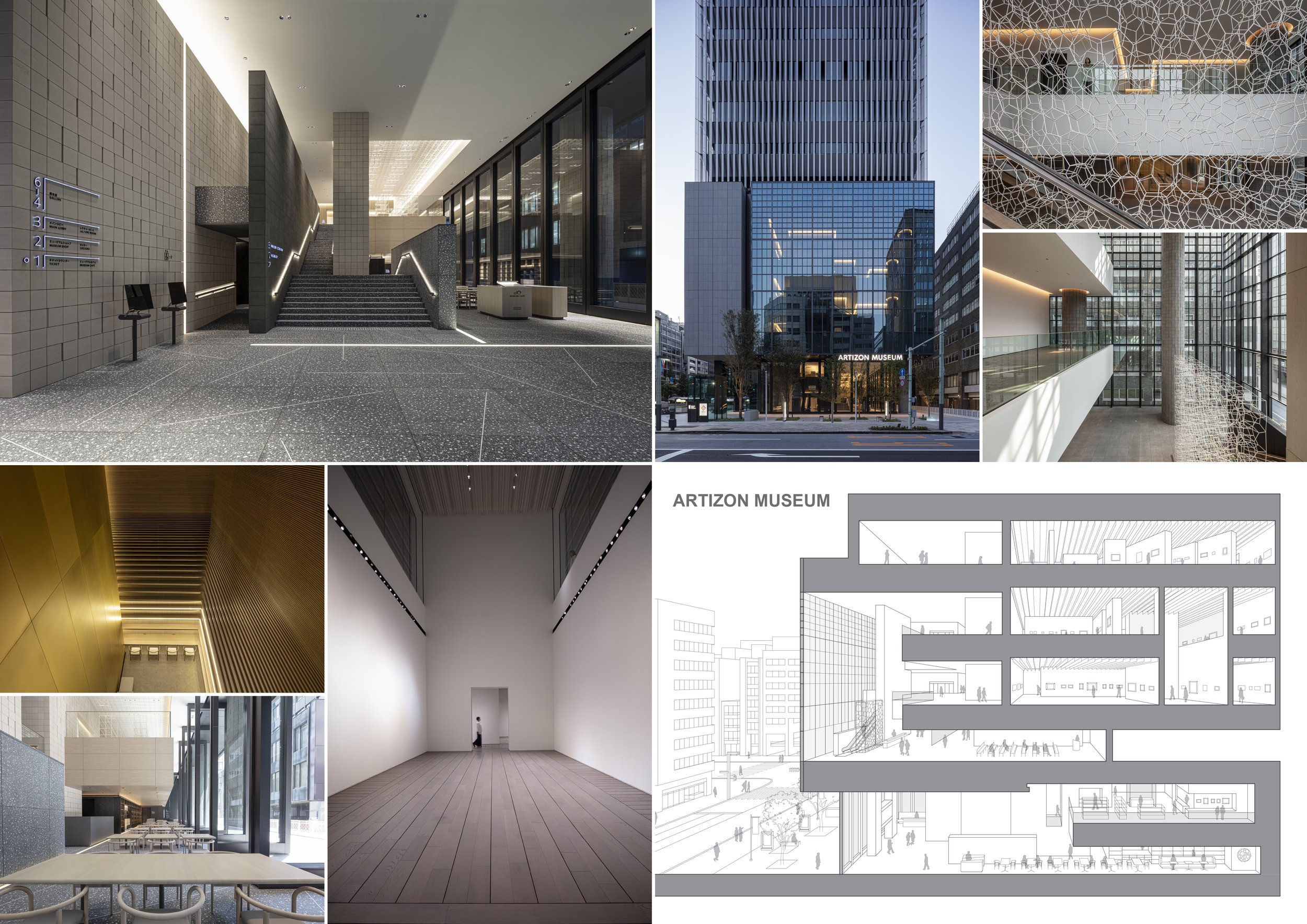
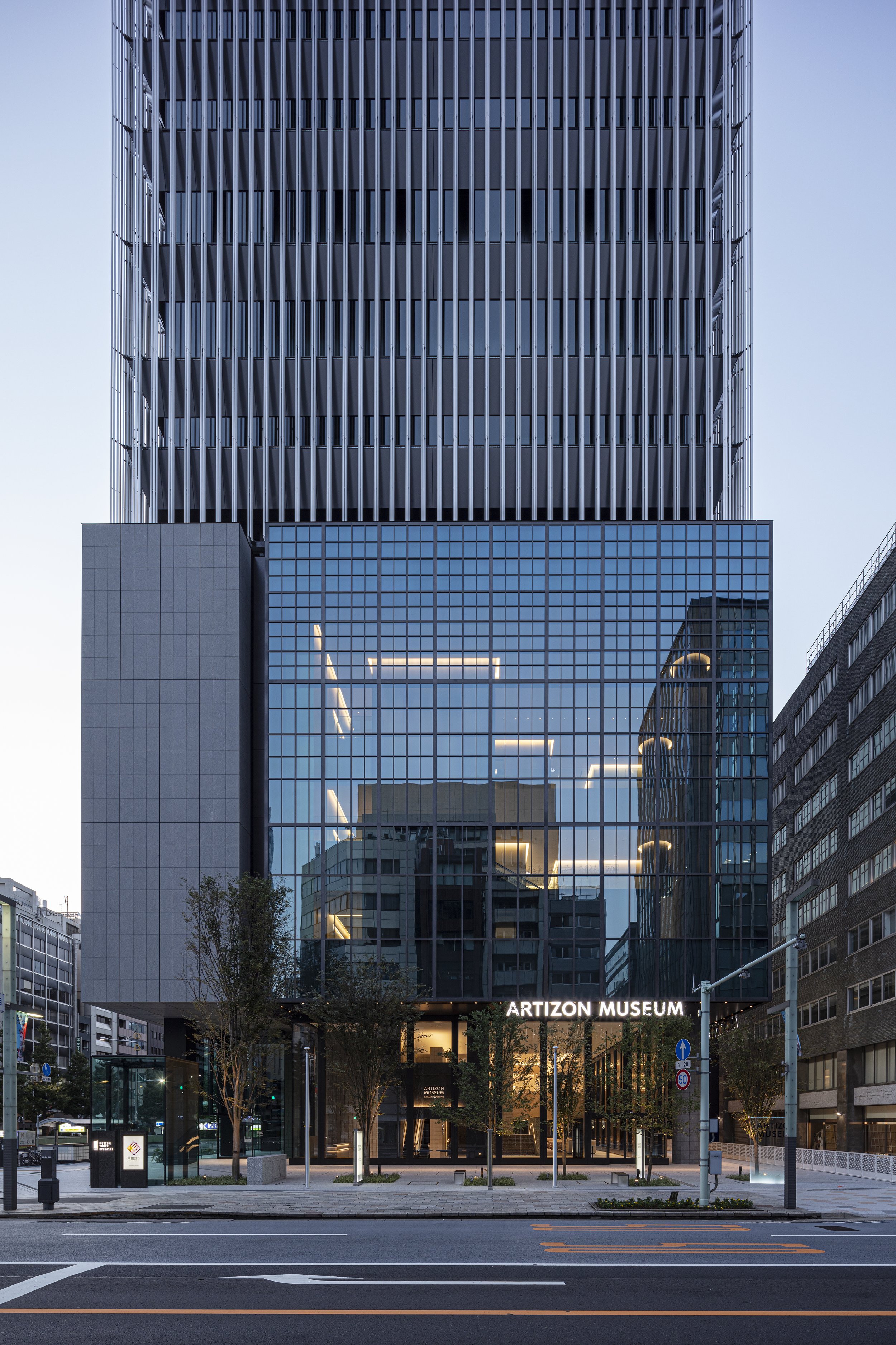
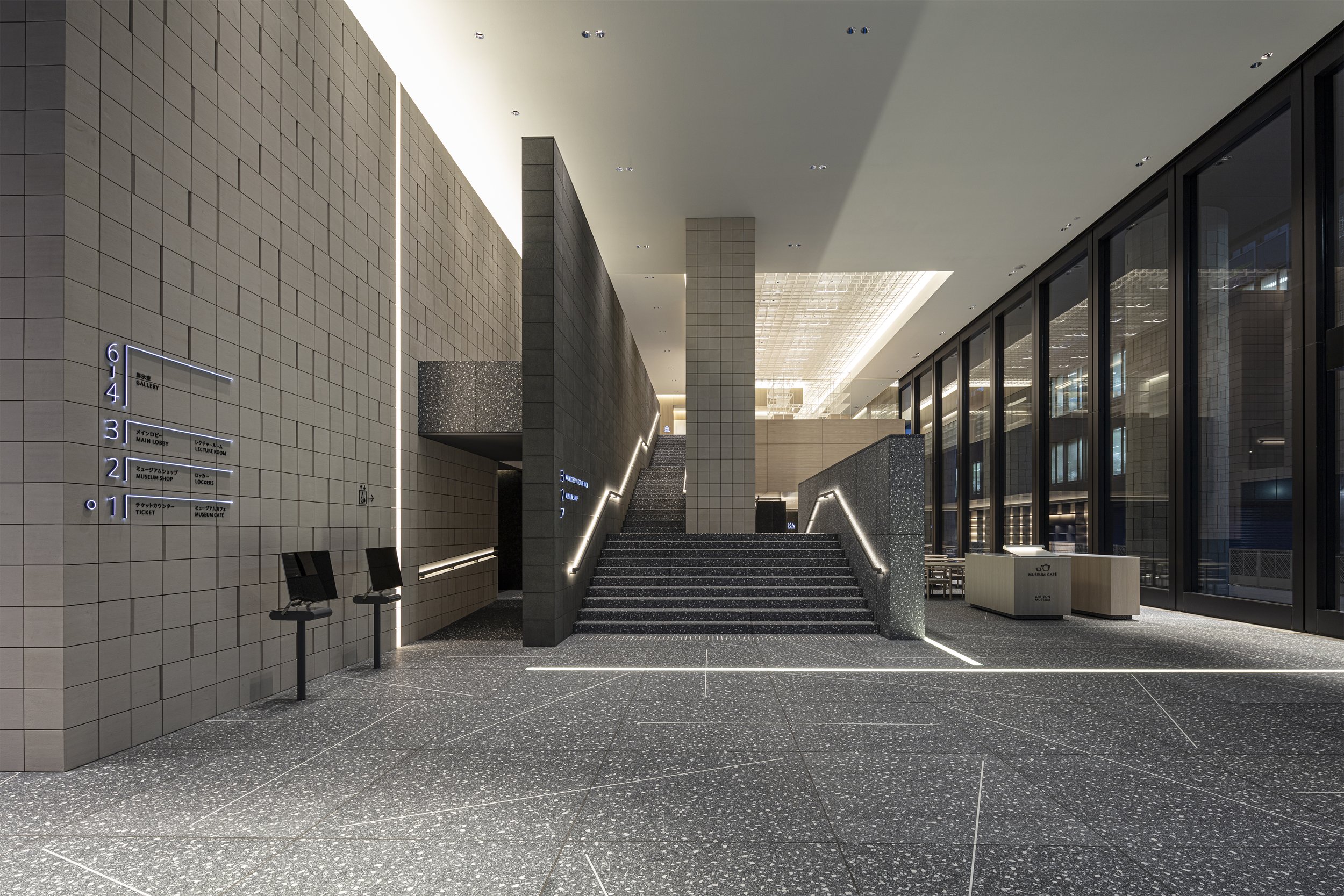
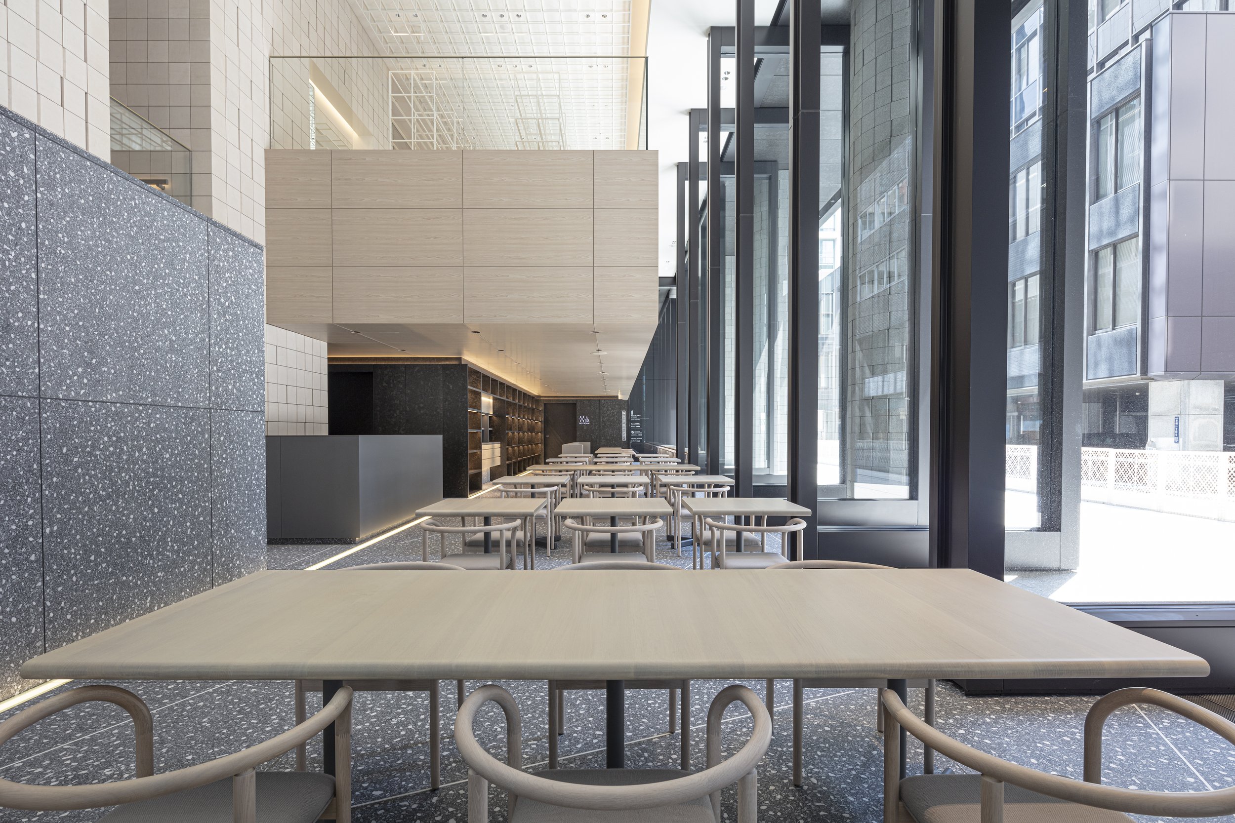
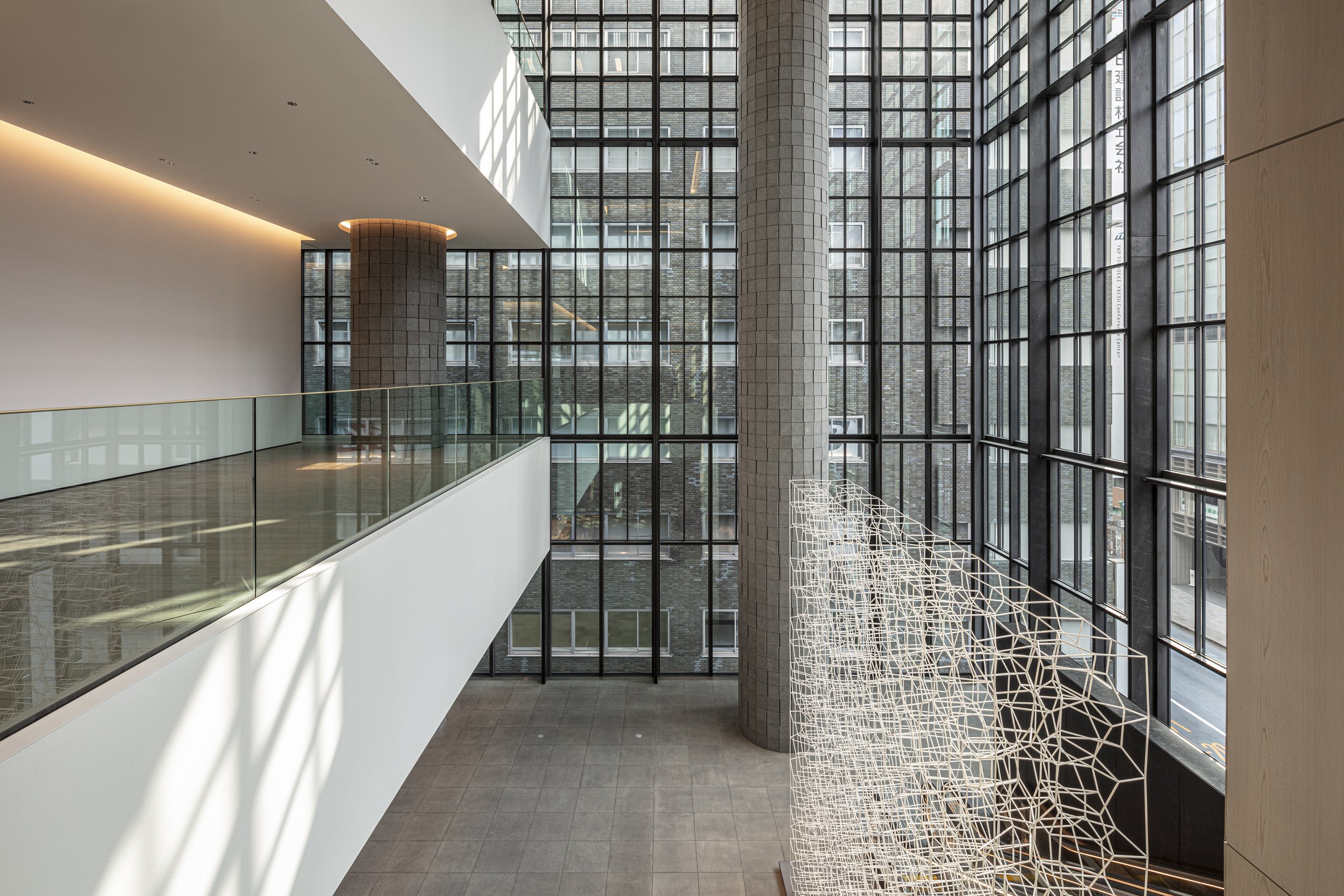
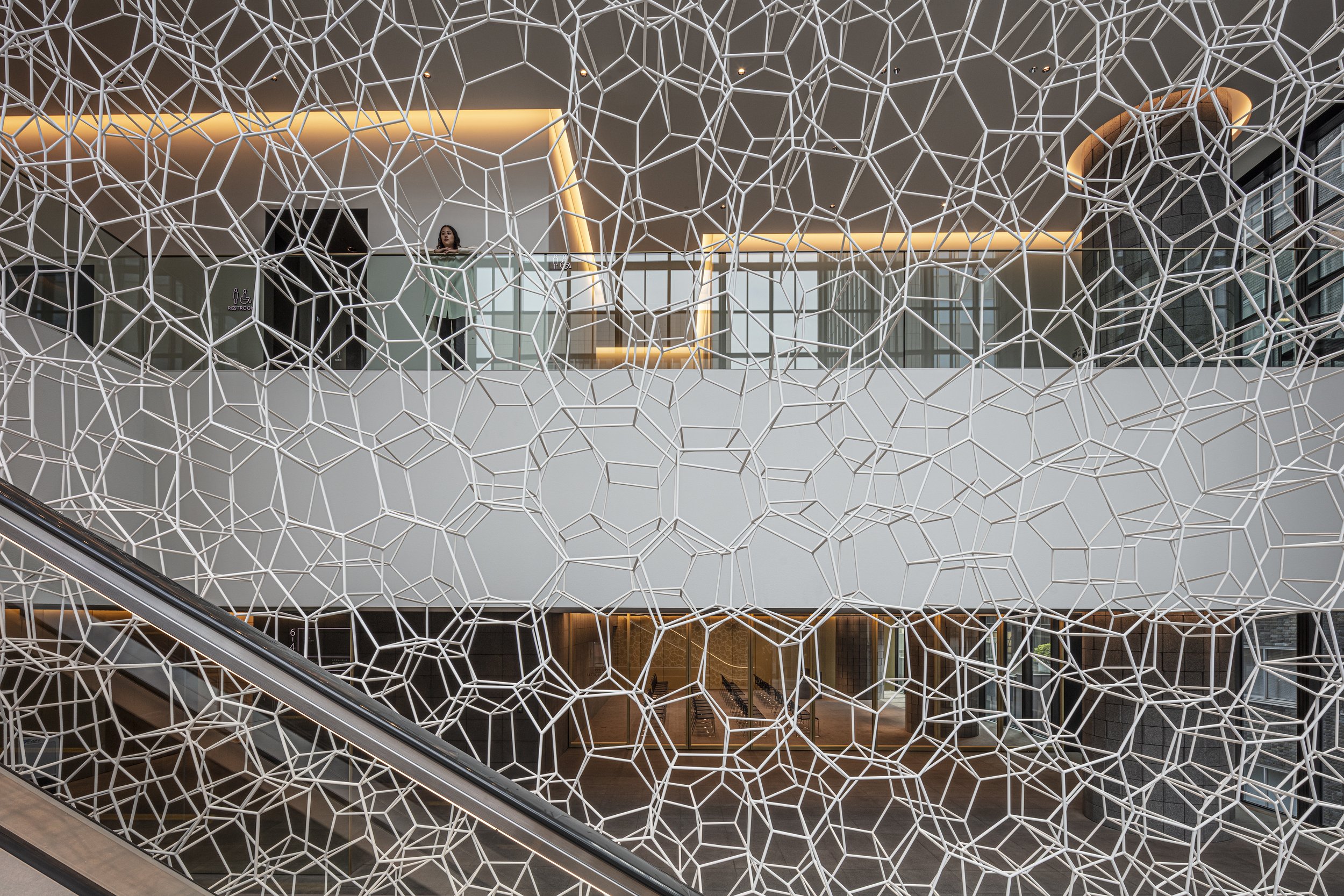
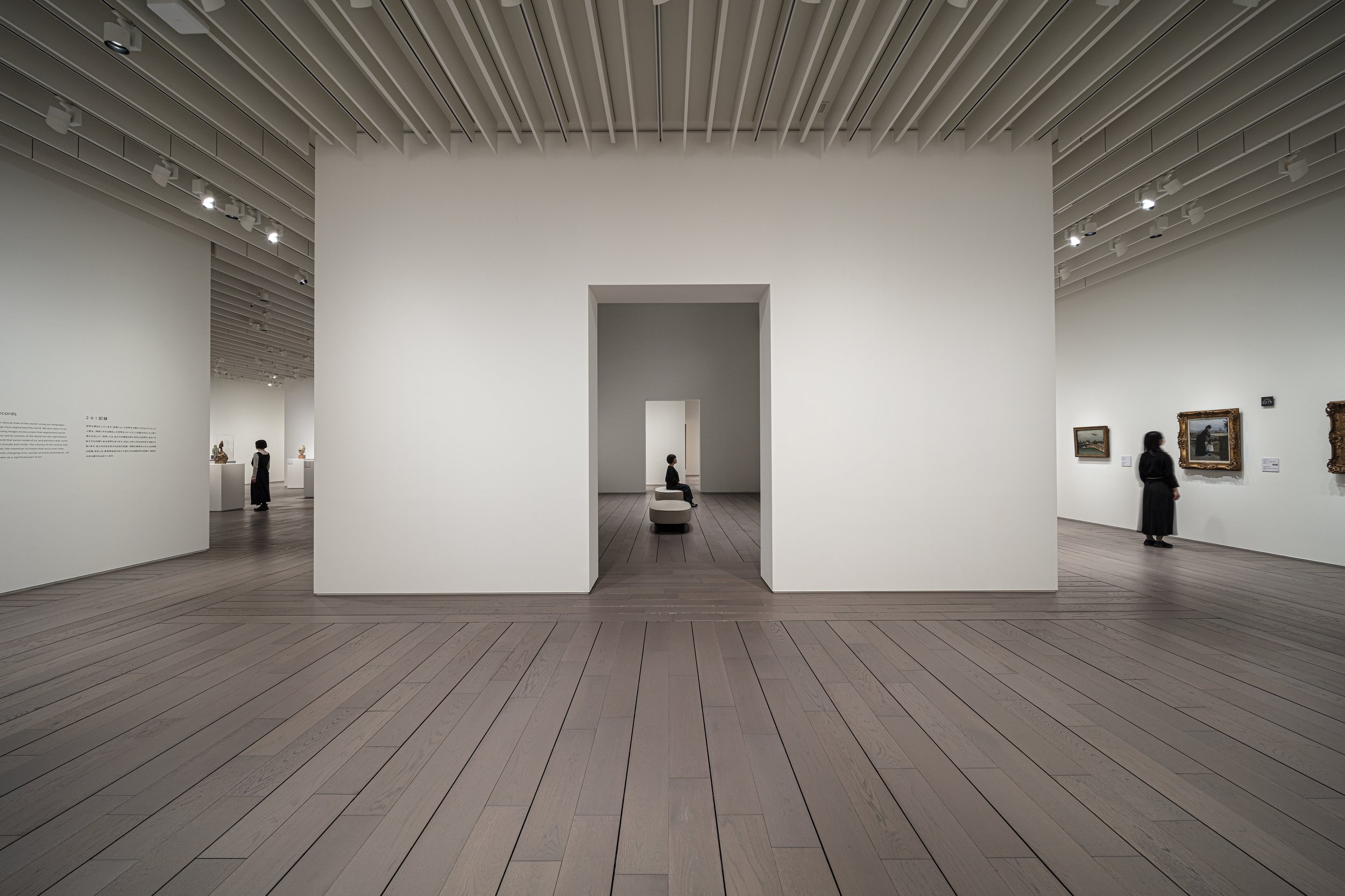
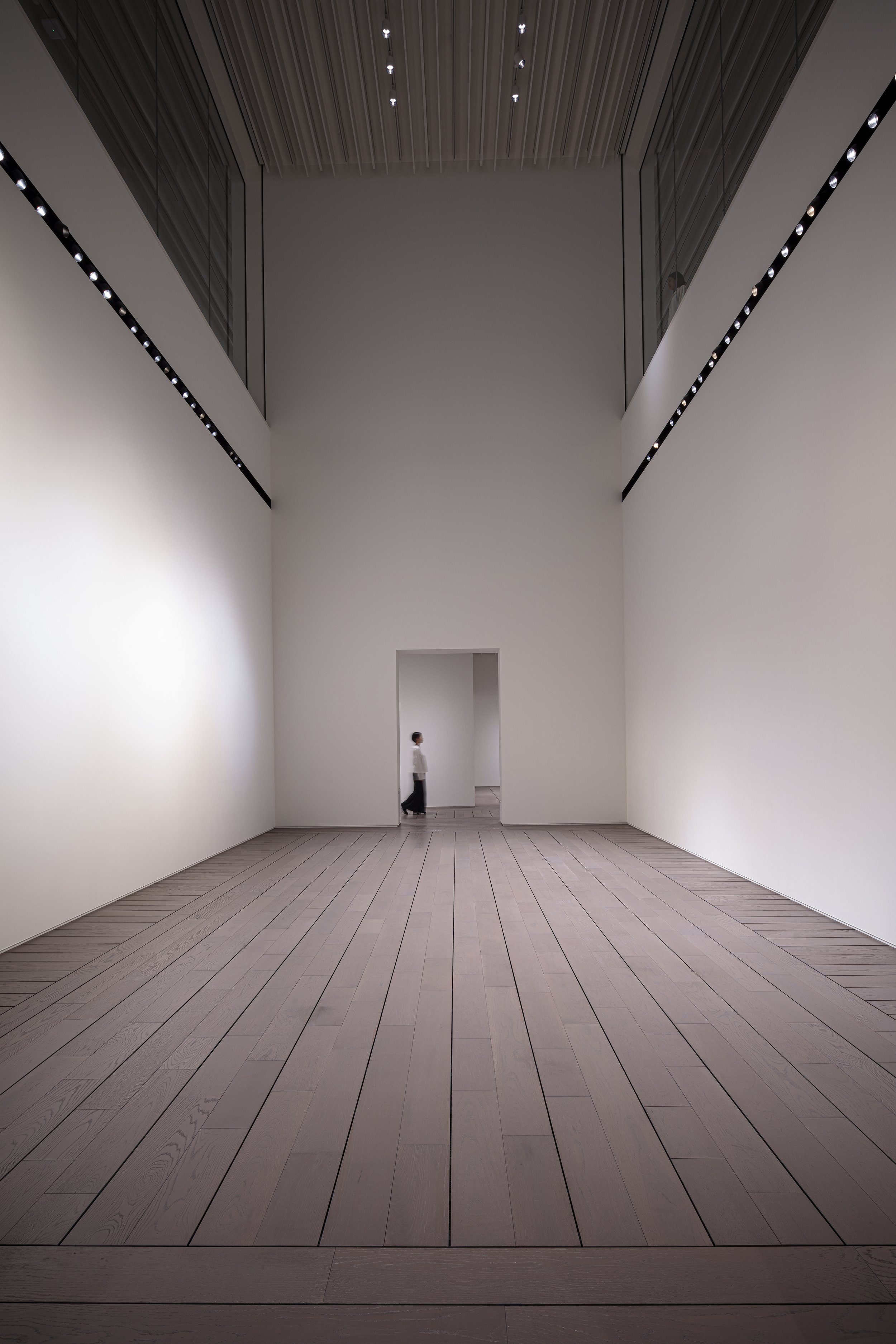
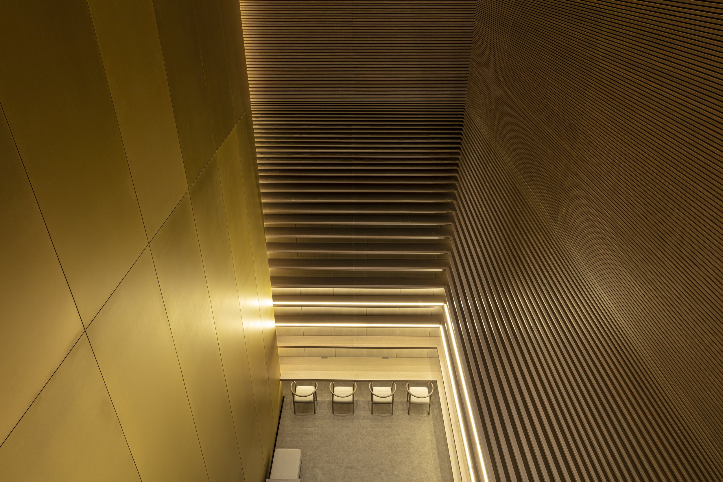
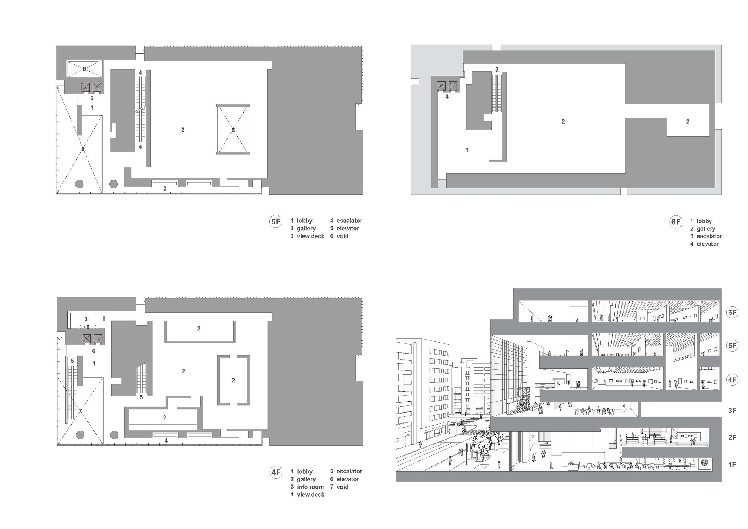
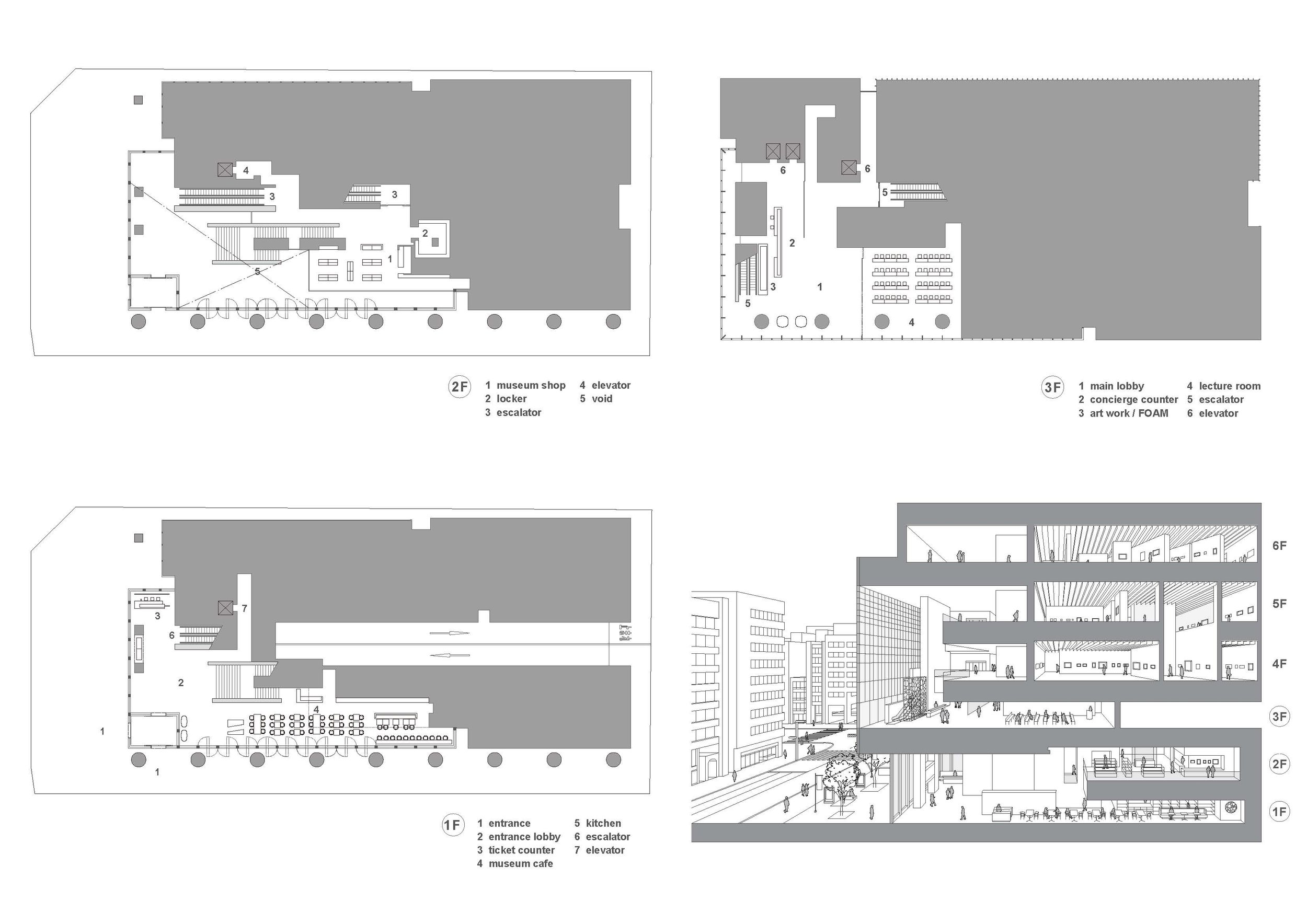
"Experiencing Creation" is the concept of the museum. Visitors can experience creativity in this space by seeing, sensing, and knowing the artworks and artists. By doing so, you can encourage them to explore various forms of creativity. It was necessary for it to embody a more intimate relationship with art that the outside of the museum would be accessible from within. Thus, the name "ARTIZON" is derived from the combination of the words "ART" and "HORIZON.". The inside of the museum must be visible from the outside to embody a more intimate relationship with art. Rather than complying with the basic principle that natural light should not be allowed inside the galleries, the idea of a visible space between the inside and outside of the enclosed space flies in the face of this fundamental principle. However, the objective was to produce a museum that would be both visually and sensually open to the city. In the Museum Tower Kyobashi, the first through sixth floors are dedicated to museums. On the three floors that make up the top floor, there will be exhibitions on display, while on the bottom floor, there will be public spaces, such as the entrance, a café, a shop, and a lecture hall.
Drawing/ Planning
Designer Profiles
TONERICO:INC.
Tokyo-based designers Hiroshi Yoneya, Ken Kimizuka, Yumi Masuko established their own studio TONERICO:INC. in 2002.
Imaise House - A high earthquake resistance residential in Japan
Japan is constantly affected by seismic and volcanic activity thanks to its location in the Circum-Pacific Mobile Belt. Despite covering just 0.25 percent of the earth's land area, Japan experiences 18.5% of the world's earthquakes. Geographically and physically, how the Japanese live and how they design safe living environments. For one of his clients, Tatsuya Kawamoto + Associates designed a high earthquake resistance residential building, which won the "New Black" Award in 2021.
Japan is constantly affected by seismic and volcanic activity thanks to its location in the Circum-Pacific Mobile Belt. Despite covering just 0.25 percent of the earth's land area, Japan experiences 18.5% of the world's earthquakes. Geographically and physically, how the Japanese live and how they design safe living environments. For one of his clients, Tatsuya Kawamoto + Associates designed a high earthquake resistance residential building, which won the "New Black" Award in 2021.
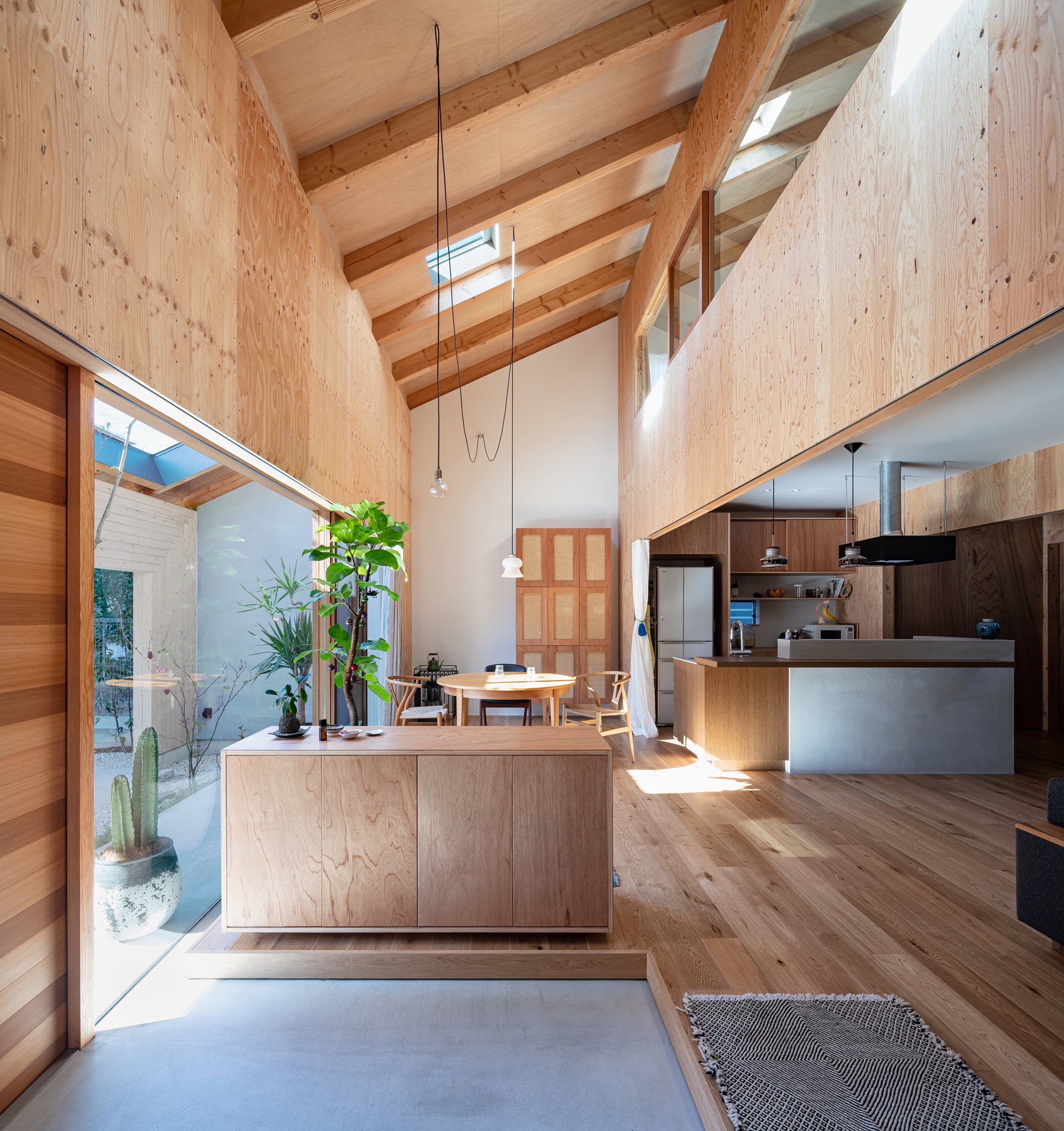
Generally, the main areas of a building need to be on the second floor since the structural walls needed on the first floor are reduced. The building should have "high earthquake resistance" as well as "open space."
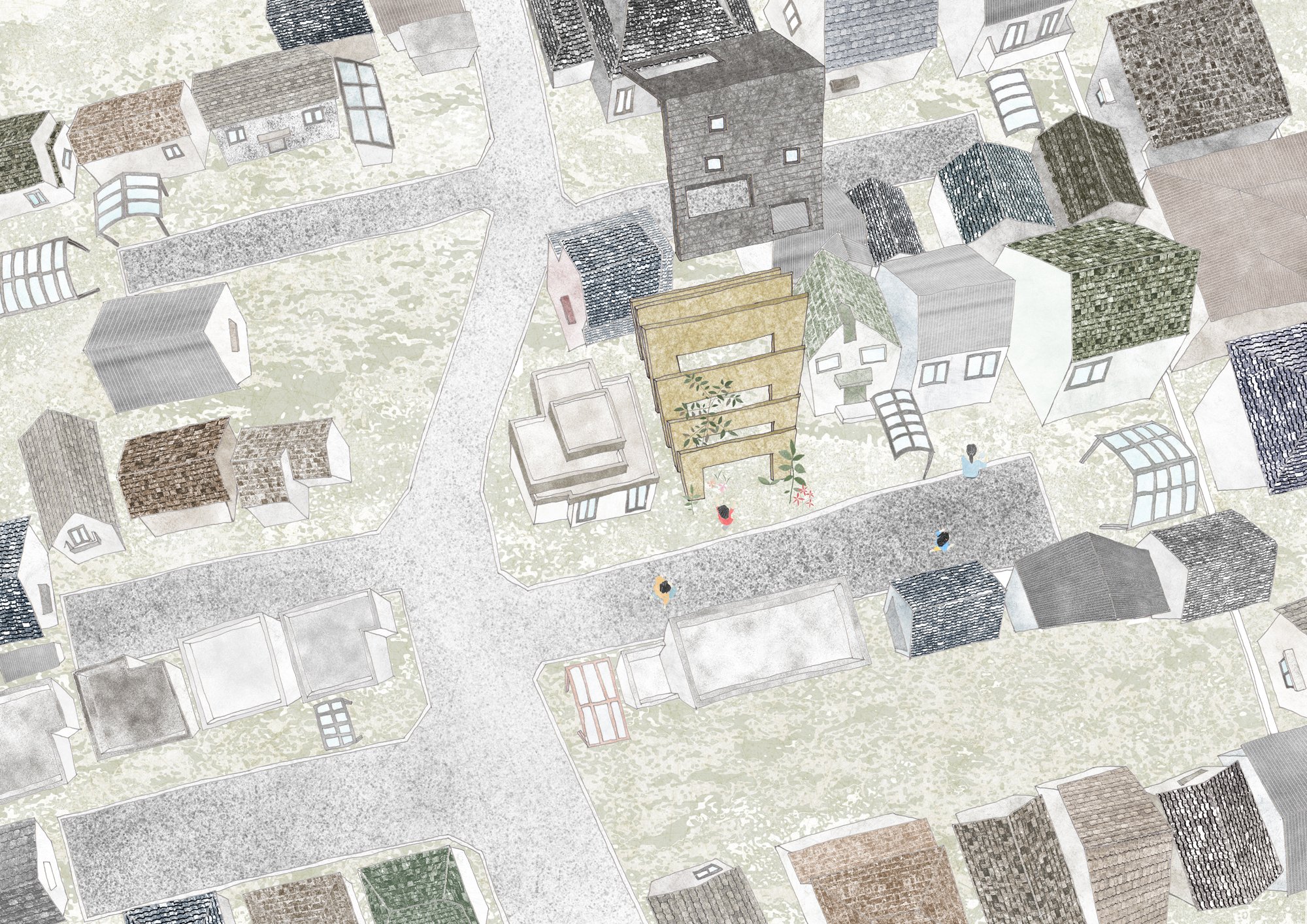
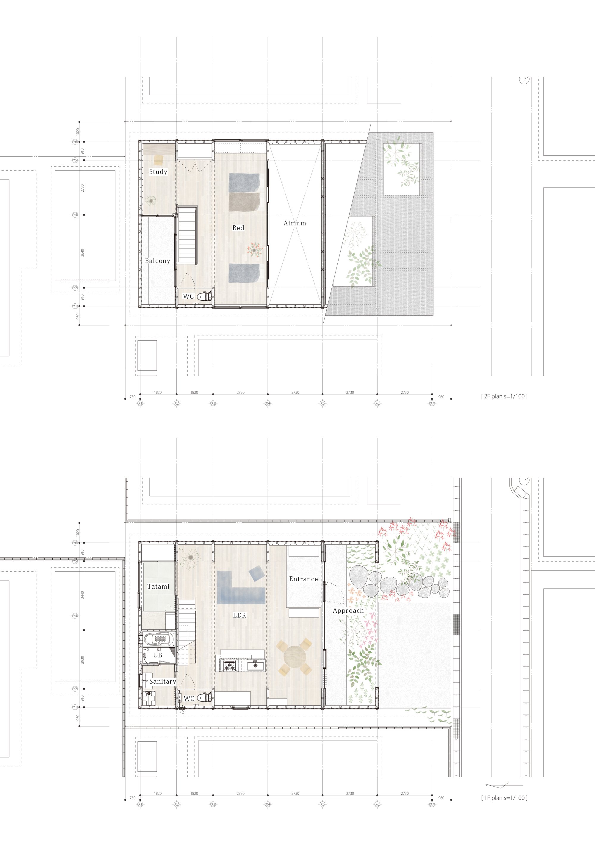
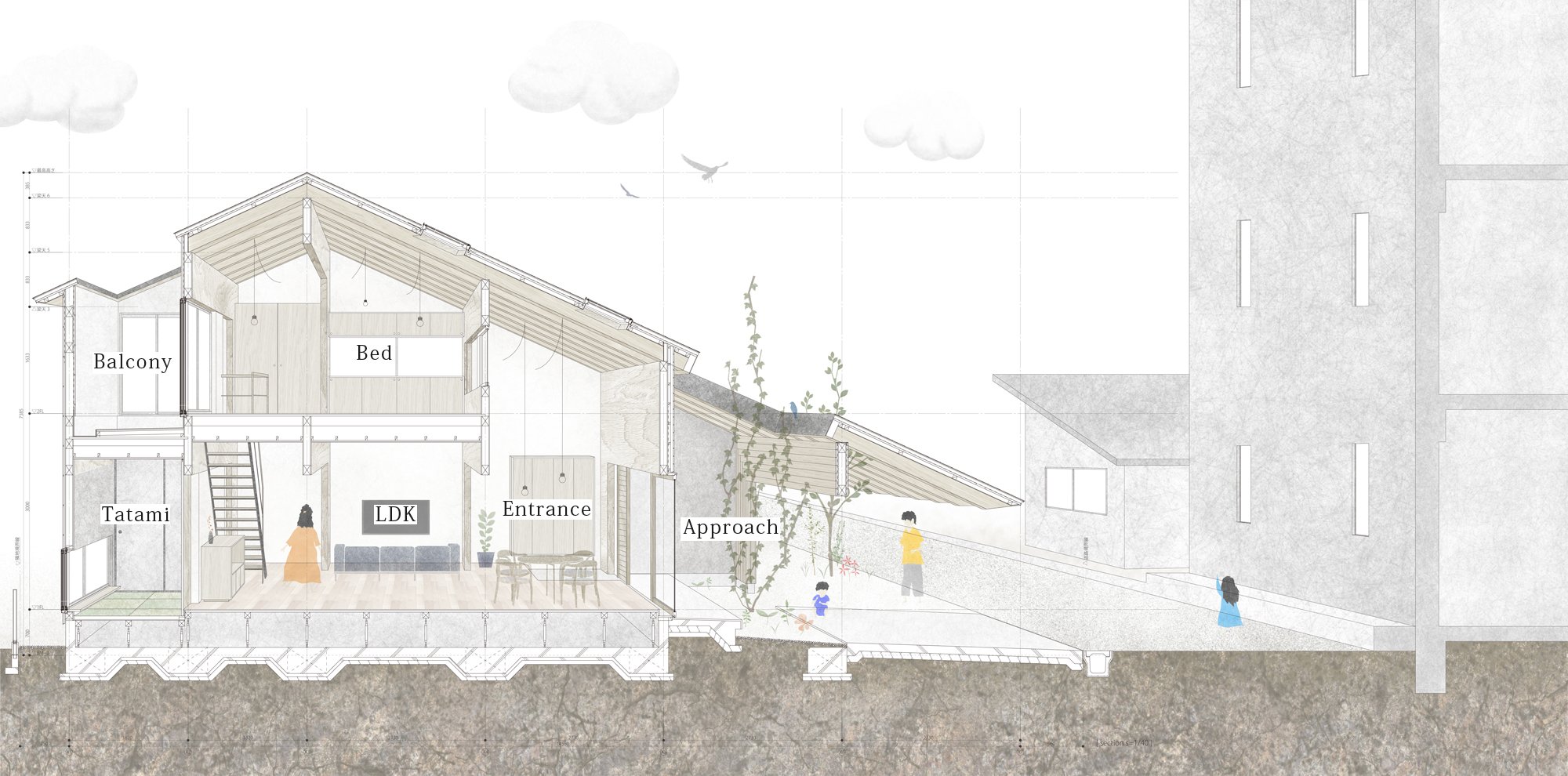
By taking into consideration the surrounding environment of a "private road," the front road is a private property, and planning a space in which the inside and the outside are seamless, the designer aims to achieve maximum spatial volume within the given constraints.
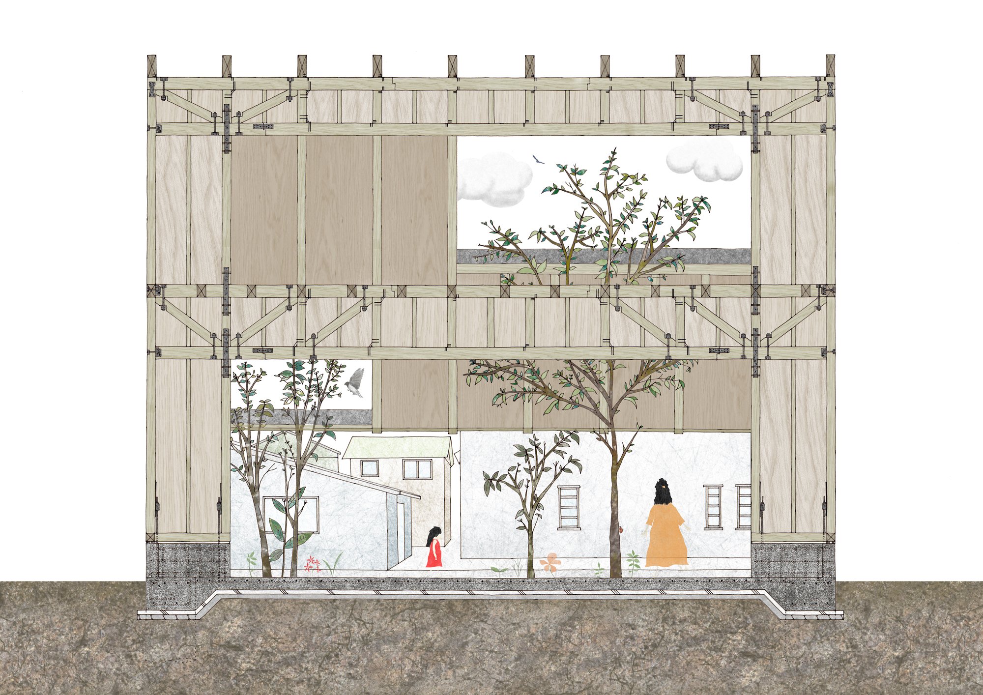
The building has a simple and clear configuration with only an 8.0m-wide "frame" that provides both earthquake resistance and a large opening.
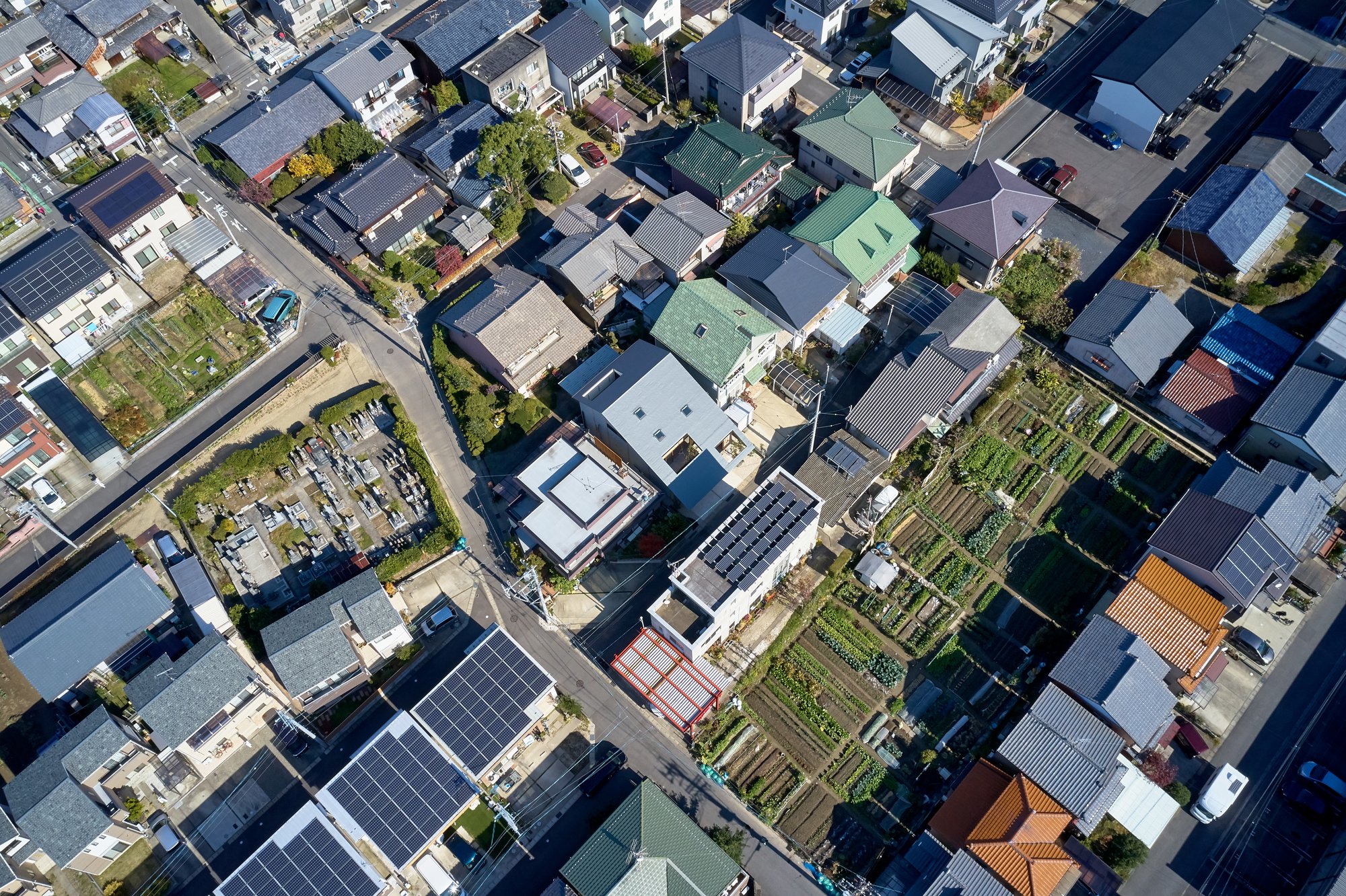
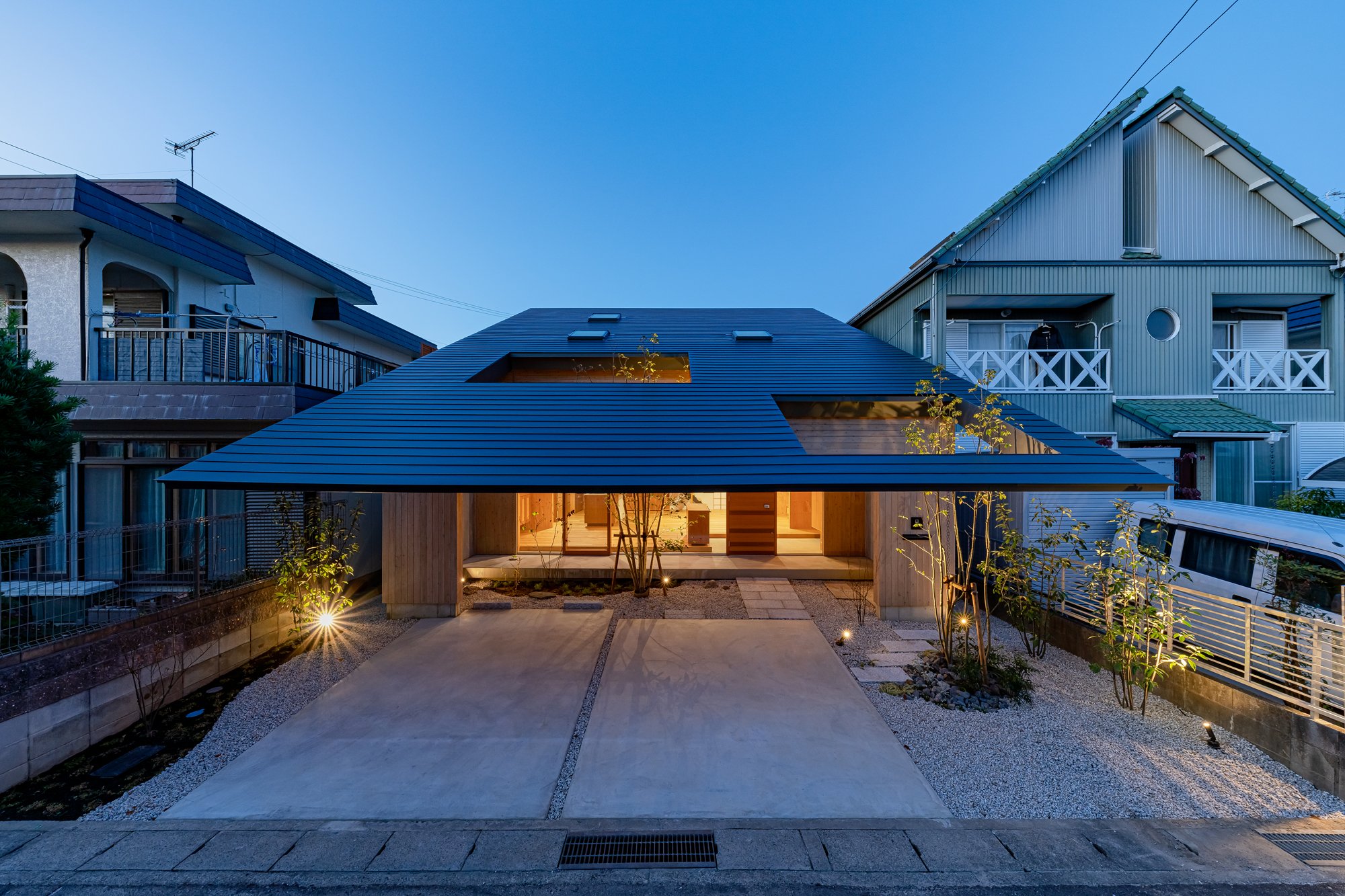
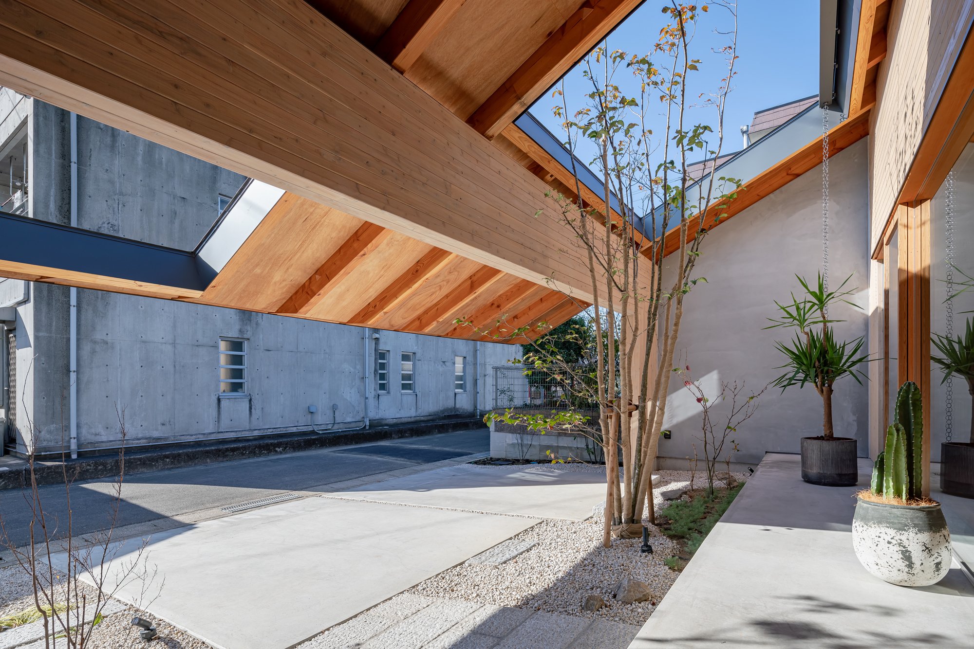
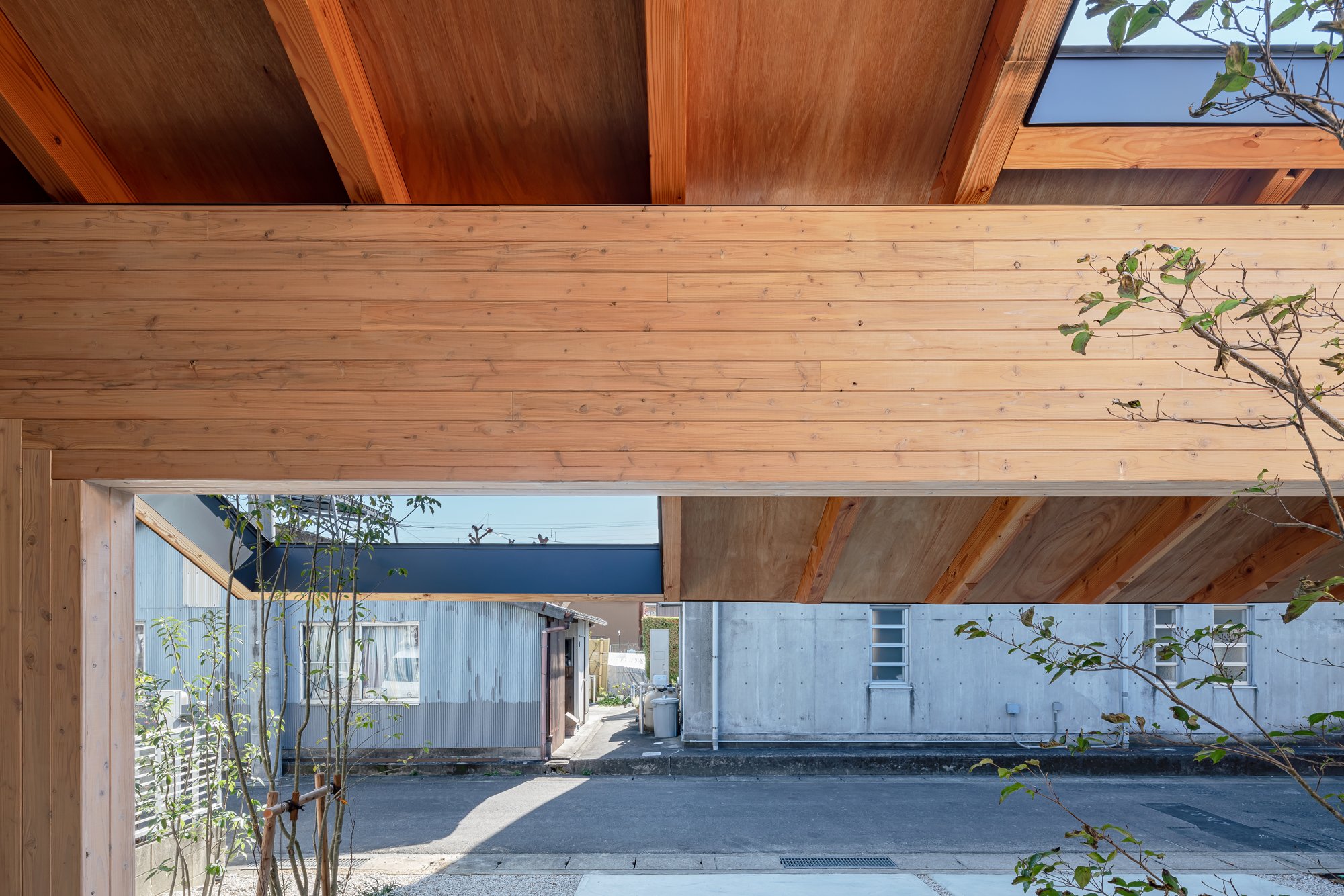
There was a unique community created around this "private road", which branched off the main road.
With the incorporation of local, unique characteristics that are different from each road into the living space, the designer thought it would be possible to contribute to regional development by establishing a favorable climate as a residential area for communities that could be made as a by-product of local industries.
A gate frame, in addition to its function as an earthquake-resistant element, also acts as a ruler that gives rhythm to the space by arranging at regular intervals and measuring the distance from the city, and by inserting rails into each frame, it can be private as desired.
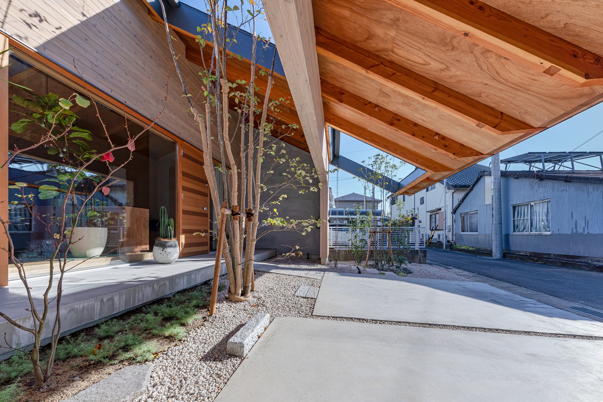
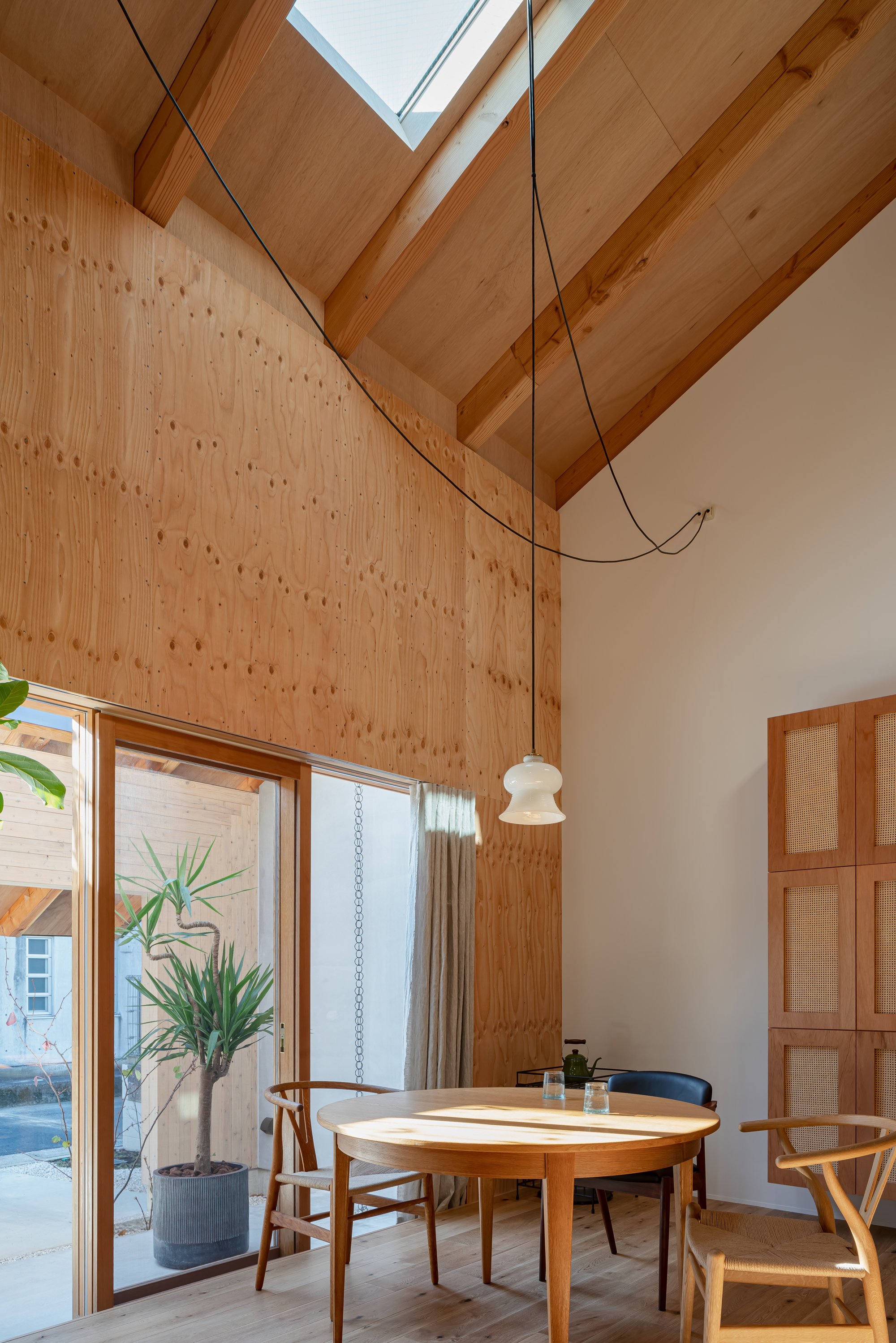
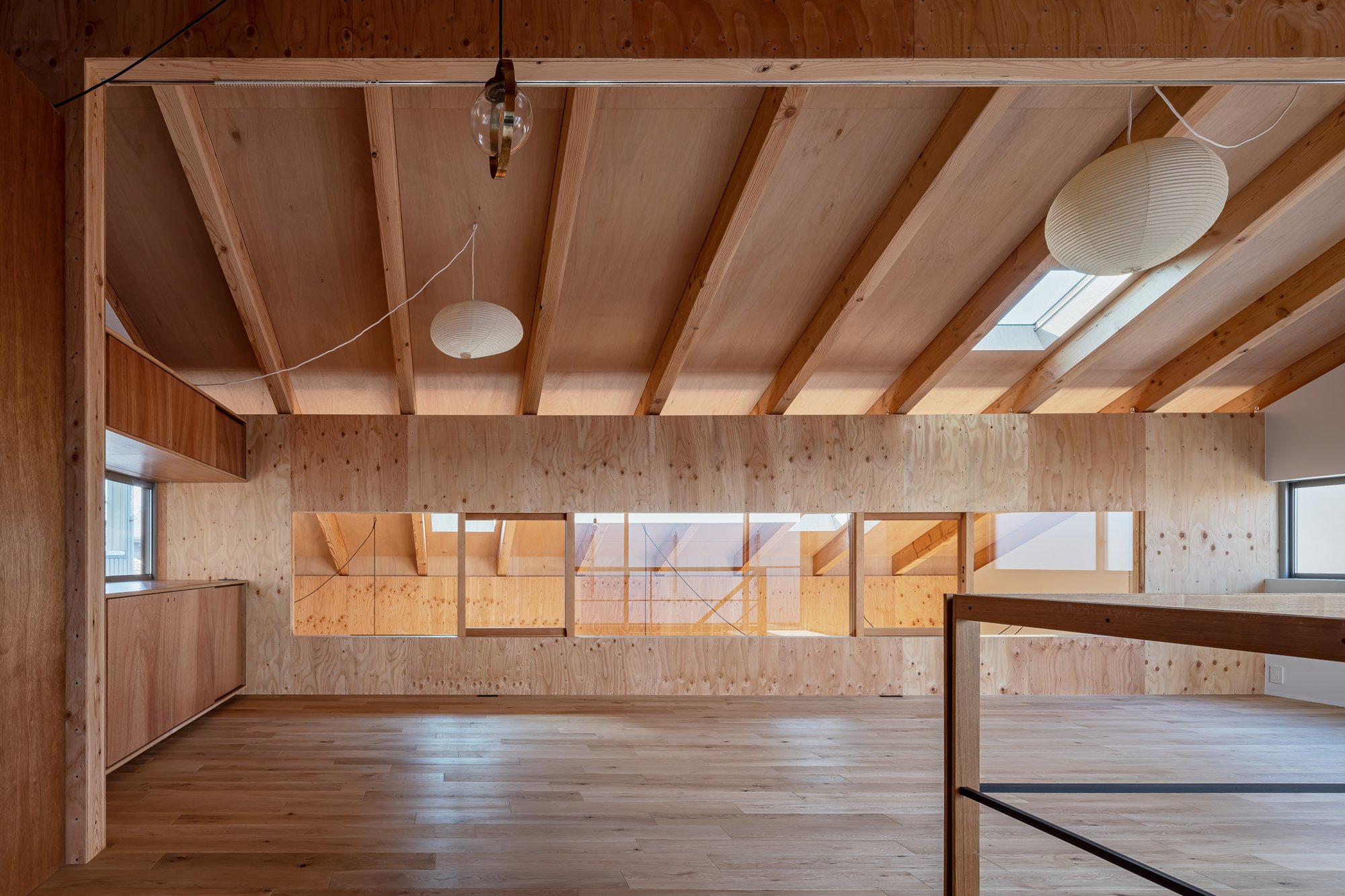
By extending the eaves across the front road side and creating a continuous external space, it is anticipated that the resident will gradually spread out under the roof while making the most of the small parcel.
Mr. Kawamoto said: "Due to the surrounding environment, which was moderately protected by chance, we were able to live in the nearby land and use the road as a living space."
Construction methods like this have taken root in this area. By mixing the resident's demand, the structure designed to solve the problem, and these, it is made.Imaise House
Architectural Overview
Location : Ichinomiya Aichi Japan
Completion : November 2020
Principal use : House
Structure : Timber structure
Site area : 168.38㎡
Building area : 99.12㎡

Designer Profile
Tatsuya Kawamoto
1990 Born in Aichi,Japan
2012 ~ worked at Takeshi Hosaka Architects
2013 ~ worked at Hiroyuki Shinozaki Architects
2018 ~ established Tatsuya Kawamoto + Associates
AWARDS
2011 2nd prize of Japan institute of architects tokai branch architectural design competition award 28th
2012 2nd prize of Graduation design review
2013 3rd prize of Japan institute of architects tokai branch architectural design competition award 30th
2015 Fine work of Nisshin kogyo architectural design competition 2015
2016 2nd prize of Circos international architecture competition 2016
2017 Honorable mentions of Shinkenchiku residential design 2017
2017 4th prize of CLT idea contest 2017 Awards
2011 2nd prize of Japan institute of architects tokai branch architectural design competition award 28th
2012 2nd prize of Graduation design review
2013 3rd prize of Japan institute of architects tokai branch architectural design competition award 30th
2015 Fine work of Nisshin kogyo architectural design competition 2015
2016 2nd prize of Circos international architecture competition
2017 Honorable mentions of Shinkenchiku residential design 2017
2017 4th prize of CLT idea contest 2017
For more information about Tatsuya Kawamoto + Associates, please visit:
*The New Black is a new award from www.skydesignawards.com designed to discover and recognise young architects and designers, or small projects such as pop-up, residential, or retail shops project sizes up to 50m2 (540 ft²).
*The New Black entrants must be either under 38 years of age OR the project submitted must be less than 50m2 (with no age limitation).
Kyushu Voice in Japan, Design by Jindesign Co., Ltd
In order to revitalize the economy and culture of Kyushu, Kyushu Voice aims to promote Kyushu products in Japan and around the world. As a home base for the project, this building fulfills three purposes, including serving as a new symbol of Kyushu's history and nature. It also serves as a shop selling a variety of products made in Kyushuin along with a workshop developed with local producers and citizens.
In order to revitalize the economy and culture of Kyushu, Kyushu Voice aims to promote Kyushu products in Japan and around the world. As a home base for the project, this building fulfills three purposes, including serving as a new symbol of Kyushu's history and nature. It also serves as a shop selling a variety of products made in Kyushuin along with a workshop developed with local producers and citizens.
Kyushu Voice's base is located in Dazaifu, the most suitable city for this project because of its history and popularity as a central city of Kyushu. From ancient times until the Heian period, Dazaifu was the imperial office in charge of Kyushu. There are around ten million tourists visiting this historical city every year, both from inside and outside the country.
At the core of this project, it is imperative to demonstrate modern Japanese architecture that incorporates tradition and innovation. As such, it was not necessary to construct a bespoke building, but rather to renovate an existing structure with a long history. Tokyotaka Aoki, principal architect of Jindesign Co., Ltd. from Japan, chose a wooden old folk house around 100 years old that was located on Kotoriishoji. It was 2 minutes away from Dazaifu Tenmangu shrine because of its condition and location.
Moreover, Mr. Aoki designed the building to display the latest Japanese architecture and function as a shop and a community center in the area.
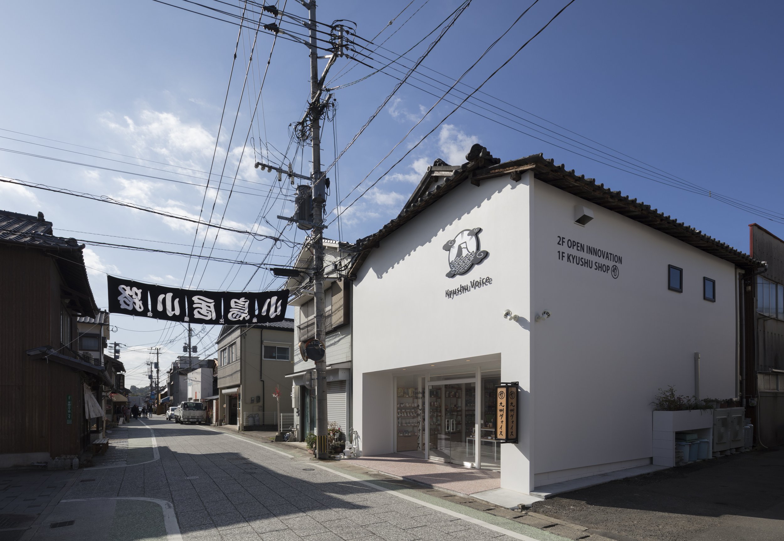
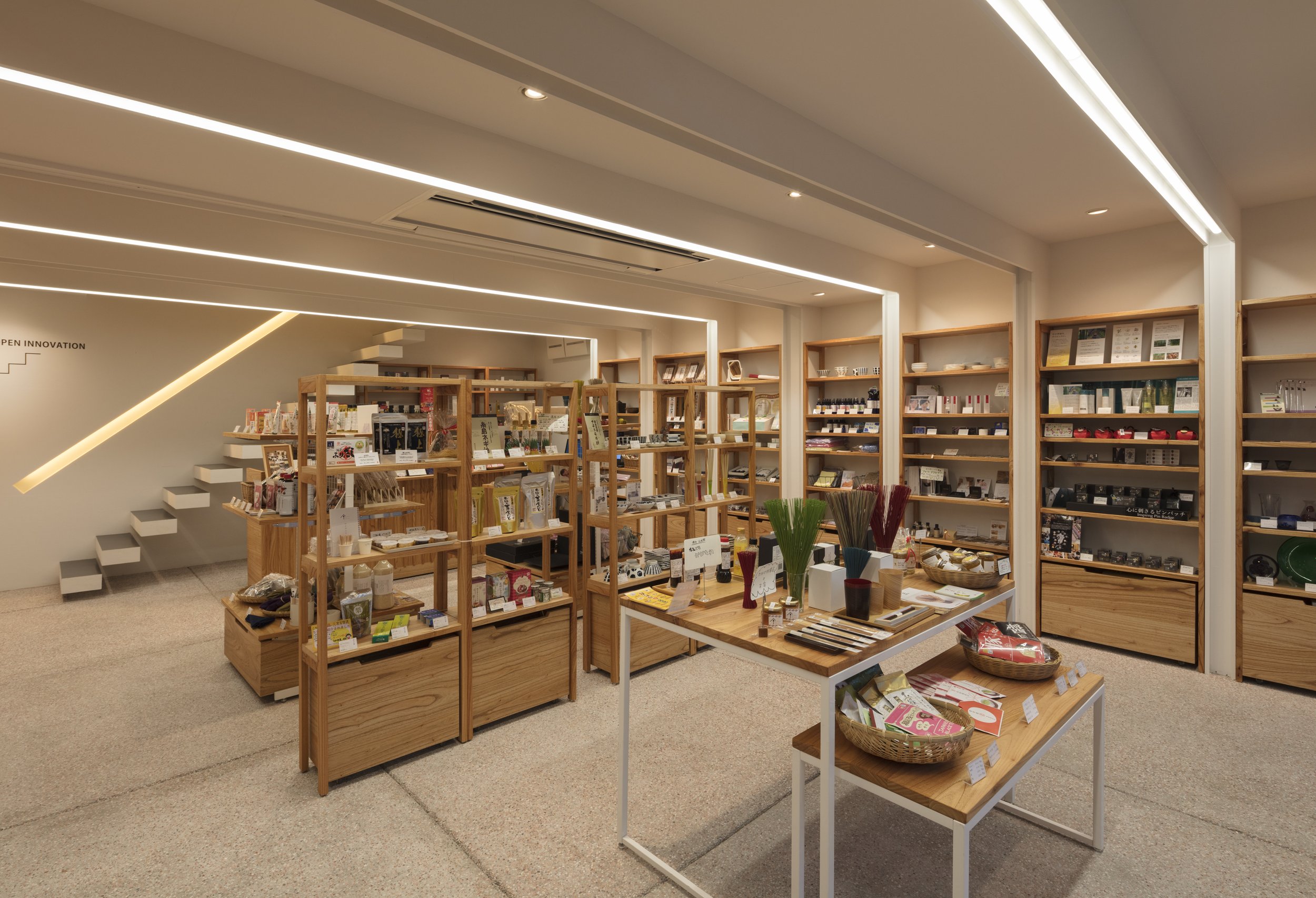
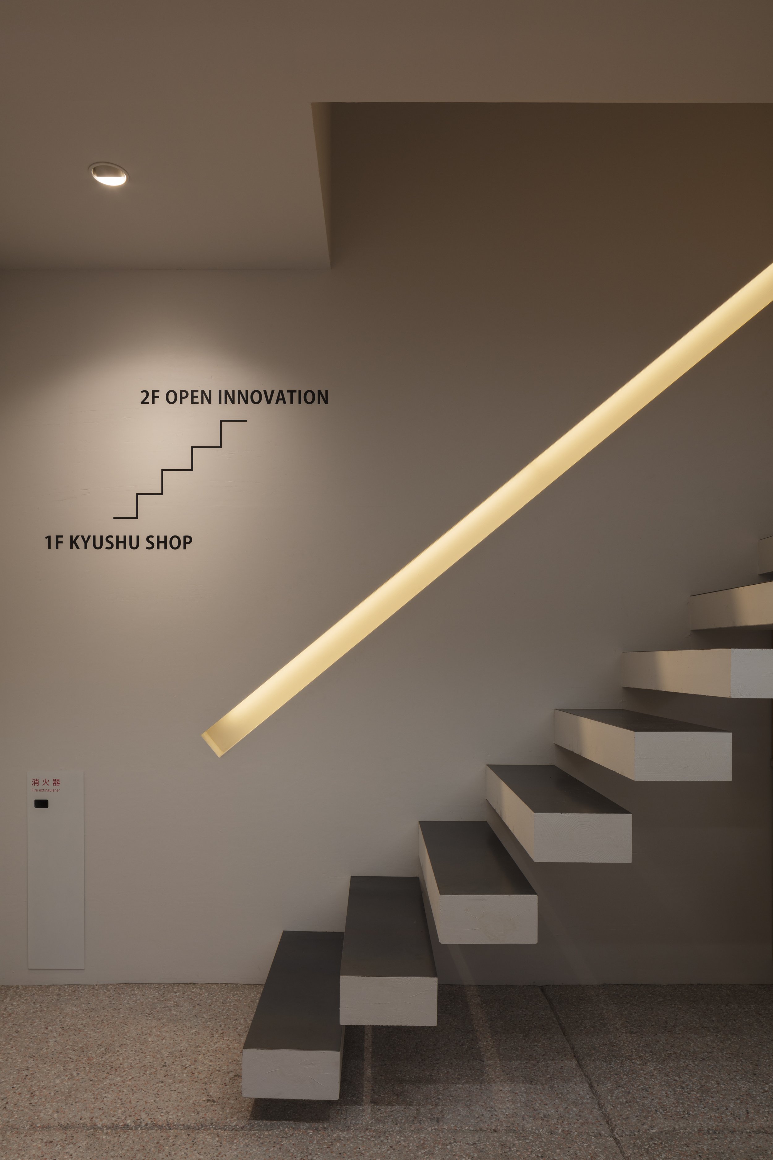
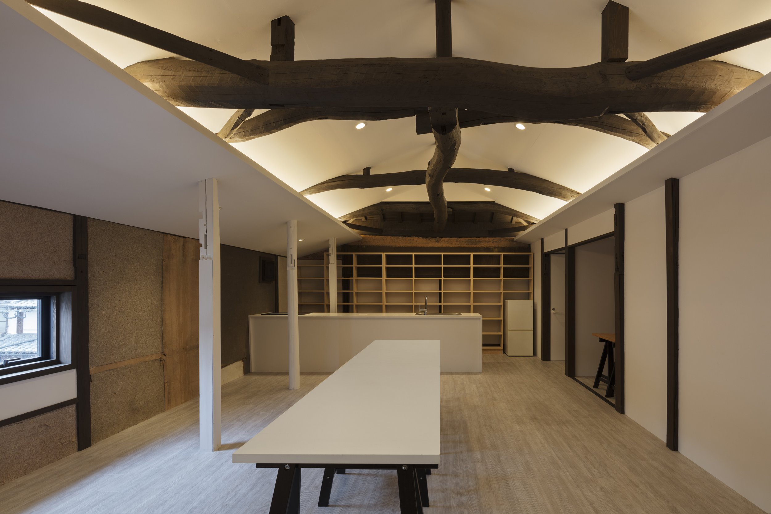
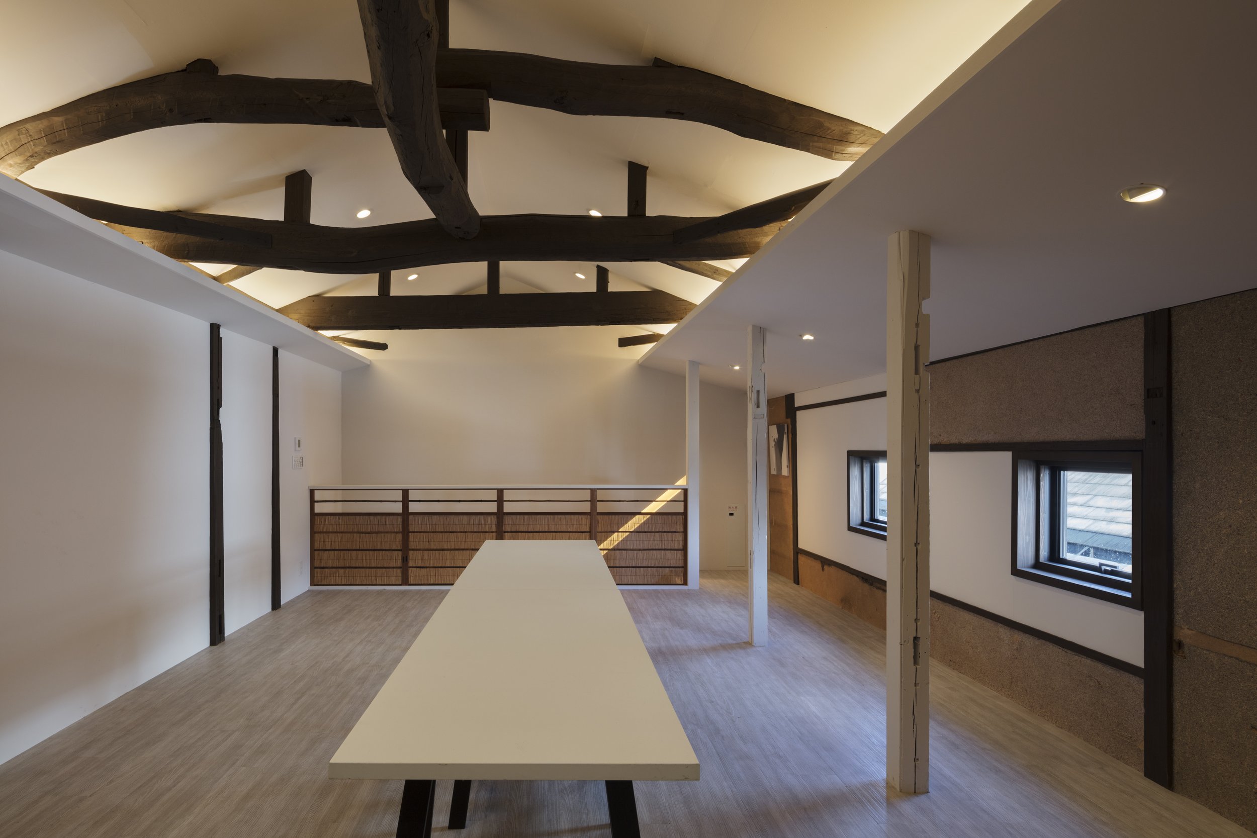
In keeping with the tradition of the building, the designer decided to conserve the tile roof. Aside from this, it is located along a tasteful street, so its façade needed to match the historic Dazaifu. To design its façade, Mr. Aoki drew inspiration from a traditional Japanese warehouse, "Kura". "Kura" has the character of a massive white wall of plaster, similar to the White Cube, an architectural element associated with Modernism. In addition, its traditional elements were applied to its façade design.
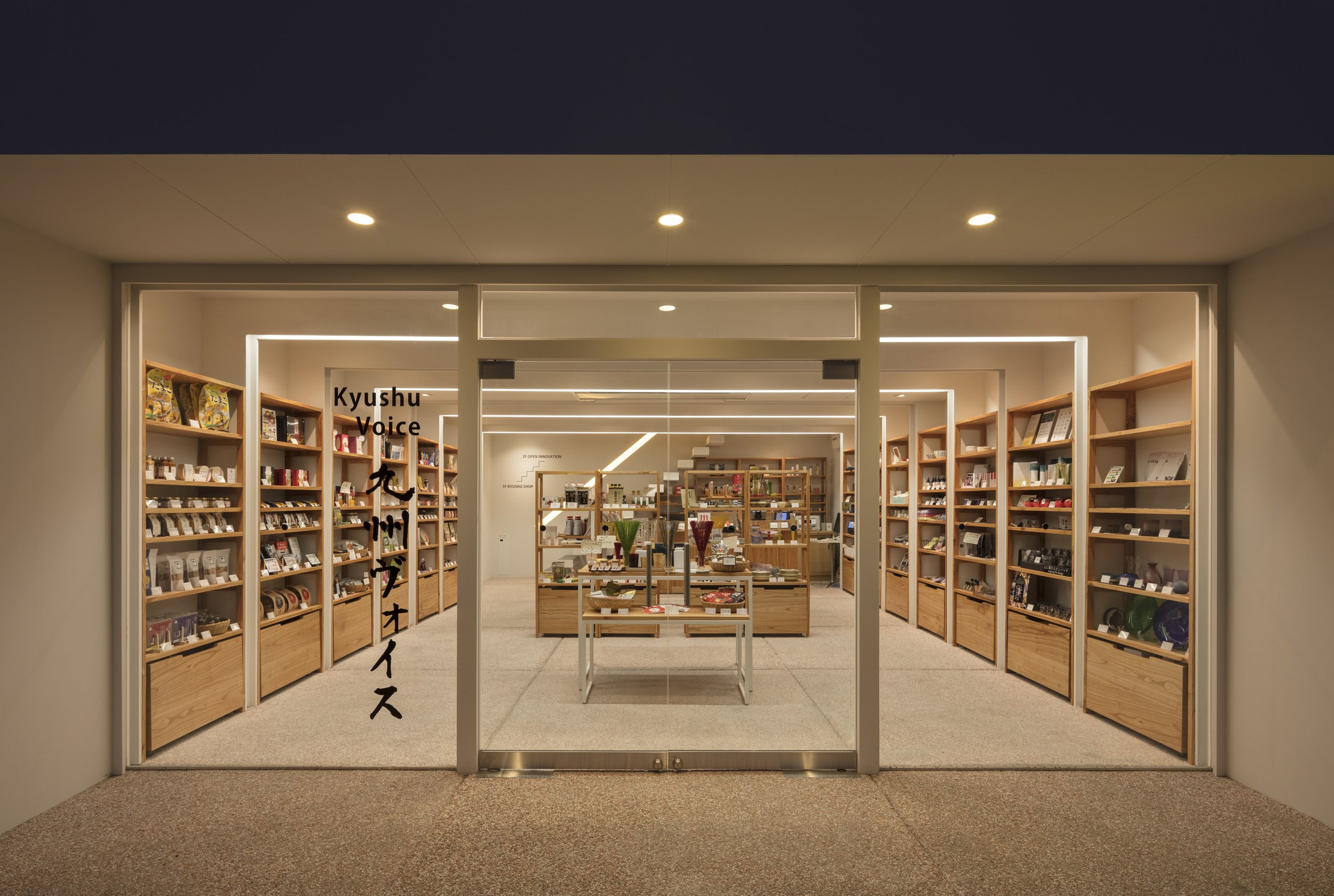
The designer further emphasized the modernist theme by inserting white volumes with a columnless open space, similar to the Kura pattern. A row of wooden frames shaped like gates was arranged in order to remind us of a shrine's main entrance. As a result of the construction and reinforcement of the 5.5m span columnless space, the lighting in the frames provided opportunities for people to enter.
"Kyushu Voice" is the silver winning project of Sky Design Awards 2022 in the "The New Black" architecture division,
*The New Black is a new award designed to discover and recognise young architects and designers, or small projects such as pop-up, residential, or retail shops with project sizes up to 50m2 (540 ft²).
*The New Black entrants must be either under 38 years of age OR the project submitted must be less than 50m2 (with no age limitation).
For more information about this project, please visit: https://www.jindesign.co.jp/ or visit the www.skydesignawards.com
R100 Tokyo promotes the cross-cultural aspects of Opus Arisugawa in Japan
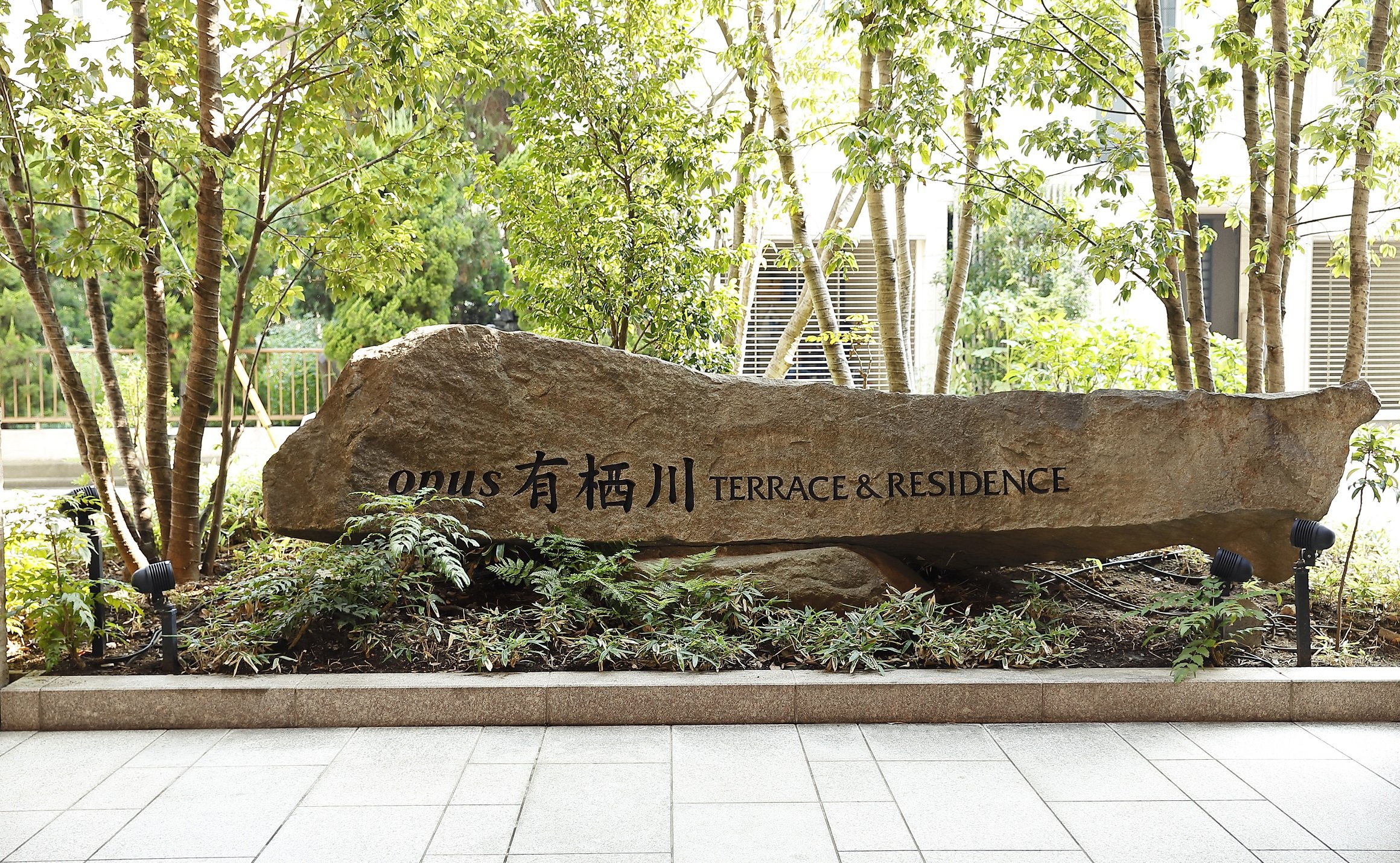
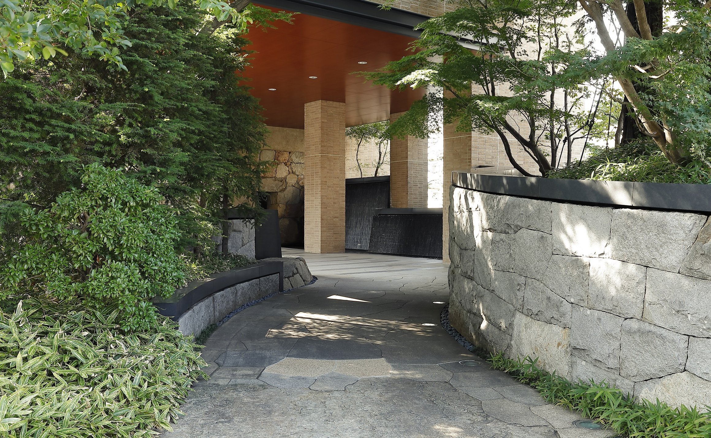
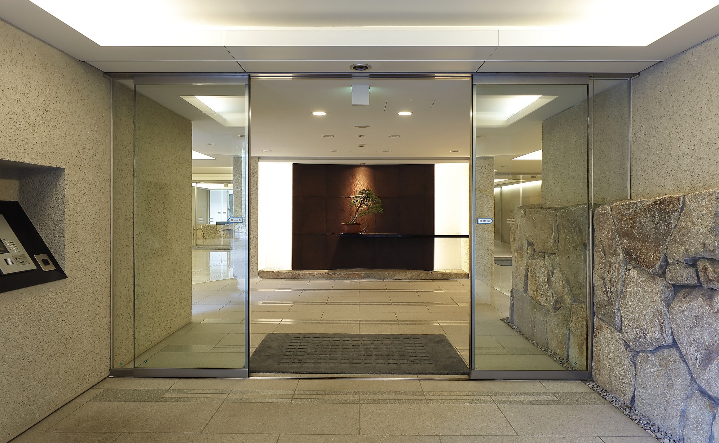
With the "R100 TOKYO" brand, Rebita offers essential living in a direct location in the heart of Tokyo with over 100 square meters of exclusive living space. This unit has been designed according to the concepts of "CROSS-CULTURAL" and "COMPELLING MINIMALISM", and OEO Studio, long inspired by Japan, has added a new proposal based on the sensibilities of Scandinavia and Japan.
Through collaboration with OEO studio, With the collaboration of OEO studios, R100 Tokyo promotes Opus Arisugawa's cross-cultural aspects in Japan
Over a 100 square-meter unit has been developed by Rebita Corporation in cooperation with NTT Urban Development Corporation (Head Office: Chiyoda-ku, Tokyo; President: Junichi Kawashima.), developed within Opus Arisugawa, a leading Tokyo condominium . The unit was designed by Copenhagen, Denmark-based OEO Studio as the first residential design available for sale.
Rebita is proud to announce that they have teamed up with the design firm, OEO studio, to create a new concept for living in Tokyo. This unit has been designed according to the concepts of "CROSS-CULTURAL" and "COMPELLING MINIMALISM", and OEO Studio, long inspired by Japan, has added a new proposal based on the sensibilities of Scandinavia and Japan.
The result is R100 TOKYO - a 100 square meter unit that provides essential living in a direct location in the heart of Tokyo through collaboration between two cultures. OEO Studio is a design company that specializes in creating products and spaces that are both compelling and minimalistic. The company's signature approach is to express a simple yet compelling narrative through the use of materials and subtle, precise details. Through this partnership, R100 hopes to promote cultural similarities between Scandinavia and Japan while observing Japan from a slightly different perspective.
About the Concept
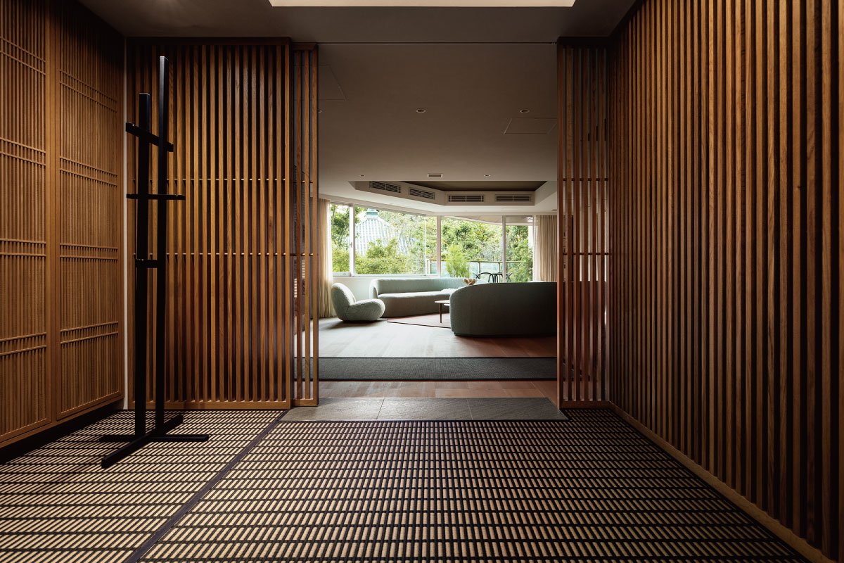
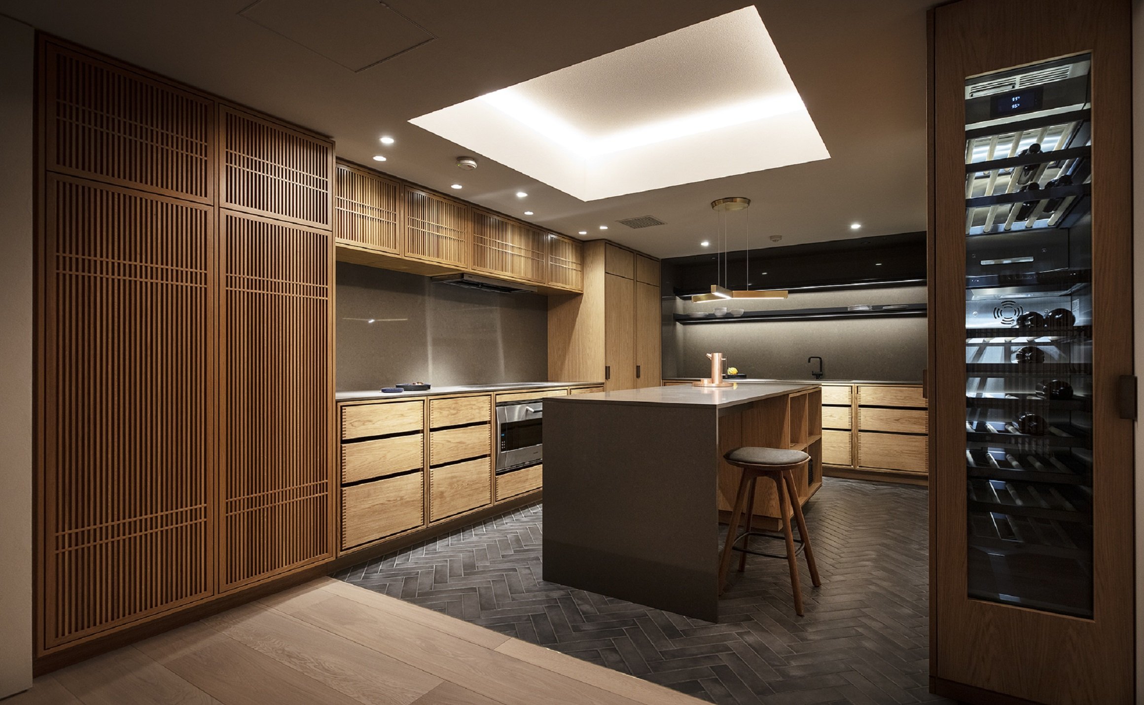
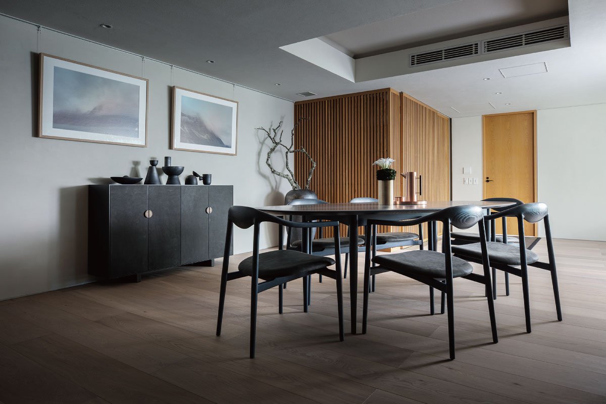
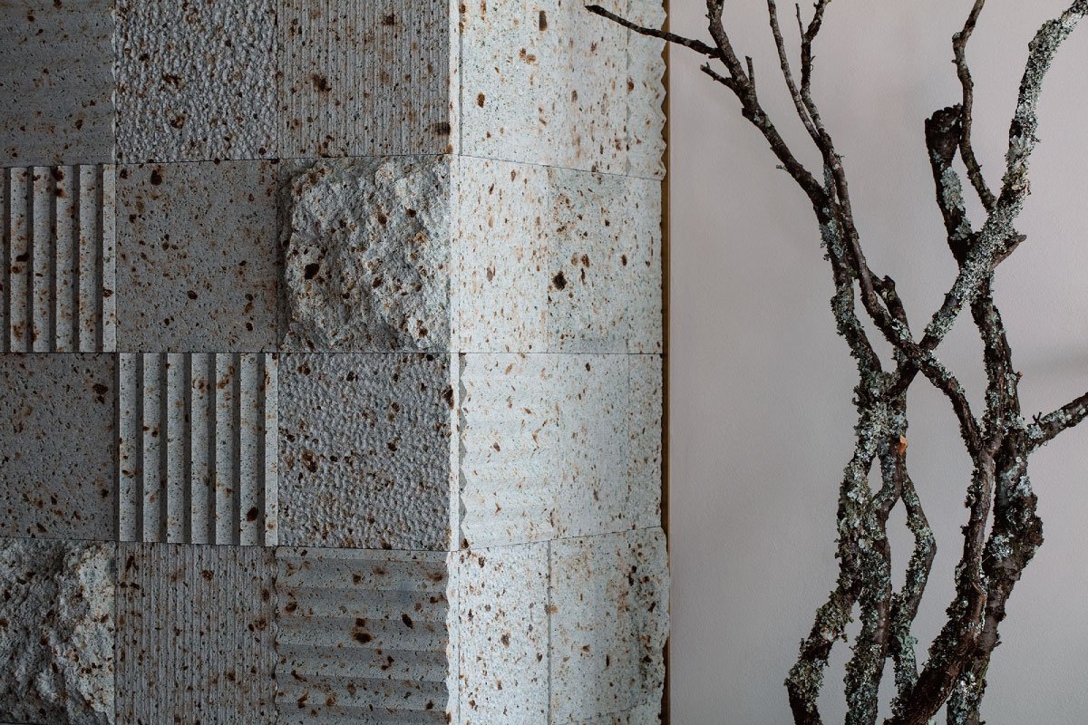
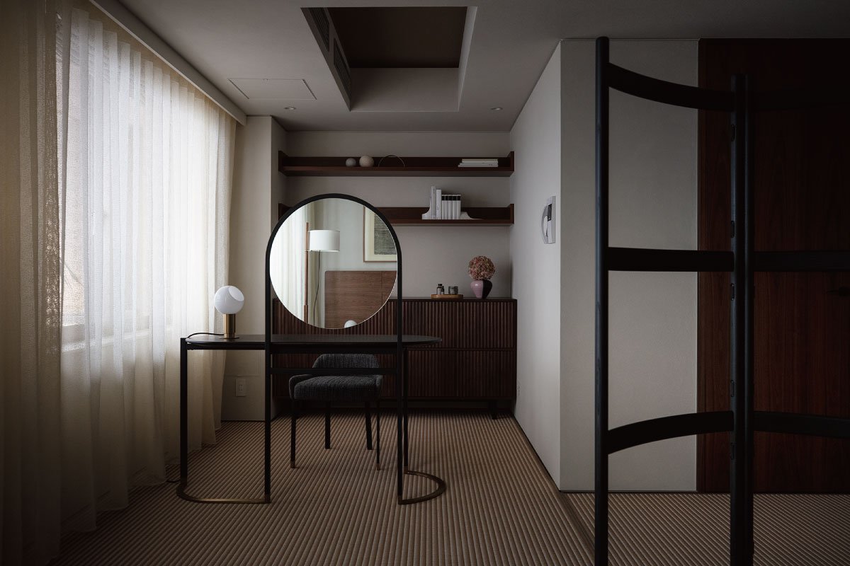
Above images: A variety of natural materials are used in the design of natural spaces
Scandinavian and Japanese cultures share a sense of natural materials, and the units draw extensively on natural elements. The oil finish is given to solid wood as much as possible so that it can change even more beautifully over time. Garde Hvalsøe (also written as Garde Vels), a Danish kitchen workshop, designed and constructed the large wooden kitchen, which is the first of its kind ever to be shown to the public. As it is used more and more, the solid wood will become a symbol of the residence because it is reminiscent of Danish cabinetry from the 1950s. With this property, you will be able to experience Scandinavian and Japanese cultures at the same time, and as you live there longer, the more blessings you will reap.
Background of Planning Recent growth in the urban luxury condominium market has occurred along with the emergence of a new group of buyers, including young entrepreneurs and executives, and there is a growing demand for homes that exceed traditional values such as real estate market prices and features of homes. Located in the heart of Tokyo's city center, R100 TOKYO from Rebita International offers one-of-a-kind residences designed by numerous architects and designers in order to provide "homes that look forward 100 years".
With the acquisition of Opus Arisugawa, a superior urban residence in terms of both location and specifications, we aim to offer a one-of-a-kind residence that will maximally express what R100 TOKYO wishes to offer, which led us to design this residence.
Japanese people have respected nature for thousands of years, taking in the surrounding scenery and sunlight, blending it with materials that make up their homes, and experiencing the changes and beauty of the four seasons each day. With their fusion, Japanese culture and Scandinavian values would enhance and sublimate each other. The design of this unit is a collaboration between R100 Tokyo and OEO Studio, a Danish architectural firm with deep cultural knowledge of Japanese design and culture, with the goal of creating a "cross-cultural" design based on Japanese culture.
Please visit: https://r100tokyo.com/sales/akasaka-aoyama-azabu/opus3rdflooroeostudio/ for more information
Or stay tuned with our Upcoming new publication of “One Story” for the story of R100 Tokyo.
OEO Studio has designed interiors, furniture, and products around the world, in addition to a number of projects in Japan, including the Kaikado Cafe, a collaboration with a Kyoto craftsman, as well as the interior design for the INUA restaurant in Tokyo.
Left: Thomas Lykke, Head of Design & Founding Partner at OEO Studio
Right: Anne-Marie Buemann, Managing Partner at OEO Studio
Apartment with Six Void in Fudomae, Japan
A city with a dense population in Japan has many small houses and apartments. Fudomaw's apartment with six voids was designed by Akira Koyama from Key Operations Inc. This project won the bronze award in the architecture category in the 2021 Sky Design Awards.
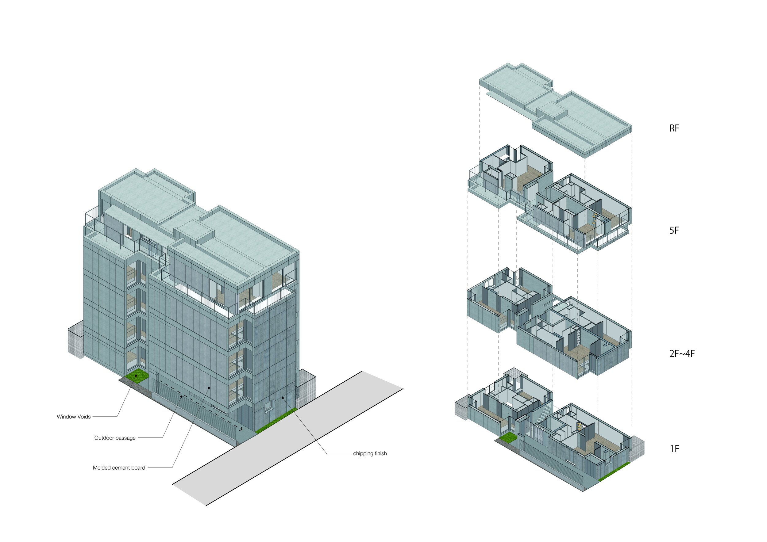
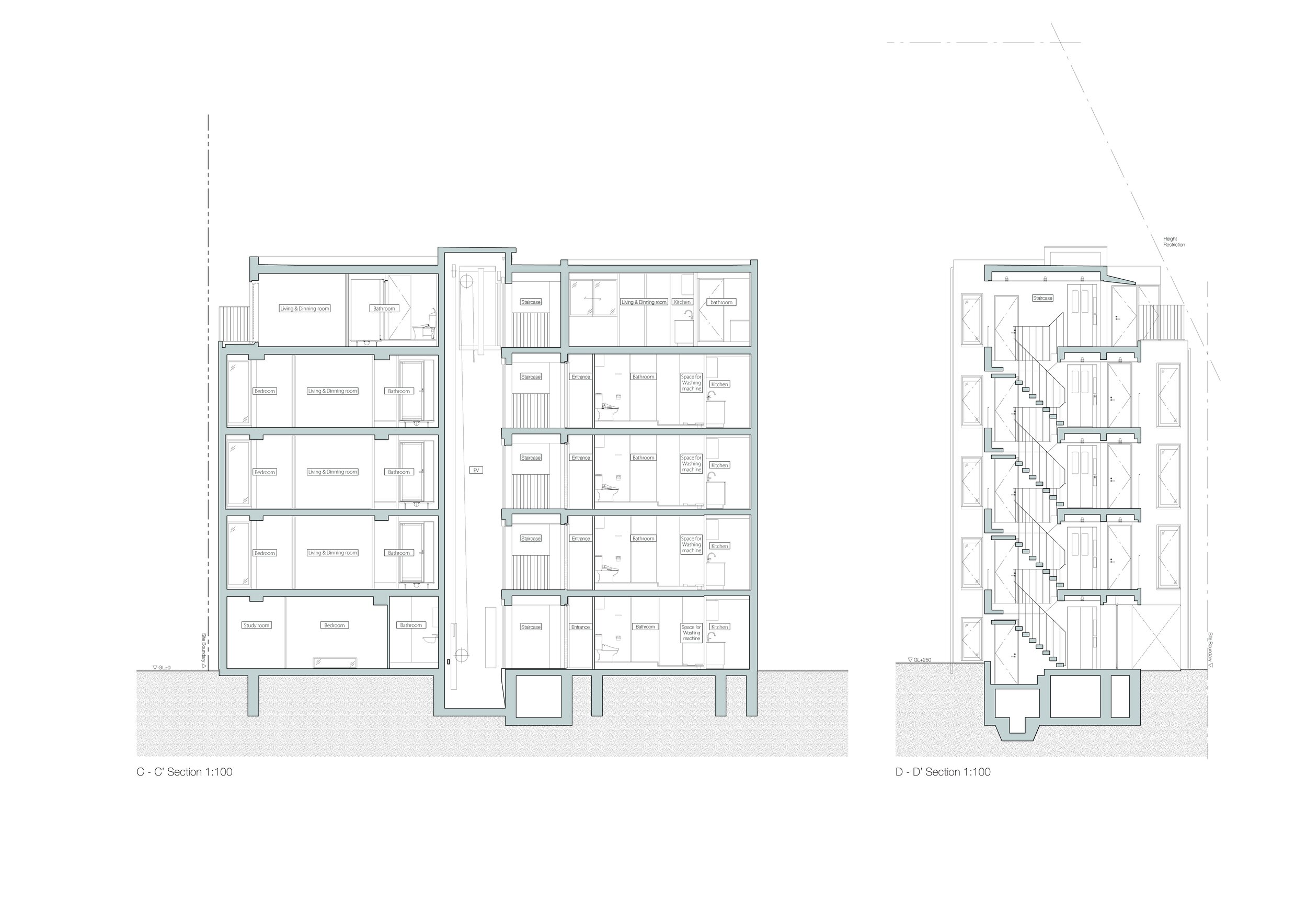
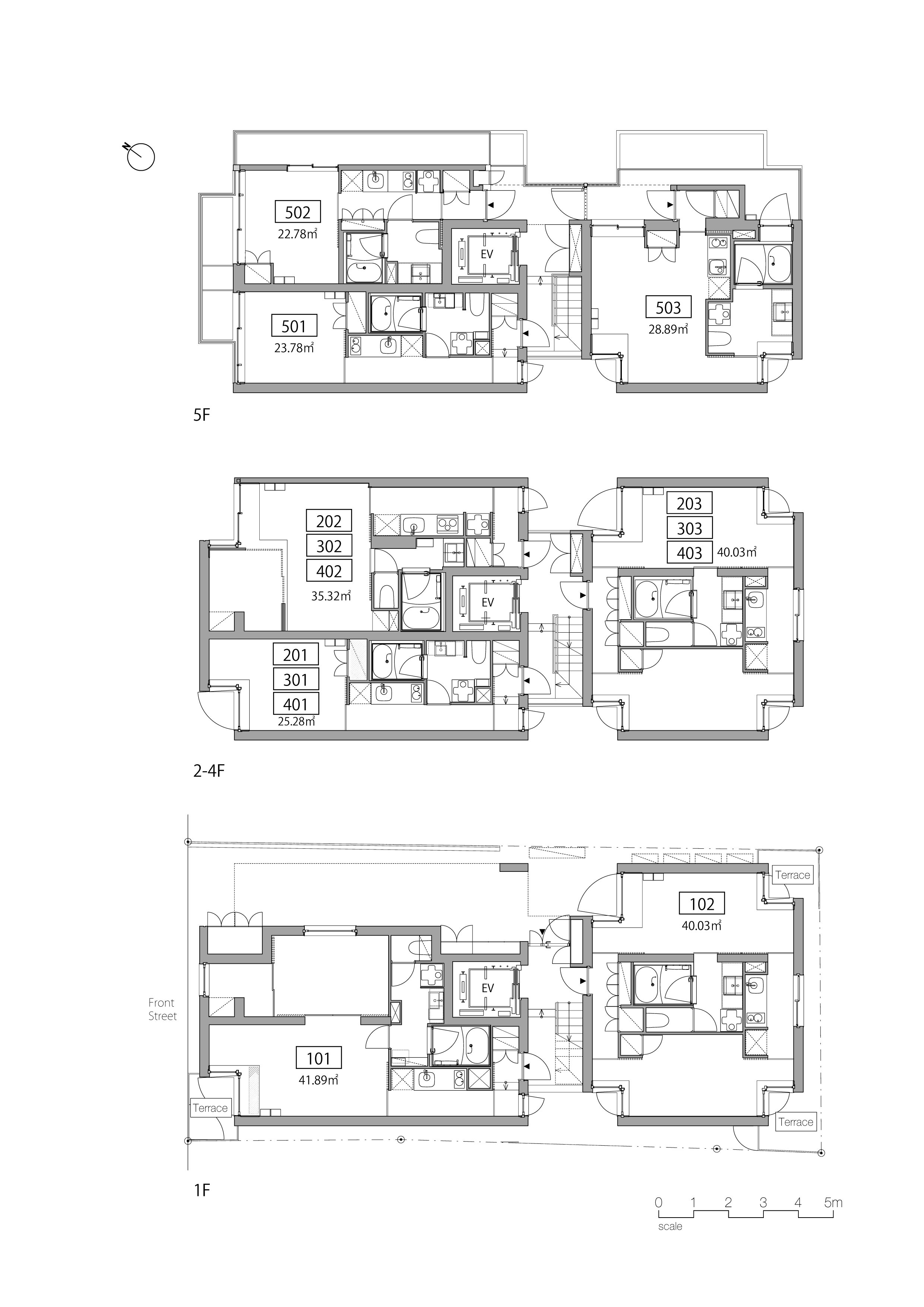
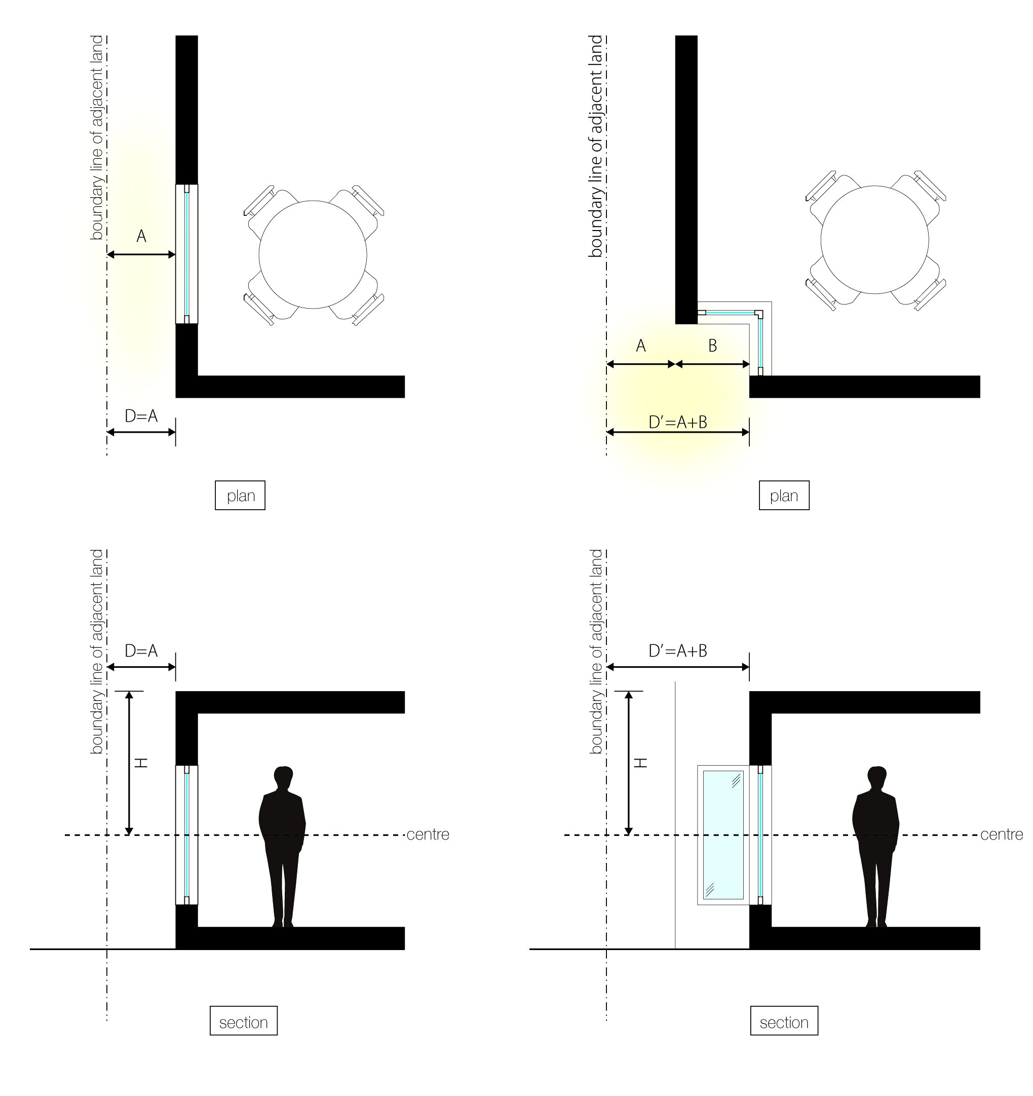
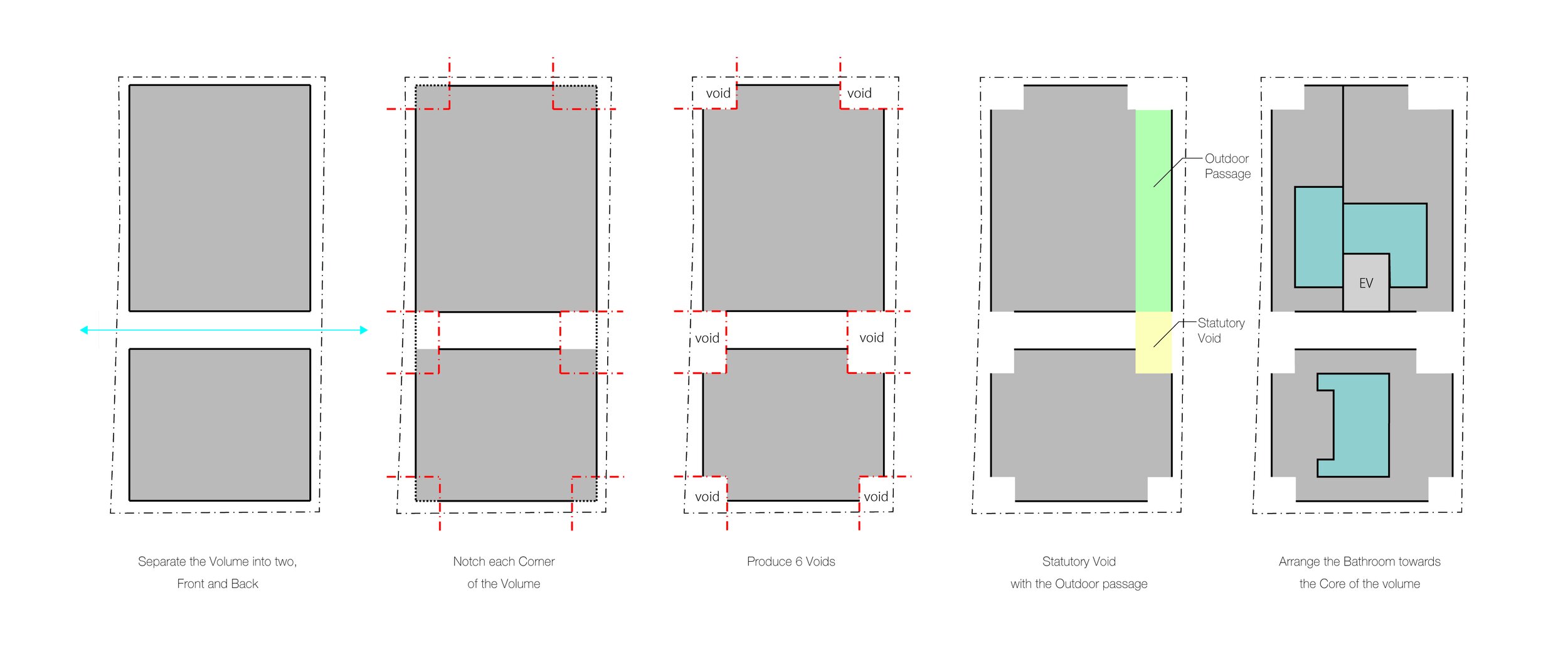
In an area near the entrance to Meguro Fudoson, a Buddhist temple, a five-storey apartment complex with 14 units was built. In order to develop a parcel relatively deep with an extremely tight frontage in central Tokyo, the main theme for the design was to provide daylight and airflow wherever possible. The design also maintained density, thereby optimizing rental rates. Additionally, voids were established to meet the local ordinance requirement of an evacuation route.
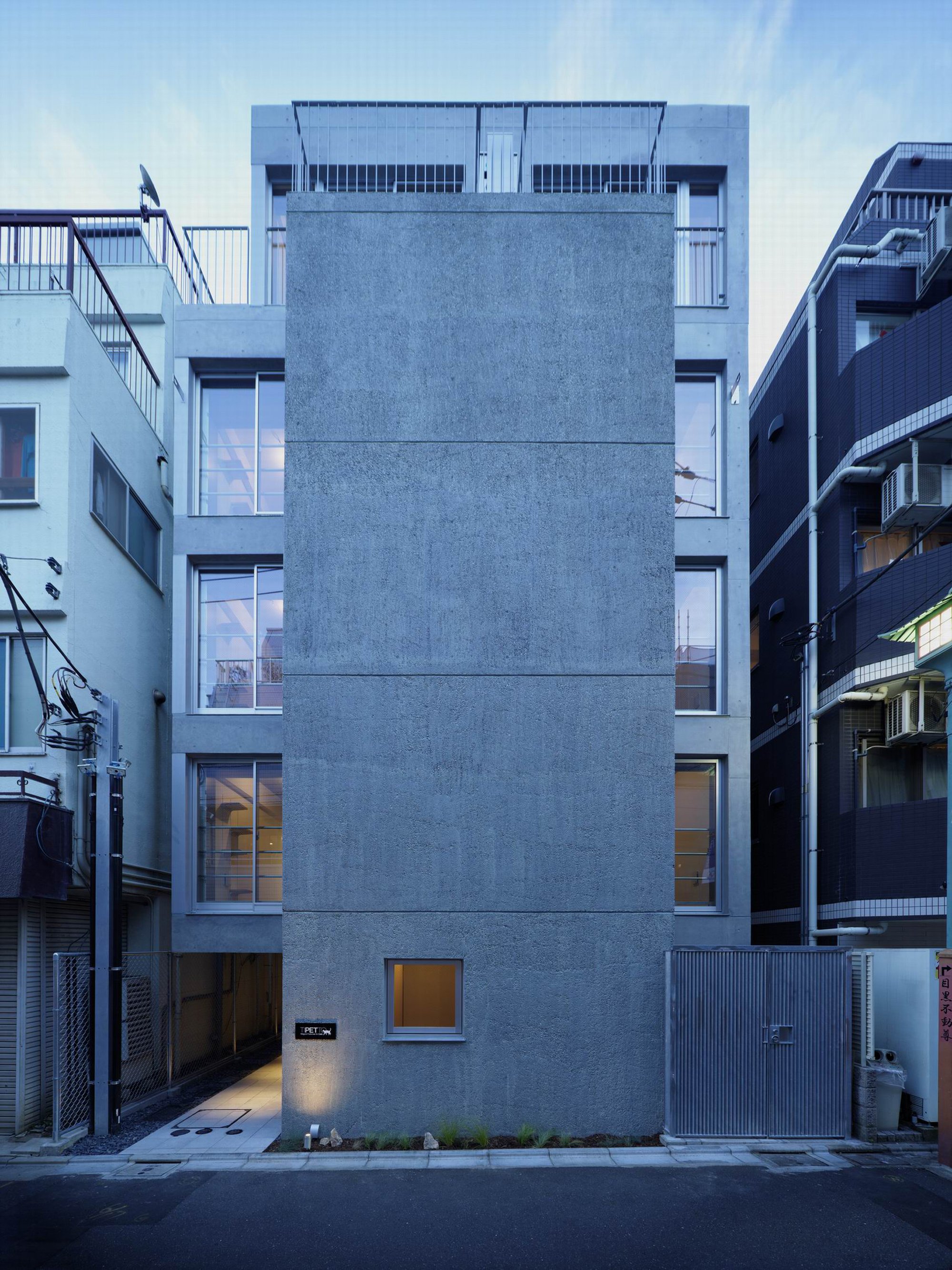
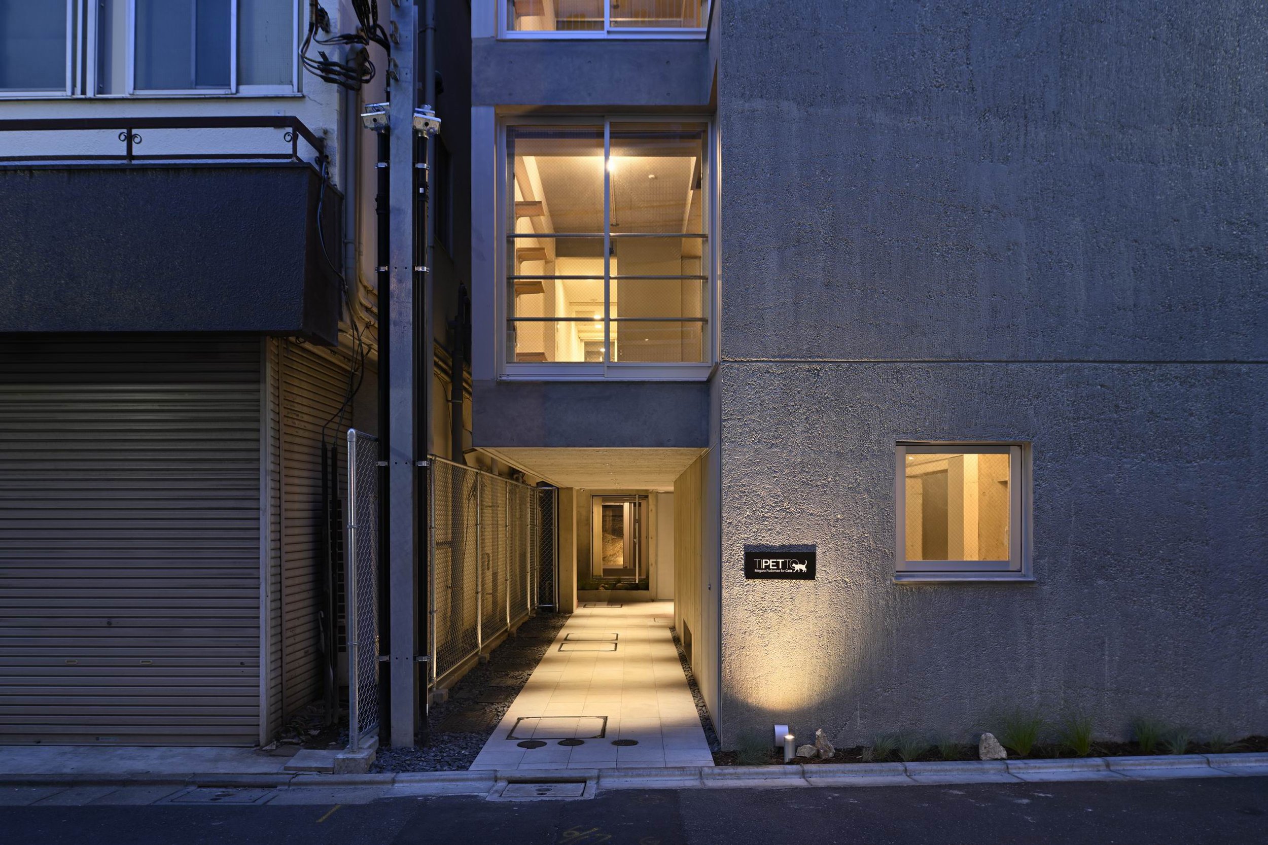
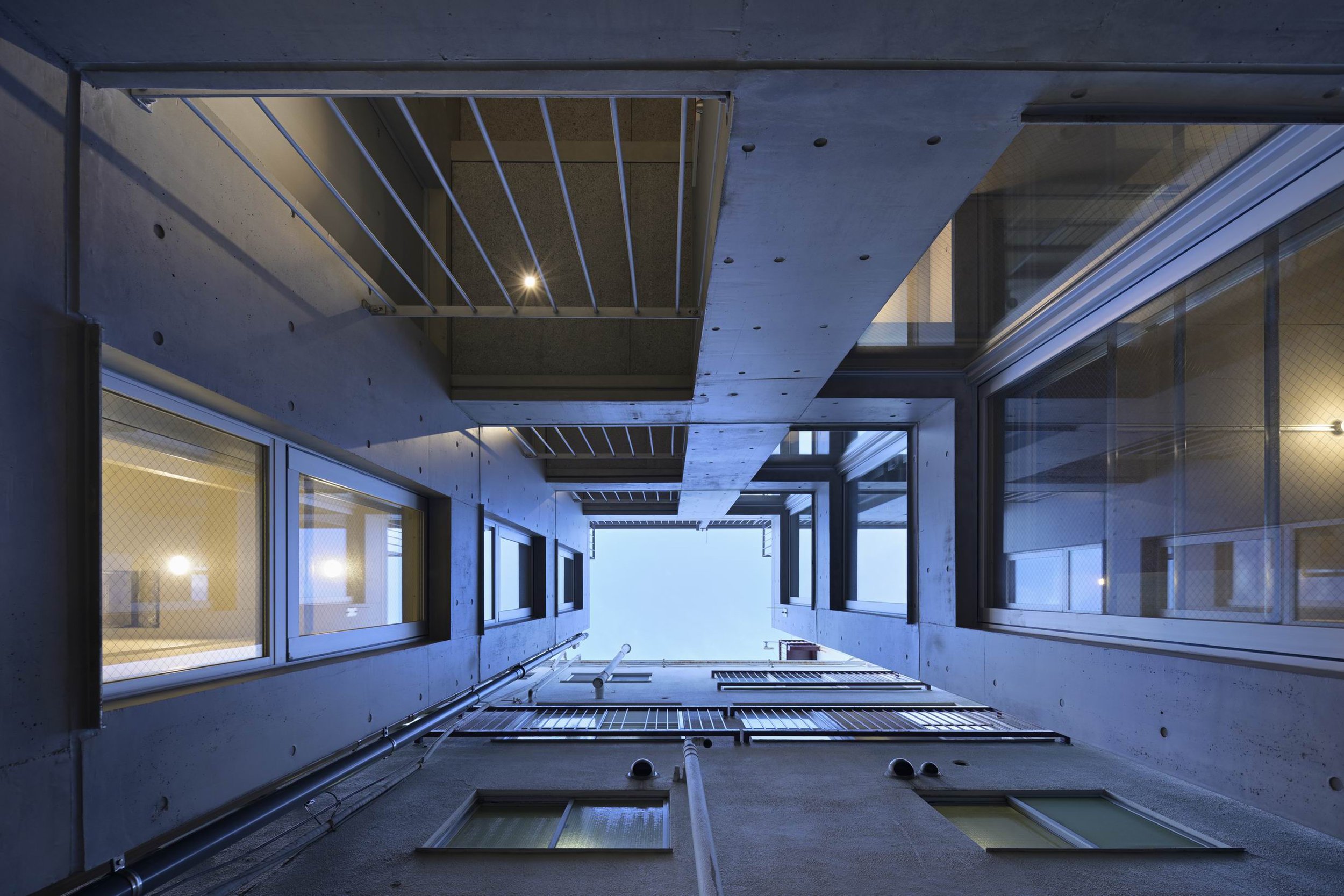
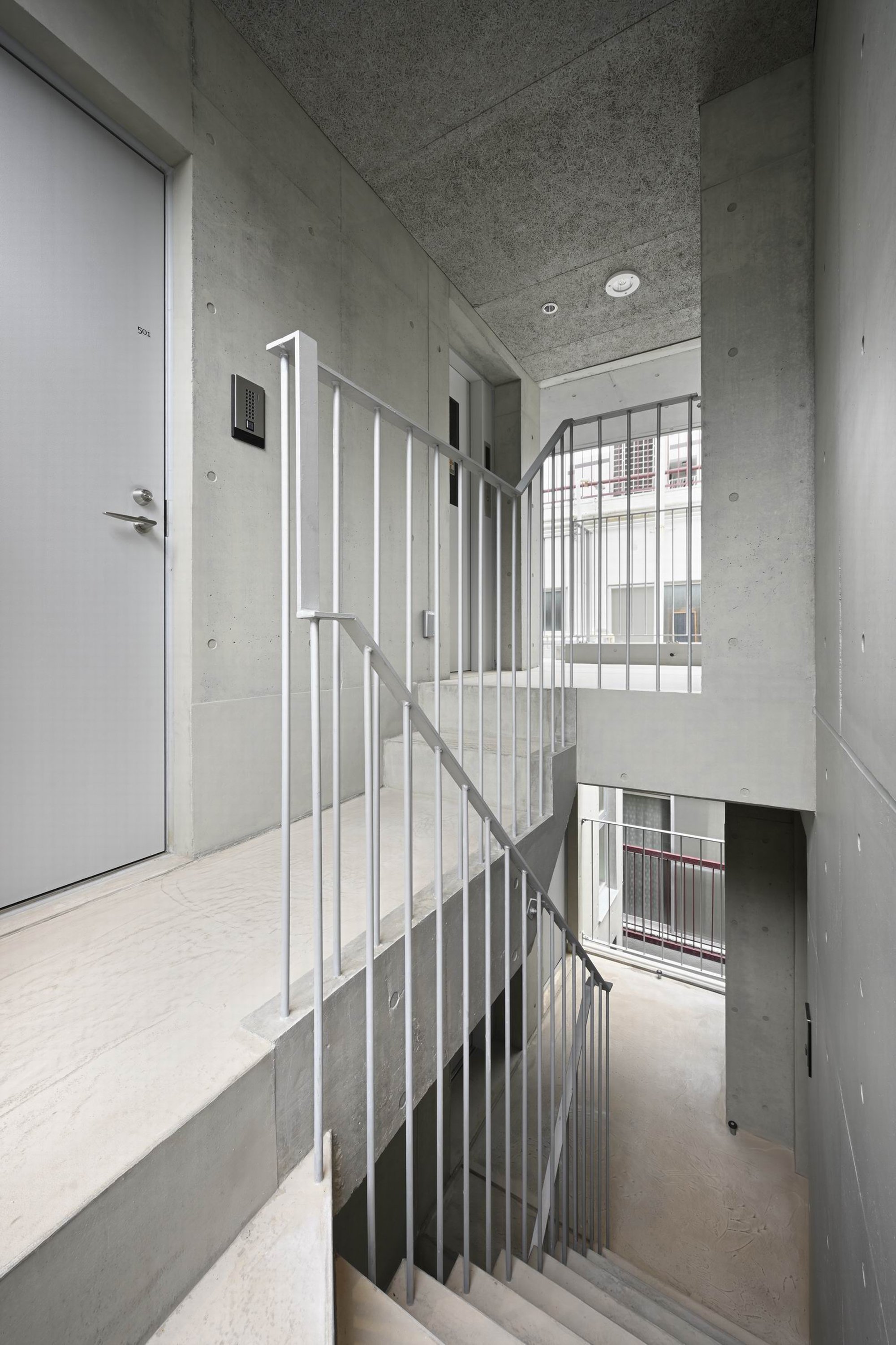
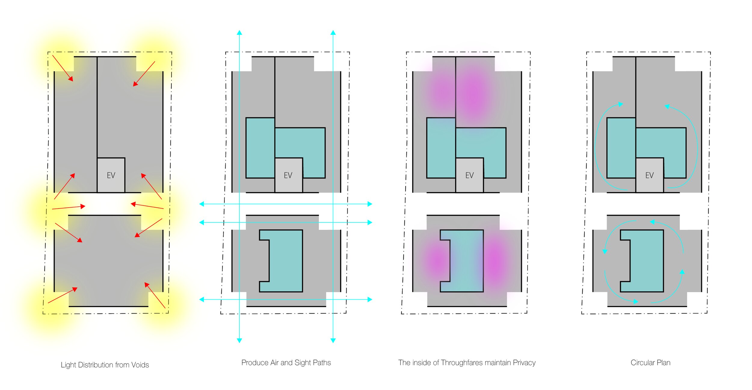
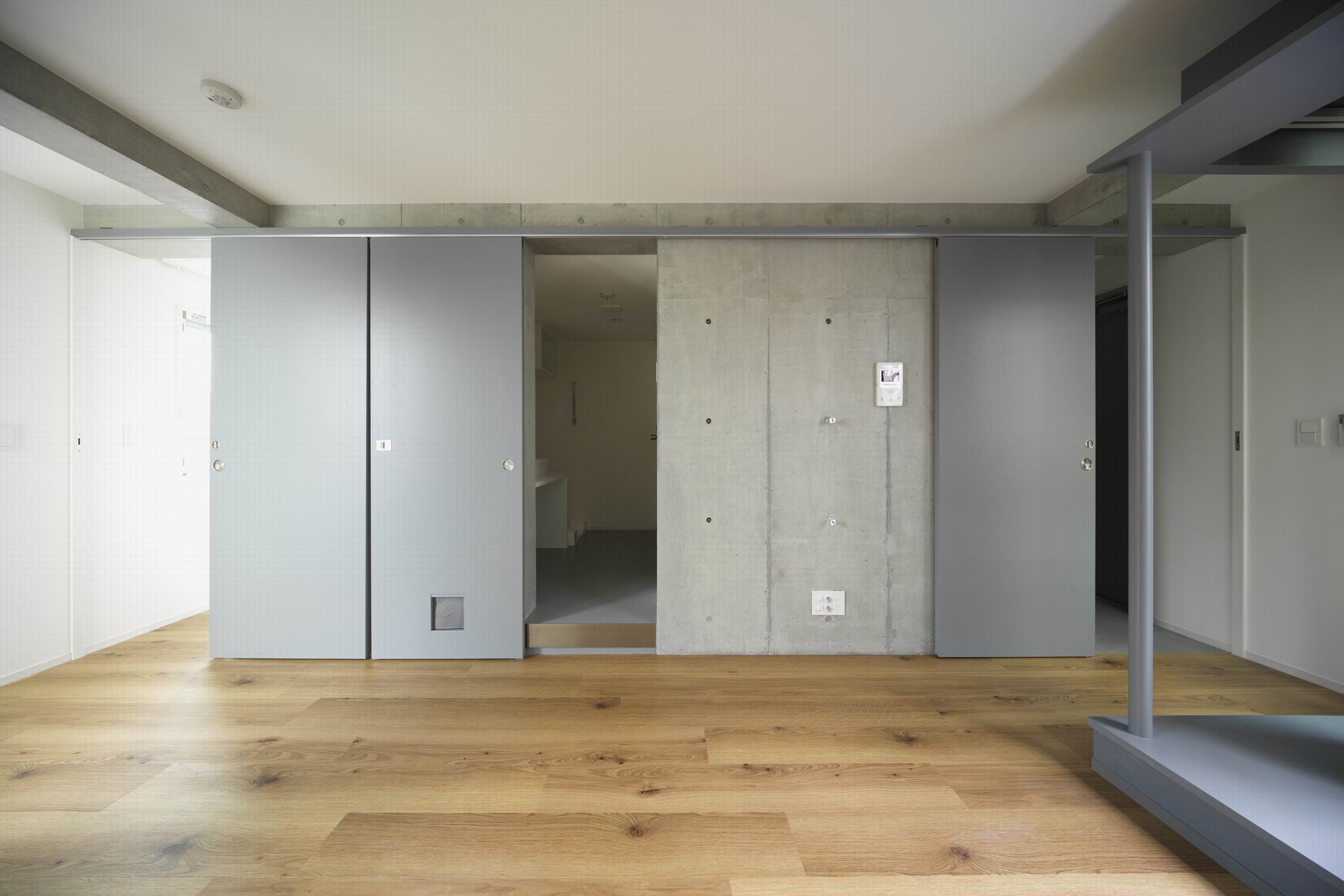
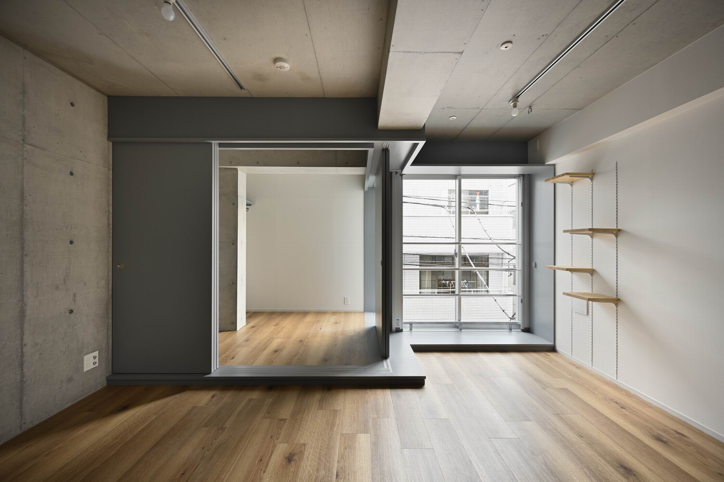
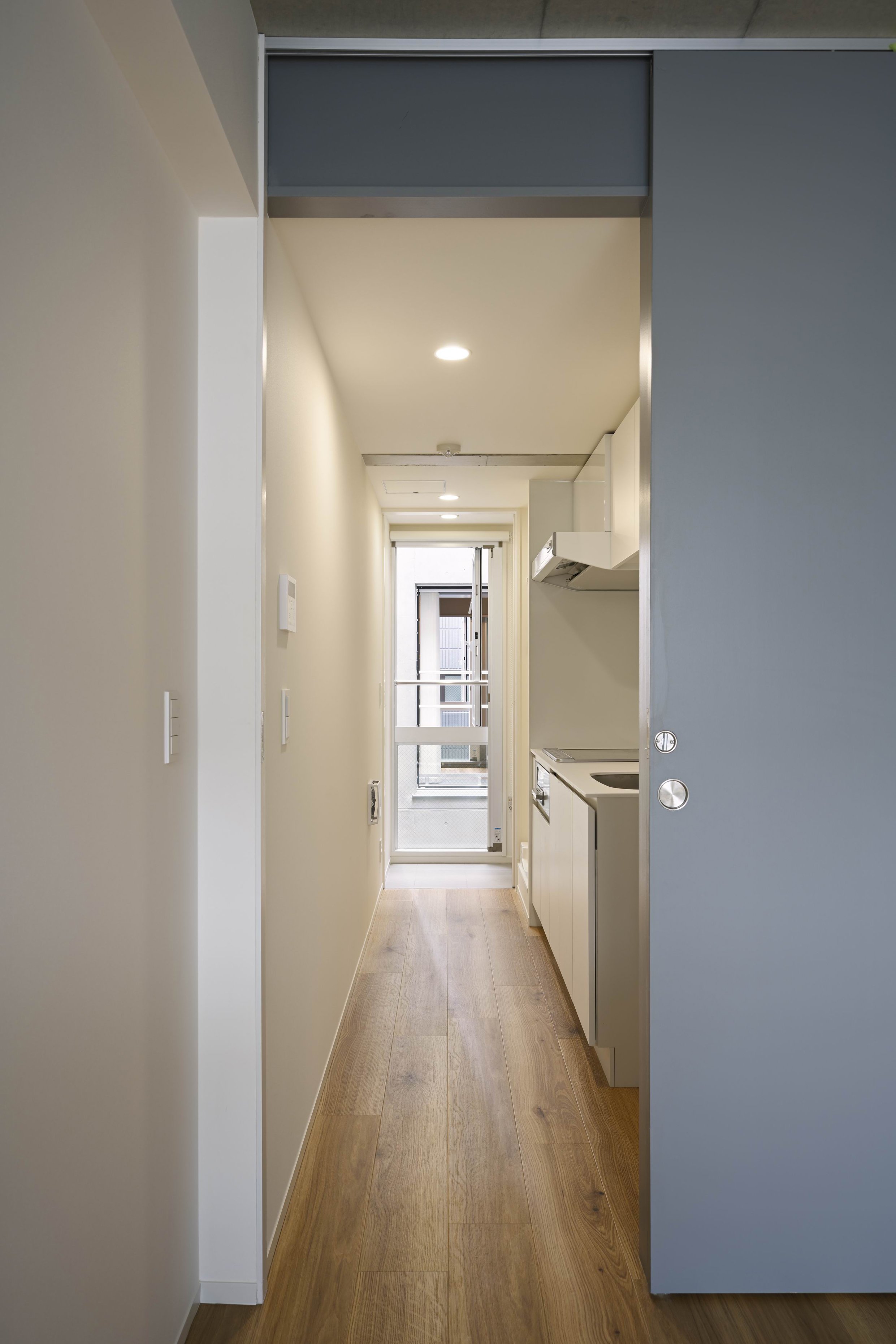
The completed building consists of two volumes, front and rear, separated by open corridors and stairs ascending to all floors. There are six vertical voids in each volume that focus light downward for a comfortable indoor environment. Each volume is notch-notched to reveal six vertical voids. In this complex, studio flats are arranged so that the bathrooms are at the center of the volume and the corridor runs along the exterior wall. Internally, the corridors serve to provide natural ventilation through the six voids from the front to the back. Similarly, the one-bedroom flats of the rear volume have bath areas at the core and can also be traversed past the entry and kitchen to the living room or bedroom, so a circular path can be followed around the entire perimeter of the apartment. Within the vicinity of windows facing the voids, there is a loft and stairs for cats. While humans relax in the same area, cats can bask in the sun and explore outside. On the whole, the indoor environment is conducive for humans and cats.
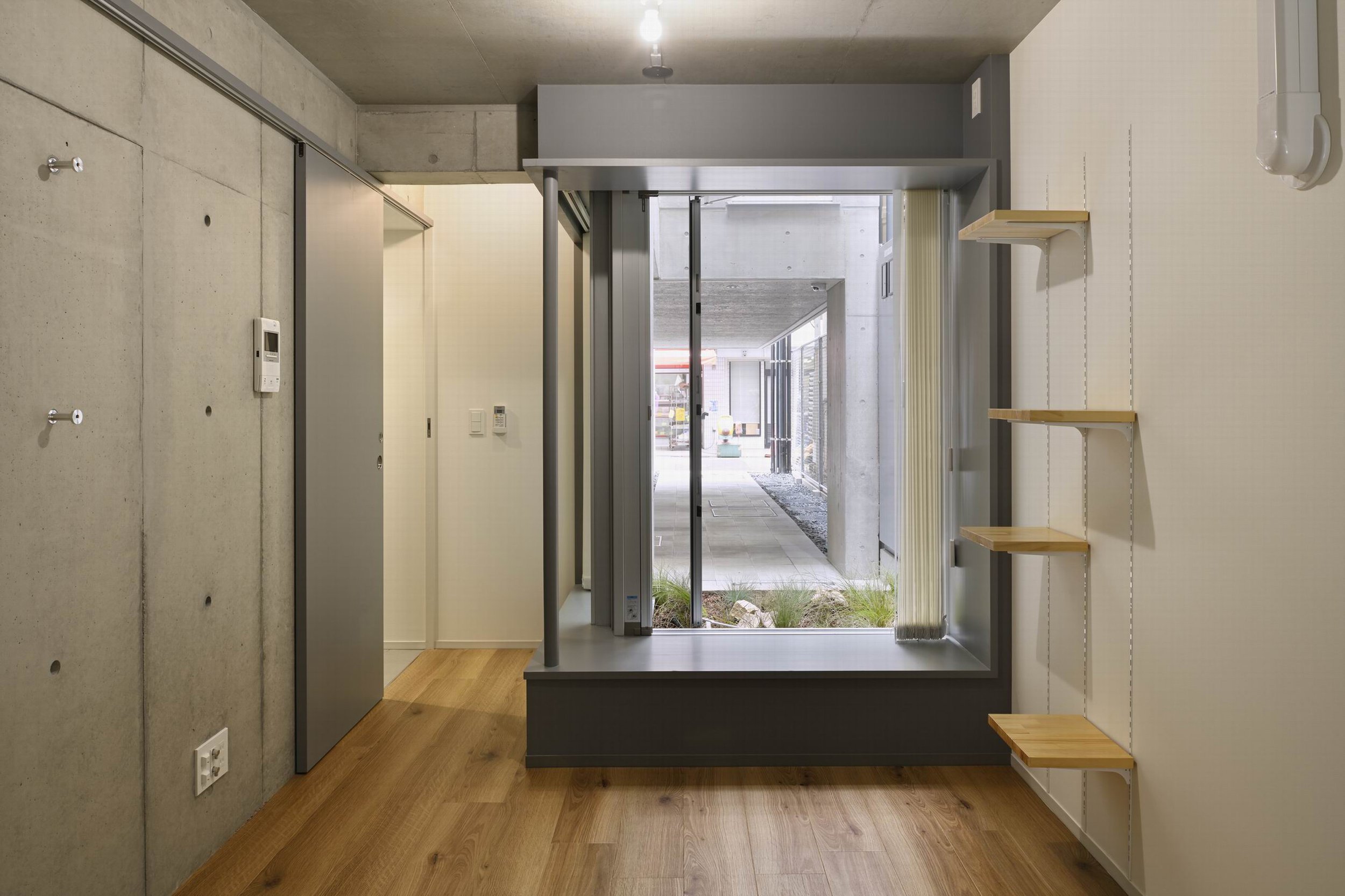
The COVID-19 experience highlights the importance of including outdoor spaces in the design, like windows, balconies, rooftops, and courtyards, as well as plazas, parks, and other open spaces. Within this flat complex, there are voids which create poor airflow to the back to ensure natural ventilation.
Although a studio layout was initially requested for the larger flats designed for two occupants, the final plan establishes two mutually separate, comfortable living spaces connected by corridors along the full perimeter of the building. Separate "meeting" rooms are available to both residents if they are both working at home and provide quiet work environments without having to worry about noise from the other. Furthermore, accommodations provide comfort through pets to the "post Coronavirus" generation.
Drawing/ Planning
