Touch Tea: A New Poetic Dialogue Between Tradition and Modernism
In today's urban landscape, the design of spaces reflects the cultural shift where the youth are increasingly drawn to fast-paced lifestyles and vibrant social environments. Touch Tea, designed by Touch Design, is a modern tea house that offers a refreshing response to this dynamic. Unlike traditional teahouses with elaborate and overly formal atmospheres, Touch Tea stands out with its unique blend of minimalism and an innovative approach to the ritual of tea drinking. It delicately balances honouring the tea tradition with embracing the vitality of modern life, creating a space that resonates with both the past and the future.
In today's urban landscape, the design of spaces reflects the cultural shift where the youth are increasingly drawn to fast-paced lifestyles and vibrant social environments. Touch Tea, designed by Touch Design, is a modern tea house that offers a refreshing response to this dynamic. Unlike traditional teahouses with elaborate and overly formal atmospheres, Touch Tea stands out with its unique blend of minimalism and an innovative approach to the ritual of tea drinking. It delicately balances honouring the tea tradition with embracing the vitality of modern life, creating a space that resonates with both the past and the future.
Touch Tea redefines the act of "savouring tea," creating a space where the experience becomes a dialogue between past and future, tranquillity and vibrancy. Its architectural design moves beyond form, creating a fluid interaction of purpose and aesthetics. The designers have reimagined how people engage with the space and the culture, infusing the experience of tea drinking with fresh meaning that resonates with a younger, more progressive audience.
The Touch Tea design philosophy is a poetic approach to life, emphasizing harmony over the trivialities of the city. The space is a harmonious environment with washable stones, stainless steel, and red brick, striking an elegant balance between simplicity and sophistication. It invites visitors to slow down and connect with the art of tea, reflecting a precise understanding of life's textures. It offers a sanctuary where rituals unfold naturally, enhanced by the surrounding ambiance, providing a calm and relaxing escape from the hustle and bustle of urban life.
Technology plays an understated but essential role in shaping the environment at Touch Tea. Intelligent curtains and lighting systems adapt to patrons' moods, adjusting the indoor lighting to match the shifting tone of the day. A 6-meter by 3-meter P2.0 full-color LED panel and BOSE surround sound system work together to create an immersive, sensory experience, soothing the mind and creating a serene atmosphere. These elements amplify the calming essence of the space, allowing guests to find respite from the noise of the outside world.

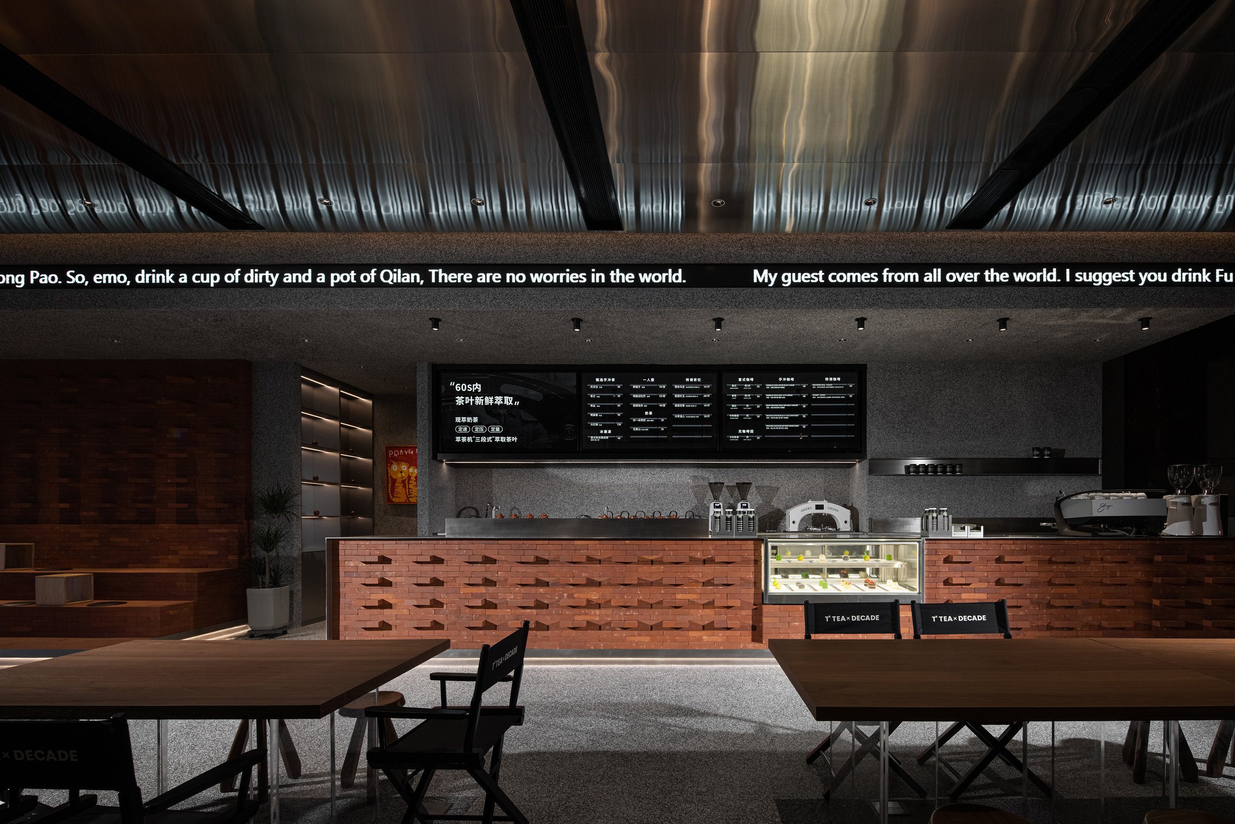
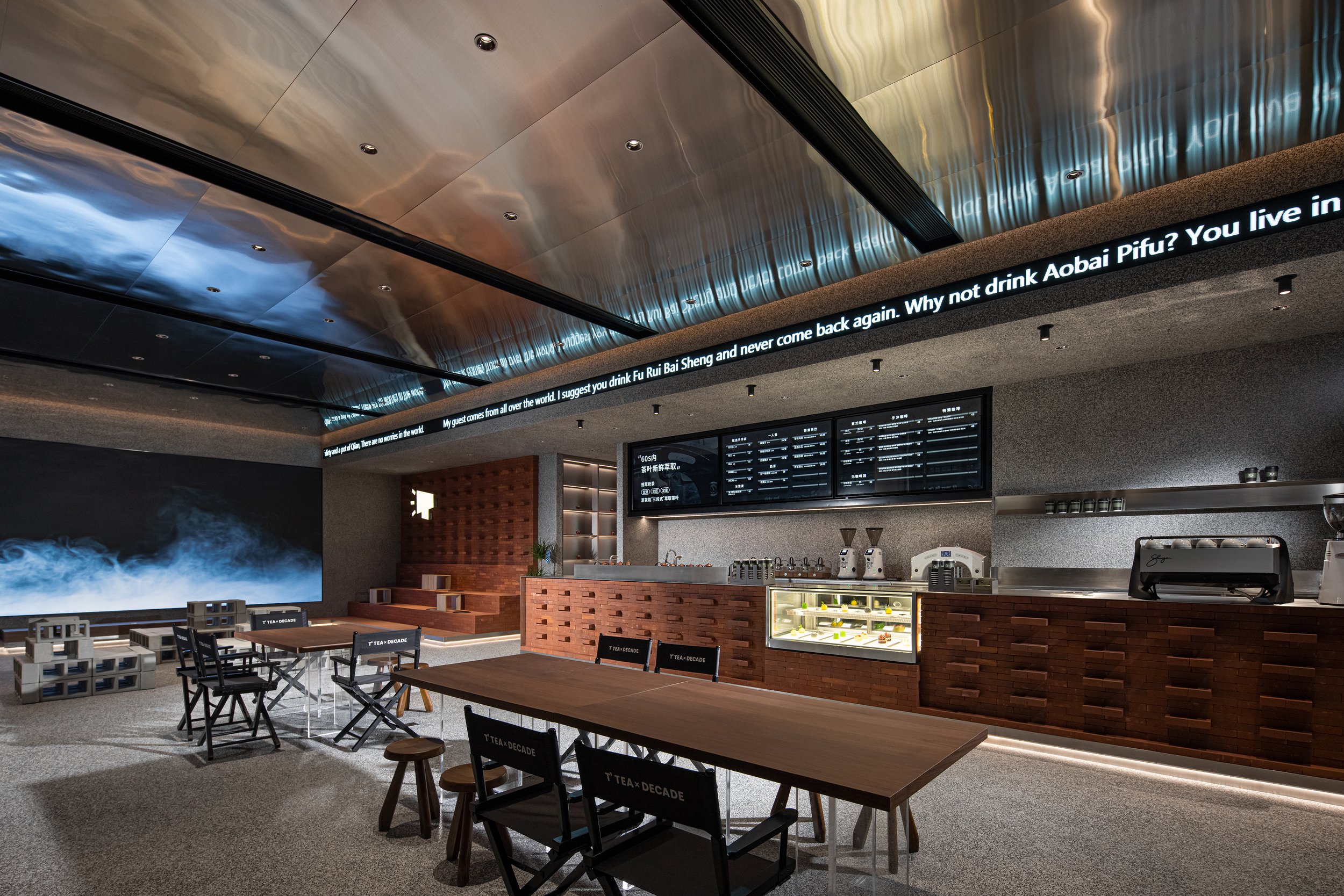


Touch Tea is more than just a teahouse; it's a vibrant social space that fosters simple connection and engagement. Its open, cubist-inspired layout breaks down barriers, creating a flexible space where people can meet, share, and engage in conversations. The design's contemporary yet thoughtful approach makes it an ideal setting for the evolving needs of the young generation—whether for socializing, contemplation or simply enjoying tea.
Touch Tea's identity is centred around the TOCOO Doku IP image, symbolizing youth and individuality. This emblem represents modern aesthetics and the brand's innovative spirit. The space itself is an artistic statement, blending avant-garde design with vitality and connecting art, architecture, and culture, but it also is a testament to the evolving relationship between architectural form and urban living. It brings together new materials, technologies, and design philosophies to reflect the needs of a generation that values tradition and forward-thinking innovation. Through its seamless fusion of architectural elements, Touch Tea creates a space that captures today's youth's anti-structure, anti-boredom, and anti-static mindset, offering a thoughtful escape amid the city's constant activity.
For more information, please visit: http://www.tj-touch.com
*This project is one of the shortlisted project in the Sky Design Awards 2024 - Interior Design: Restaurant & Clubs Division
Nomura’s Dynamic Vision: PAPABUBBLE Machida Merges Candy Craft with Immersive Design
PAPABUBBLE is a well-known candy brand from Barcelona known for its handmade candies and visually stunning presentations. Their signature candy, Kintaro-ame, is cylindrical candy with intricate patterns that are identical in every slice, showcasing the brand's dedication to precision and artistry. This commitment to craftsmanship and creativity is reflected in the design of PAPABUBBLE's Machida store, which was created by Kohei Fujinaka and his team at Nomura Co., Ltd.
PAPABUBBLE is a well-known candy brand from Barcelona known for its handmade candies and visually stunning presentations. Their signature candy, Kintaro-ame, is cylindrical candy with intricate patterns that are identical in every slice, showcasing the brand's dedication to precision and artistry. This commitment to craftsmanship and creativity is reflected in the design of PAPABUBBLE's Machida store, which was created by Kohei Fujinaka and his team at Nomura Co., Ltd.
An Experiential Design for the Senses
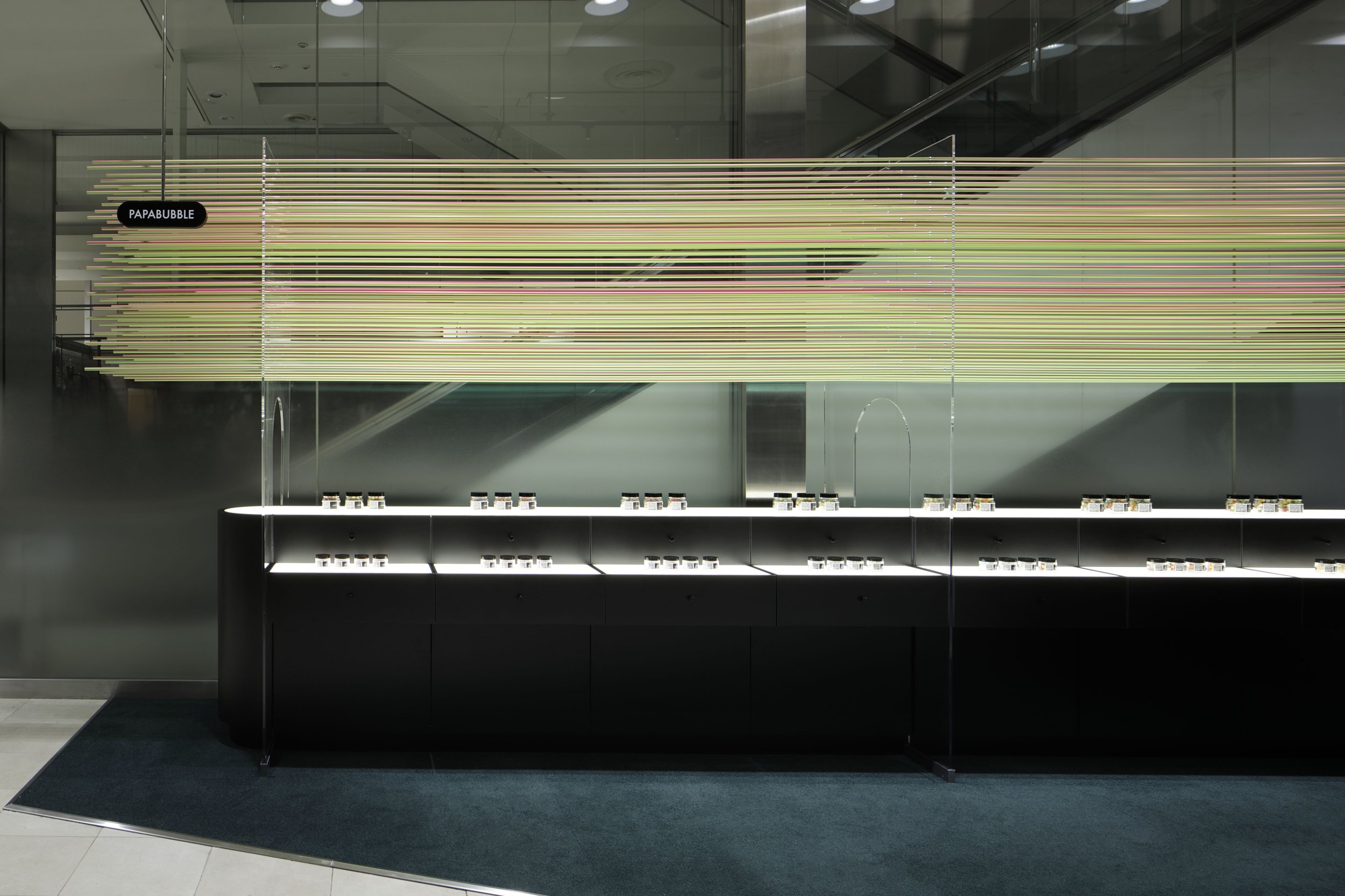
The PAPABUBBLE Machida store's design transforms a small, unconventional retail space into an immersive and dynamic experience. Despite being tucked beside an escalator in a busy shopping area, the design overcomes limitations in visibility and flow. Instead of seeing these as constraints, Nomura's design turns the store into a kinetic visual experience that attracts passersby and profoundly connects with the brand's DNA.
The design concept revolves around 90 aluminum rods, each with the same diameter as PAPABUBBLE's long cylindrical candy before it is sliced into individual pieces. These rods are not just decorative but the centrepiece of an ever-changing visual installation. Gradient-coated to shift in colour depending on the viewing angle, the rods echo the vibrant hues of the brand's kaleidoscopic sweets, creating a visual spectacle that mimics the candy's playful and intricate designs. As visitors move past or ascend the nearby escalator, they are greeted with this constantly evolving display that seemingly transforms with every step. This dynamic interaction turns a previously underwhelming space into a vibrant focal point.
The Power of Perception and Movement
The brilliance of Nomura's design lies in its ability to manipulate perception through simple, analog techniques. The colour-shifting aluminum rods interact with shoppers' natural movements, using the escalator's vertical flow as part of the store's visual narrative. This seamless integration of design and human motion transforms the store into an interactive experience that blurs the lines between retail and art installation. The fluid movement of colours not only reflects the essence of PAPABUBBLE's candy-making process (which involves transforming essential ingredients into delightful works of edible art) but also entices onlookers to engage with the store on an emotional level.
The gradual shifts in hue mirror the meticulous crafting of Kintaro-ame, a process that similarly unveils its intricate patterns with every slice. By allowing the store's exterior to change dynamically as people approach, the design invites curiosity and wonder, drawing visitors into the space like the magic of watching a master confectioner create candy.


A Narrative of Craftsmanship and Creativity
Nomura's design for PAPABUBBLE Machida is not just about looks; it is a visual story that reflects the brand's craftsmanship, creativity, and playful essence. The use of aluminum rods directly embodies PAPABUBBLE's philosophy - precision, artistry, and a sense of delight that appeals to both the senses and the imagination. This playful yet highly crafted approach perfectly aligns with the brand's identity, where making candy is as important and enjoyable as the final product.
The layout also cleverly addresses the challenge of visibility in a narrow space. Using the escalator's vertical axis, the design catches the attention of passersby who might otherwise miss the store. The visual trickery of changing colours creates a sense of wonder and ensures that the store stands out in a crowded retail environment. The design's minimalist yet dynamic execution allows the store to tell PAPABUBBLE's story - one of artful confectionery - without overwhelming the senses.
A Triumph in Spatial Innovation
The Machida store has achieved several prestigious accolades, including a Bronze Award at the 2023 Japan Space Design Awards and recognition at the 2024 iF Design Awards. These honours underscore how Nomura's design effectively combines functionality with artistic expression. In a retail environment where digital and flashy displays are increasingly prevalent, the PAPABUBBLE Machida store exemplifies how analog techniques and thoughtful design can create an equally engaging experience while striking a balance between simplicity and complexity, craftsmanship and spectacle.
Kohei Fujinaka's vision brings the brand's whimsical candy-making process into the realm of spatial design, creating an environment that is both practical and poetic. By emphasizing the connection between movement, perception, and craftsmanship, the store becomes a living, breathing reflection of PAPABUBBLE itself—dynamic, colourful, and endlessly captivating.
Design as a Reflection of Brand Identity
The PAPABUBBLE Machida store showcases how thoughtful, creative design can transcend physical space to embody a brand's core values. Nomura's innovative use of colour, form, and movement creates a sensory experience that mirrors the artistry and precision of the candy-making process. It transforms a small, challenging space into a dynamic work of art that captures attention, invites interaction, and narrates the story of PAPABUBBLE in a way that is as memorable as its candies. This project demonstrates how design can not only solve spatial challenges but also elevate a brand, turning a visit to the store into a journey through the playful, artistic world of PAPABUBBLE.
For more information, please visit: https://www.nomurakougei.co.jp/
*This project is one of the shortlisted project in the Sky Design Awards 2024 - Interior Design: Retail Design Division
Cultural Heritage Reimagined: The Contemporary Craft of Nice Rice Shanghai
The store's design draws inspiration from traditional Chinese architecture, precisely the concept of the siheyuan, a classic Chinese courtyard house. SAY Architects skillfully translated this architectural heritage into a modern context by transforming the store into a "Rice Barn Shelter" that welcomes customers beneath its iconic eaves. The eaves, often called the "fifth elevation" in Chinese architecture, create an inviting sanctuary that offers a balance of openness and intimacy. The double-sloped roofs mirror traditional structures, yet their contemporary interpretation makes them relevant to today's retail landscape.
In the lively center of Huaihai Road in Shanghai, where Eastern and Western cultures meet, the Nice Rice Shanghai Flagship Store stands as a testament to cultural preservation and modern design. Crafted by the pioneering team at SAY Architects, this flagship store fuses tradition and contemporary aesthetics, offering an experience that transcends mere shopping.
A Sanctuary Rooted in Tradition
The store's design draws inspiration from traditional Chinese architecture, precisely the concept of the siheyuan, a classic Chinese courtyard house. SAY Architects skillfully translated this architectural heritage into a modern context by transforming the store into a "Rice Barn Shelter" that welcomes customers beneath its iconic eaves. The eaves, often called the "fifth elevation" in Chinese architecture, create an inviting sanctuary that offers a balance of openness and intimacy. The double-sloped roofs mirror traditional structures, yet their contemporary interpretation makes them relevant to today's retail landscape.
The choice of interior design is more than just cosmetic. It reflects the purpose of an Oriental Rice Warehouse, historically used for storing Rice. This symbolizes sustenance, inclusivity, and generosity. SAY Architects expanded on this concept by creating a "Rice Barn Shelter," a welcoming and inclusive space beneath the eaves that represents the harmonious coexistence of diverse cultural elements. This design respects the past and contributes to the sustainable cultural expression that SAY aims to incorporate alongside the sustainable use of materials.
Modern Retail: Blending Fashion, Tradition, and Culture
Nice Rice is more than just a retail brand; it represents a lifestyle concept that combines fashion, culture, and gastronomy. The flagship store in Shanghai showcases a "fashion + coffee" dual-business model, targeting younger demographics who seek a comprehensive retail experience. The simple and versatile clothing reflects the brand's philosophy of "harmony in diversity," subtly echoing Eastern cultural values.
The store's original architecture includes a wide horizontal beam that visually separates the space. This element was further emphasized by incorporating the traditional roof style of a siheyuan into the design. The roofline appears extended through cohesive colours and a minimalist yet innovative design, creating a captivating visual effect. Inside, intricate decorations have been removed to allow for more freedom of movement. Lacquer art installations punctuate the minimalist space, giving it a timeless quality.


An Inclusive Design for Urban Explorers
The dual-purpose design of Nice Rice includes a coffee shop and fashion retail, creating a modern and open public space. The store's recessed entrance and spacious outdoor area invite people passing by to interact with the space, making it a communal hub. The seamless flow between the inside and outside encourages visitors to pause, stay, and fully experience the cultural environment. The open and accessible entrance defines the store's identity and aligns with SAY Architects' vision for cultural sustainability through spatial design.
The overarching layout is designed to foster interaction. SAY Architects aimed to extend the functionality of the traditional courtyard beyond its historical limitations, highlighting how adaptable traditional elements can seamlessly integrate with modern fashion sensibilities. This architectural philosophy resonates deeply with the young urban consumer, blending cultural recognition with the ease of modernity.
Tradition Reborn for a New Generation
Through the extension and reinterpretation of traditional design elements, SAY Architects breathes new life into cultural heritage at the Nice Rice Shanghai Flagship Store. It serves not only as a retail space but also as a cultural touchstone, where the spirit of design is rejuvenated in a fresh and relevant manner. The balance of traditional charm and fashion-forward sensibility fosters emotional connections with Shanghai's youth, whose cultural recognition and engagement are keys to Nice Rice's success.
By promoting a harmonious blend of Eastern culture in a modern urban environment, Nice Rice creates a rich narrative for both the present and the future—a story that carries the weight of tradition yet speaks the language of contemporary design.


For more information, please visit: www.sayarchitects.cn
*This project is one of the shortlisted project in the Sky Design Awards 2024 - Interior Design: Retail Design Division
Unveiling the De Bethune Lounge and 1916 Company Watch Collectors Salon: A Fusion of Elegance and Innovation
The De Bethune Lounge and the 1916 Company Watch Collectors Salon were designed by Clifton Leung Design Workshop. These luxurious spaces, located in the heart of Central Hong Kong, serve as a testament to exquisite craftsmanship and innovative design. The grand establishment was officially inaugurated in December, ushering in the New Year with opulence and sophistication.
The De Bethune Lounge and the 1916 Company Watch Collectors Salon were designed by Clifton Leung Design Workshop. These luxurious spaces, located in the heart of Central Hong Kong, serve as a testament to exquisite craftsmanship and innovative design. The grand establishment was officially inaugurated in December, ushering in the New Year with opulence and sophistication.
Upon arrival, guests are immersed in a modern and mystical Art Deco design world from entering the elevator lobby. This captivating experience sets the stage for an extraordinary stay within thoughtfully-curated spaces, where every element, from the furniture to the lighting, has been carefully selected to create a luxurious and sophisticated ambiance.
The showroom has a striking stone bar in the center, adorned with elegant gold details that enhance the ambiance and add refinement. A unique antique mirror is a stunning backdrop for a thoughtfully selected wine collection, creating a visually captivating focal point within the showroom.
The lounge area has designer loungers and coffee tables, creating flexible settings for various gatherings and events, from intimate business meetings to elegant cocktail parties. Two custom-designed desks with an attractive center display feature the finest selections from the watch collection, adding to the area's sophisticated charm.
"The open ceiling is adorned with captivating round feature lights that emit a beautiful glow over the designer furniture. Strategically placed spotlights with a high colour rendering index (CRI) ensure that the true colours of the watches are accurately displayed. This is a crucial element for a watch trading showroom."


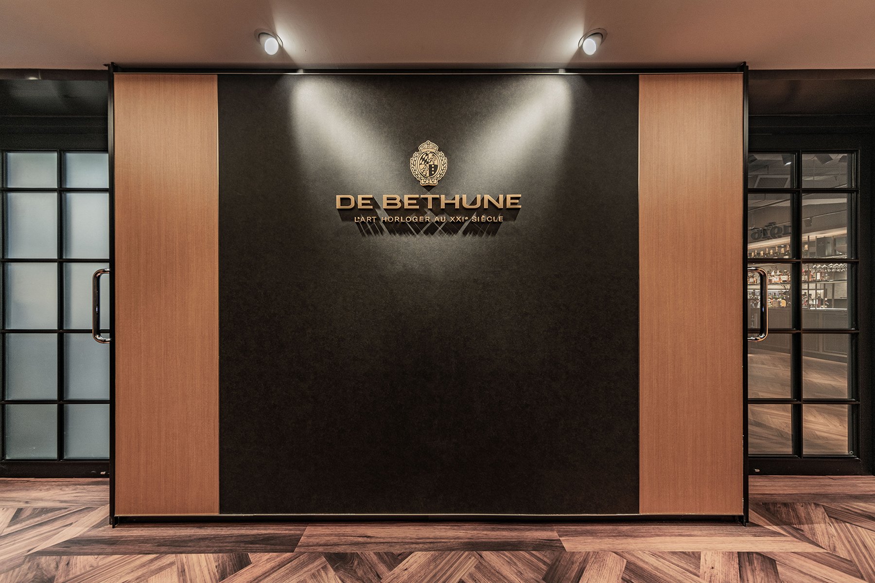


A centrepiece feature cabinet in the Salon seating area showcases carefully selected timepieces, reflecting the exceptional craftsmanship and artistry of De Bethune.
Two exclusive De Bethune rooms, accessible through pairs of elegant black mullioned sliding doors, echo the design of the De Bethune DB25 watch. The walls are adorned with captivating starry sky wallpaper and hand-painted showers of stars, mirroring the celestial beauty of the watch. Complemented by a posh black carpet, midnight blue draperies, and stage-like spotlighting, these rooms create a mysterious atmosphere perfect for personalized service from watch specialists, making you feel truly privileged and special.
An ingeniously concealed dynamic watch trading room, integrated behind a sliding partition, seamlessly blends functionality with aesthetics, ensuring a comfortable and relaxing experience within the 1916 Salon's layout.
The De Bethune Lounge and 1916 Salon offer an enchanting environment where luxury, elegance, and exceptional service converge. Patrons are invited to immerse themselves in a sophisticated salon shopping experience, enjoying intimate and educational interactions with watch specialists while perusing a meticulously curated collection, each item carefully selected for its quality and value. Step into a world where every detail is crafted to captivate and delight.
This project has been shortlisted for the Sky Design Awards 2024 in the Architecture division.
For more information, please visit: https://www.cliftonleungdesignworkshop.com/
The first Ace Hotel in Canada has opened in Toronto
Ace Hotel Toronto stands as testament to the quiet but regenerative power that thoughtful architecture and design can have on its environment. Set in the heart of Toronto’s historic Garment District – a neighborhood fueled by innovation and industry at the start of the 20th century – the building’s character and material palette recall the robustness of the surrounding brick-and-beam factories and warehouses.
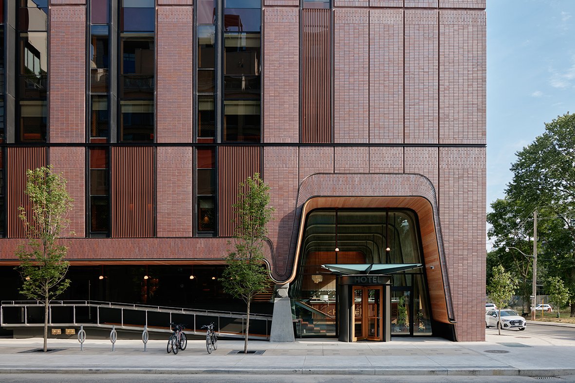
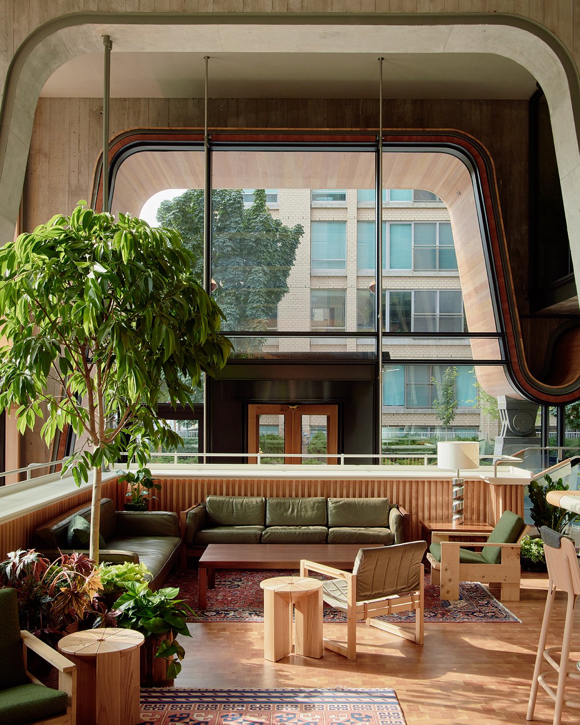
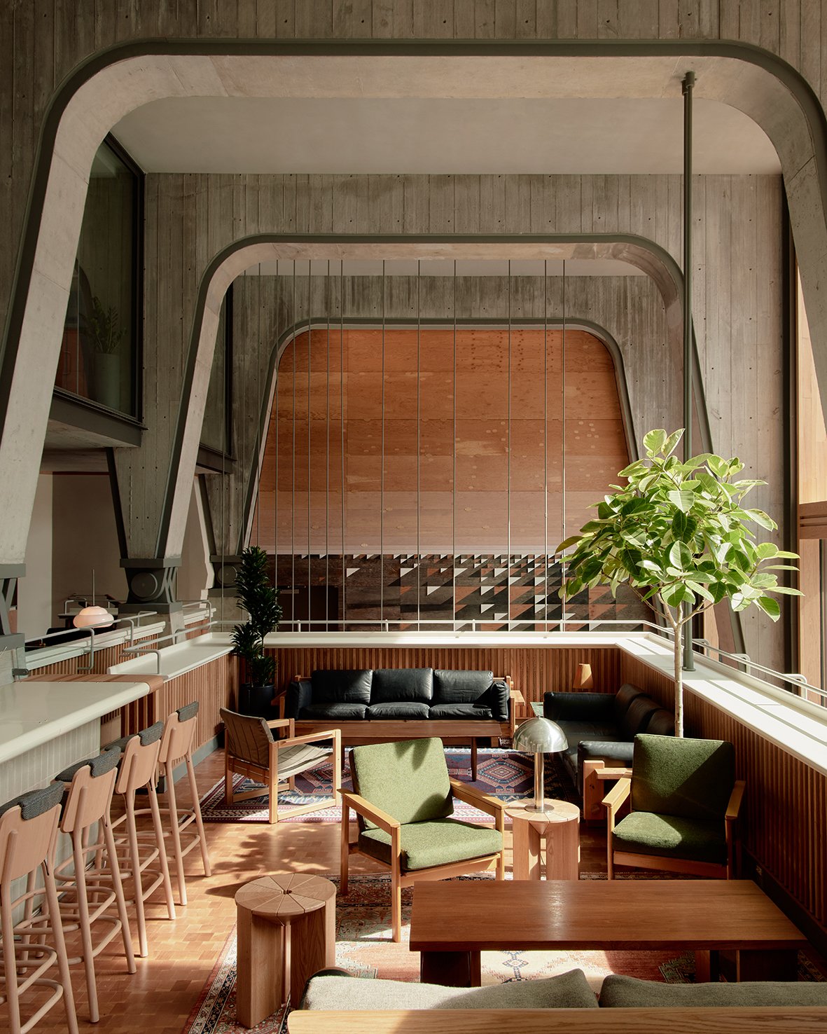
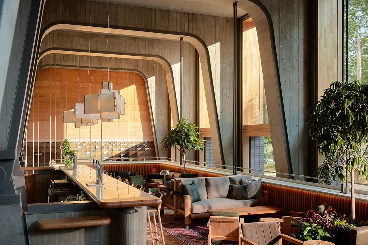
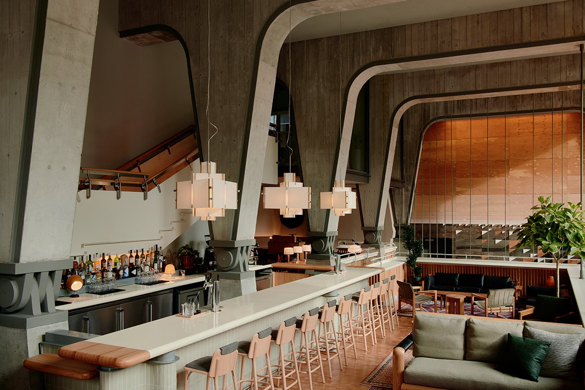
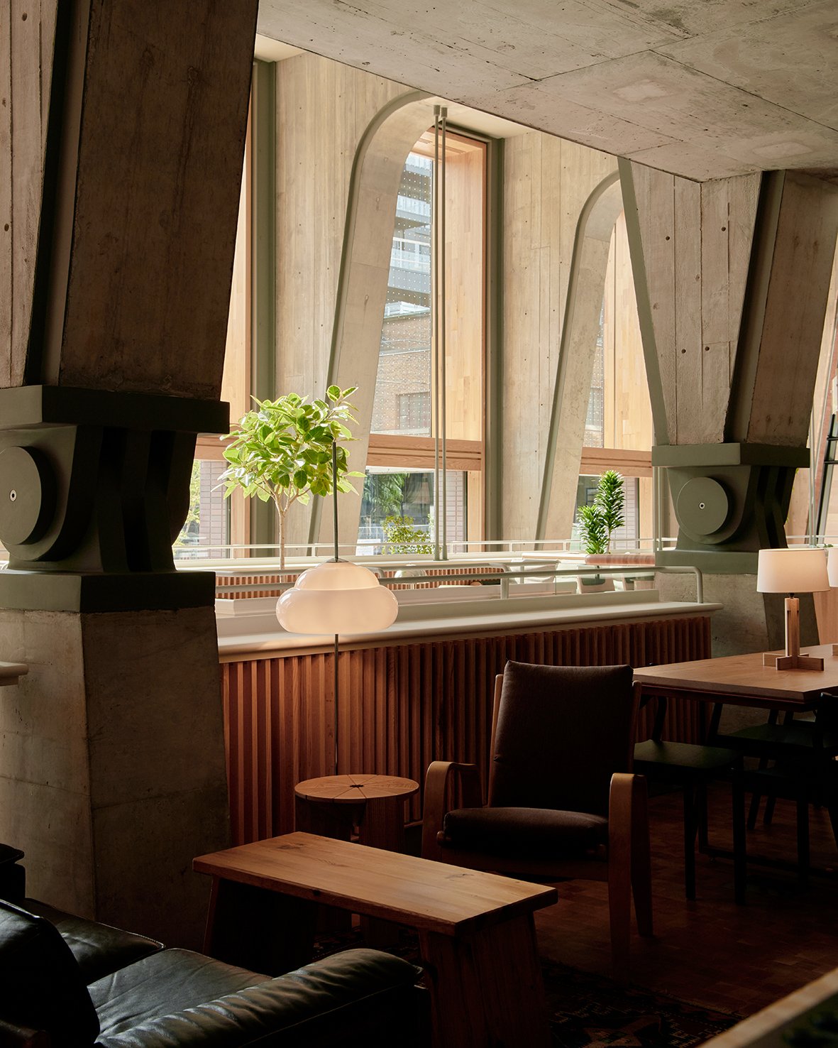
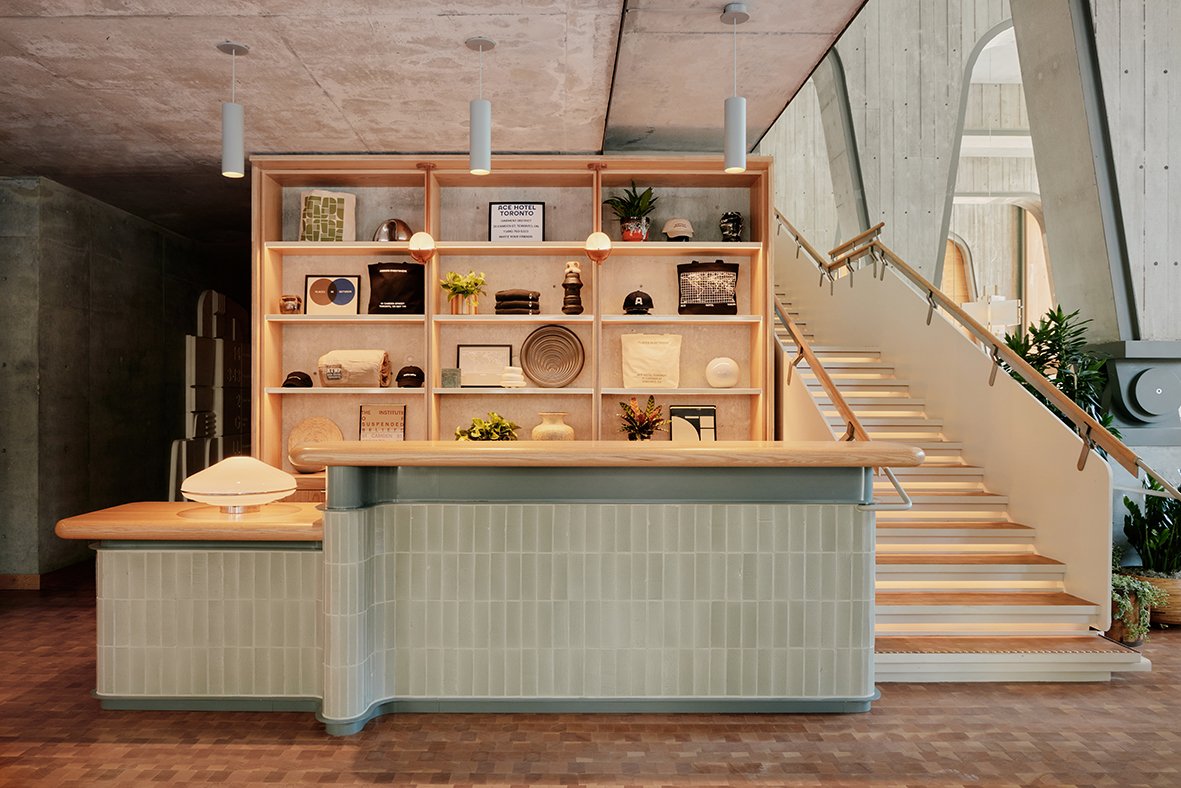
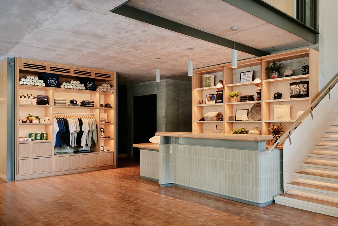
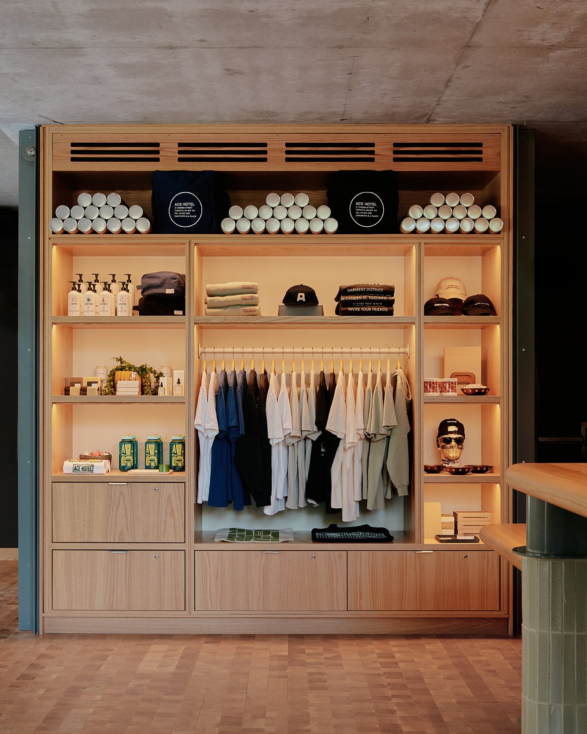
Ace Hotel Toronto — the brand’s inaugural home in Canada — opens its doors o July 26, 2022. The 123-room ground-up project was designed by revered Toronto firm Shim-Sutcliffe Architects, led by Brigitte Shim and Howard Sutcliffe, recipients of numerous awards including the 2021 Royal Architectural Institute of Canada’s Gold Medal, the nation’s highest honour for architecture. Anchoring the building is Alder, a seasonal wood-fired restaurant from critically acclaimed chef Patrick Kriss, which will open for dinner service on August 9. Chef Patrick also helms the menus for The Lobby, as well as the hotel’s rooftop bar and lounge, Evangeline, opening later this year.
Ace Hotel Toronto stands in the city’s historic Garment District, a neighbourhood ignited by innovation and industry at the start of the 20th century, once a manufacturing centre that grew into an influential artistic hub. At a nexus of neighbourhoods including Queen West, Downtown and Chinatown, and within walking distance of famed music venues, galleries, bars and restaurants, the hotel joins an area long defined by many of the independently minded and community-focused institutions that form the city’s cultural backbone. Ace Hotel Toronto stands as testament to the quiet but regenerative power that thoughtful architecture and design can have on its environment. Set in the heart of Toronto’s historic Garment District – a neighborhood fueled by innovation and industry at the start of the 20th century – the building’s character and material palette recall the robustness of the surrounding brick-and-beam factories and warehouses.
“Long a leading global light for its forward-thinking approach to city-making and design, Toronto is
a city that embraces originality and is rooted in the same open-to-all philosophy that founded Ace.
We could not be more proud to open Ace Hotel Toronto — the architectural magnificence of Shim-
Sutcliffe Architects’ work has created a bona fide wonder. They have built an inherently civic space
that respects the neighbourhood’s storied past while nurturing its future. Likewise, Chef Patrick Kriss
has worked in tandem with our team to create something exceptional at Alder, a restaurant with an
honest reverence of seasons and quality. It is with great gratitude to the gifts of friends near and far
that we welcome all to finally fill this remarkable space.”
ARCHITECTURE & DESIGN
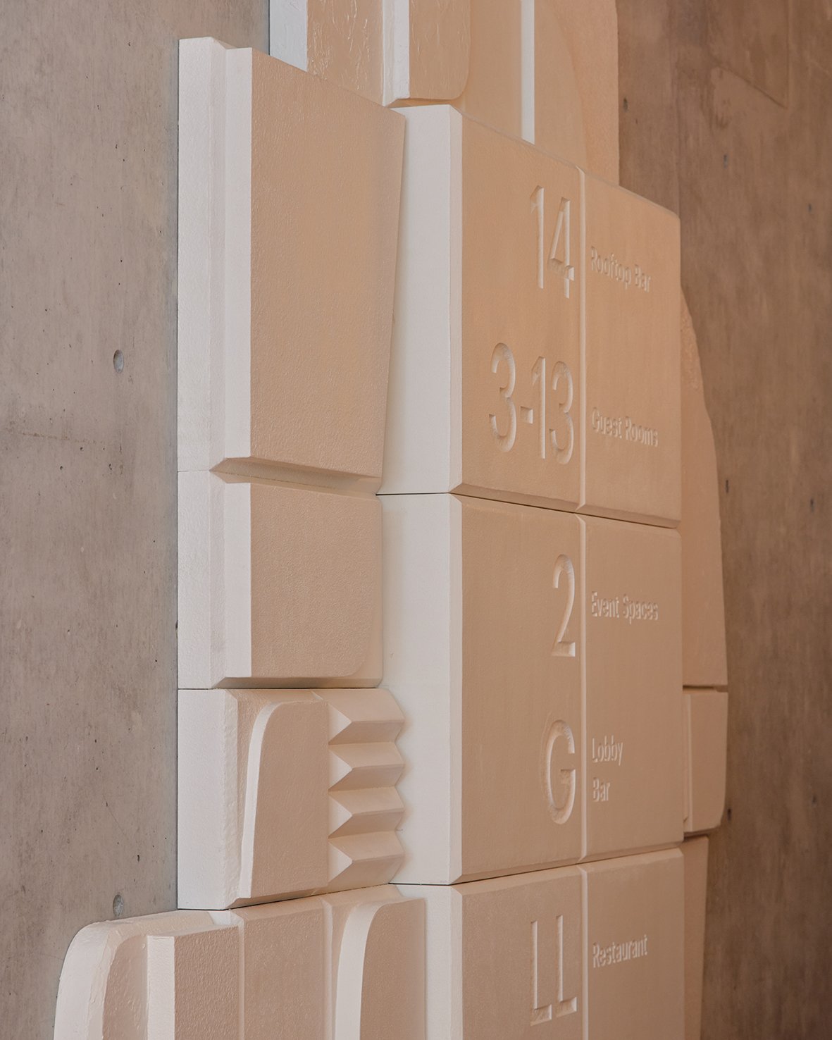
Although a new building, the robust, solid architecture of Ace Hotel Toronto was designed to convey timelessness, and feels effortlessly at home amongst its surroundings. Shim-Sutcliffe Architects’ work — imbued with modesty, honesty, and an appreciation of place, as exemplified by the studio’s famed Integral House — evokes a particularly Canadian spirit and feeling. The building’s red brick facade recalls the important role bricks pressed from Don Valley clay played in forming the city’s visual identity, and guests entering the lobby catch a glimpse of Horizon Line, a three-story site-specific art installation abstractly representing Lake Ontario’s glittering waters, designed by A. Howard Sutcliffe. A rhythmic series of soaring, poured-in-place, concrete structural arches rise from the semi-subterranean restaurant to a level above. The Lobby, clad in red oak lining and inspired in form by a wooden tray, is suspended by slender steel rods from these massive supports and offers guests a variety of viewpoints and scales within the impressive space. With a sun-dappled seating area replete with vintage and custom Atelier Ace furnishings, and views overlooking the neighbourhood green space St. Andrew’s Playground Park, The Lobby is rich with texture and warmth, offering space for life to take place.
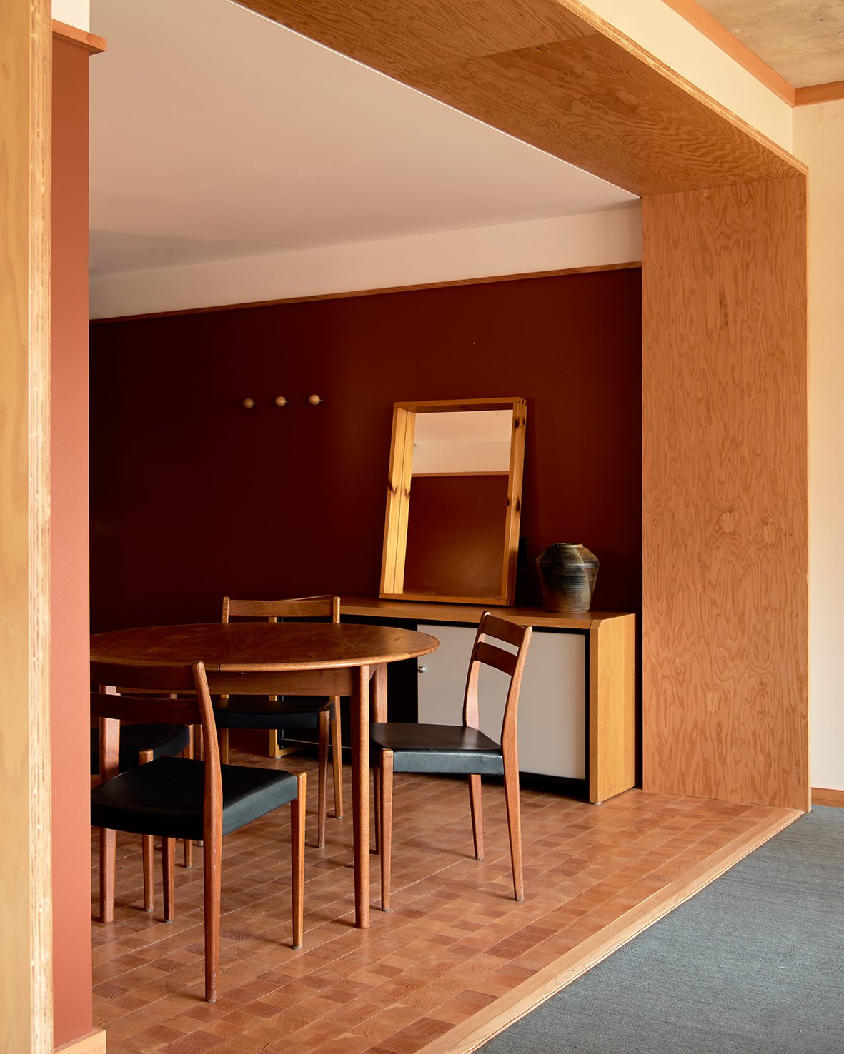
At its heart, Ace Toronto is a civic space built for gathering and trading in words, intimacies and bright ideas. A meeting of rough-hewn textures and sleek comforts, the hotel’s interiors, designed by Atelier Ace, take their cues from the city’s legacy of manufacturing and textiles as well as Ontario’s landscape of dense forests and looping riverways. Ace Toronto’s original art program features pieces by nearly 40 artists, the majority of whom share ties to the city. The far-reaching works enrich the hotel’s public and private spaces and glow of humanity.
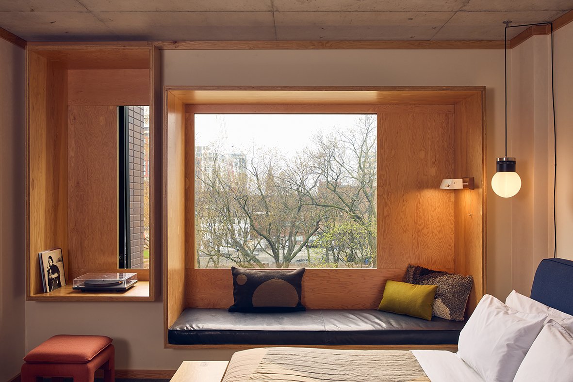
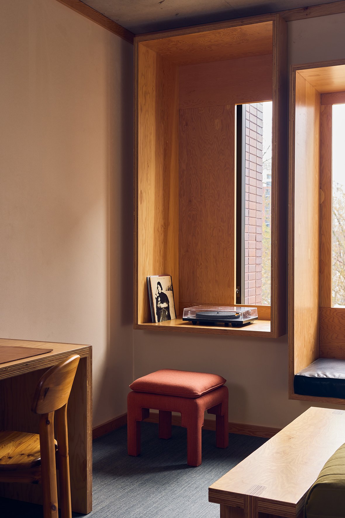
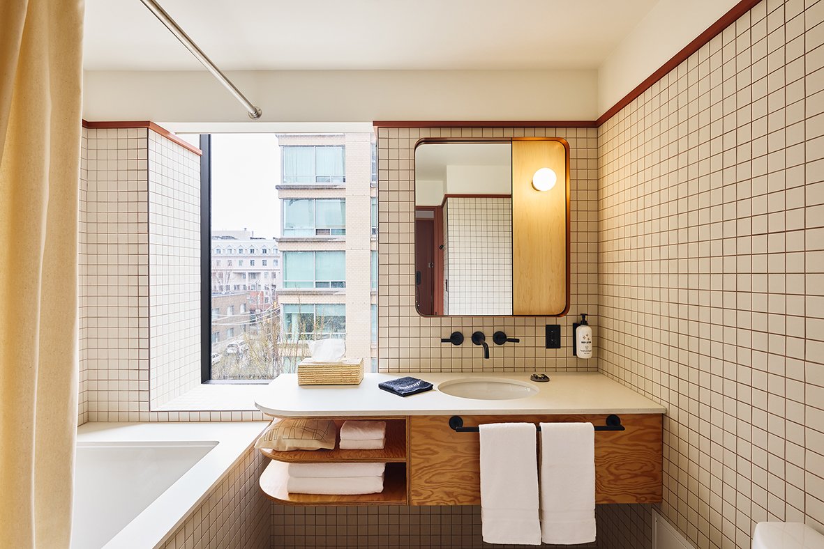
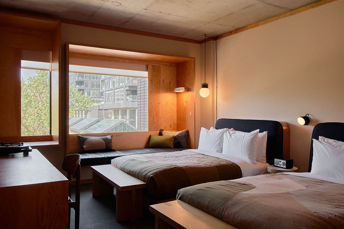
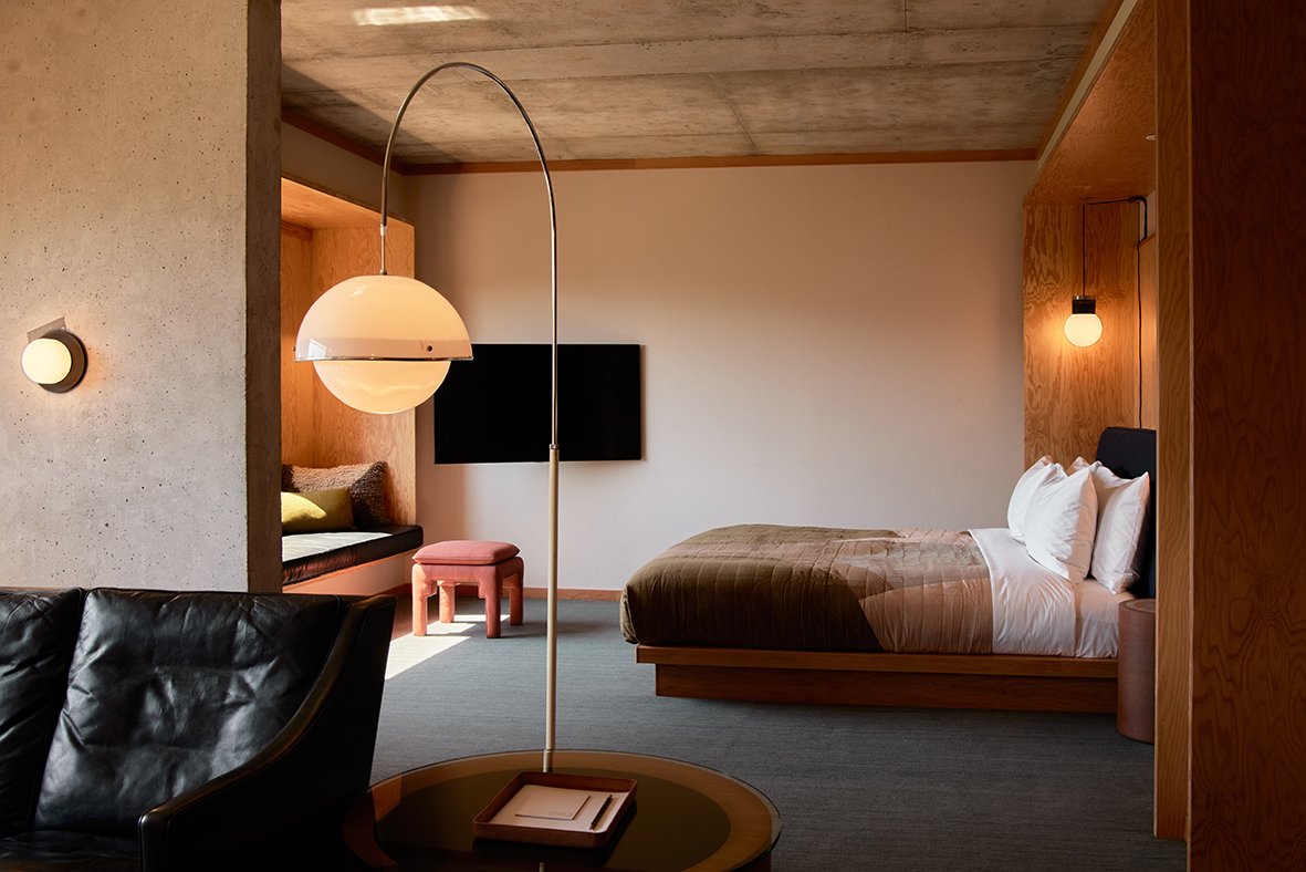
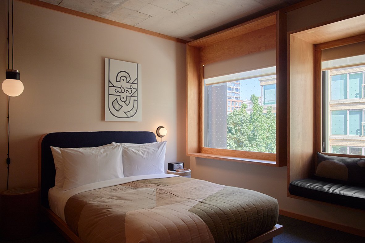
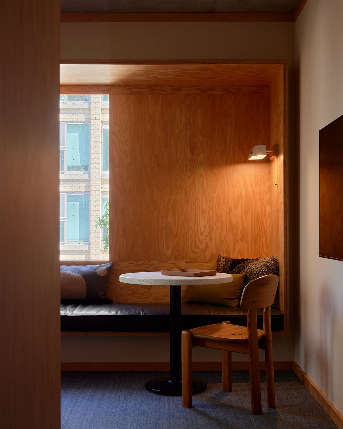
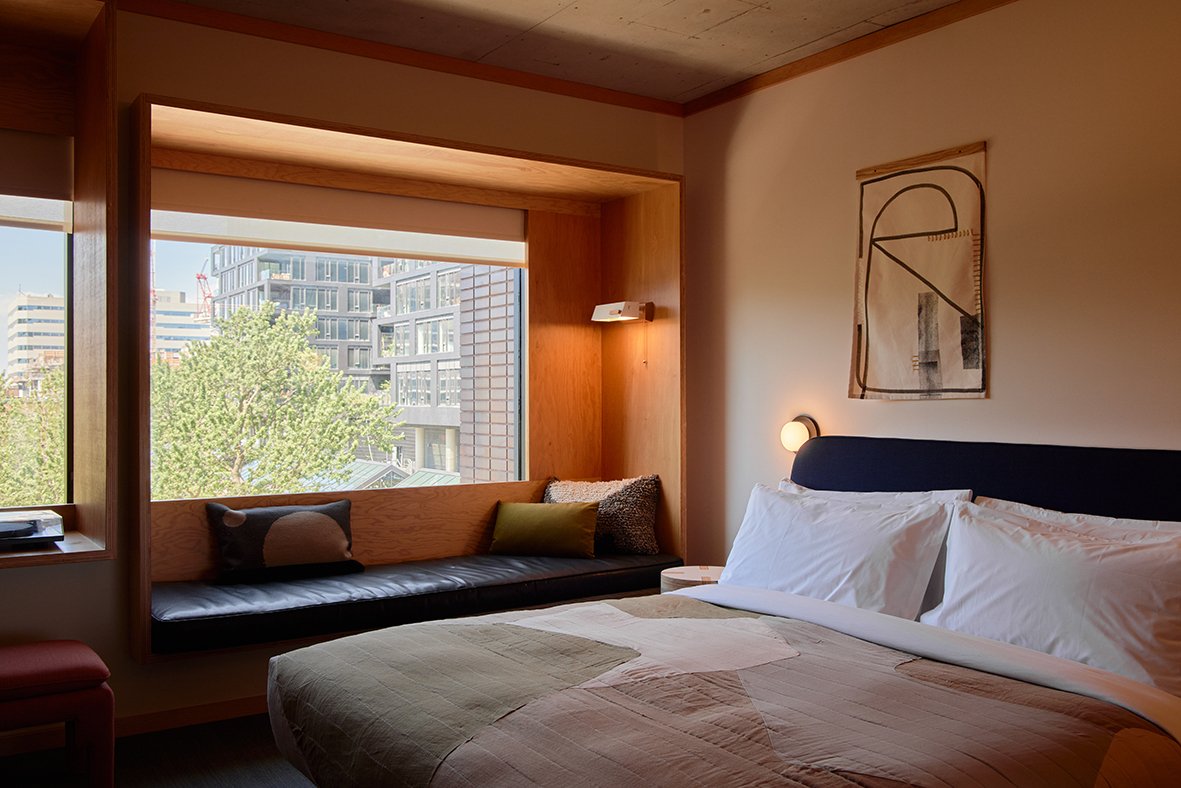
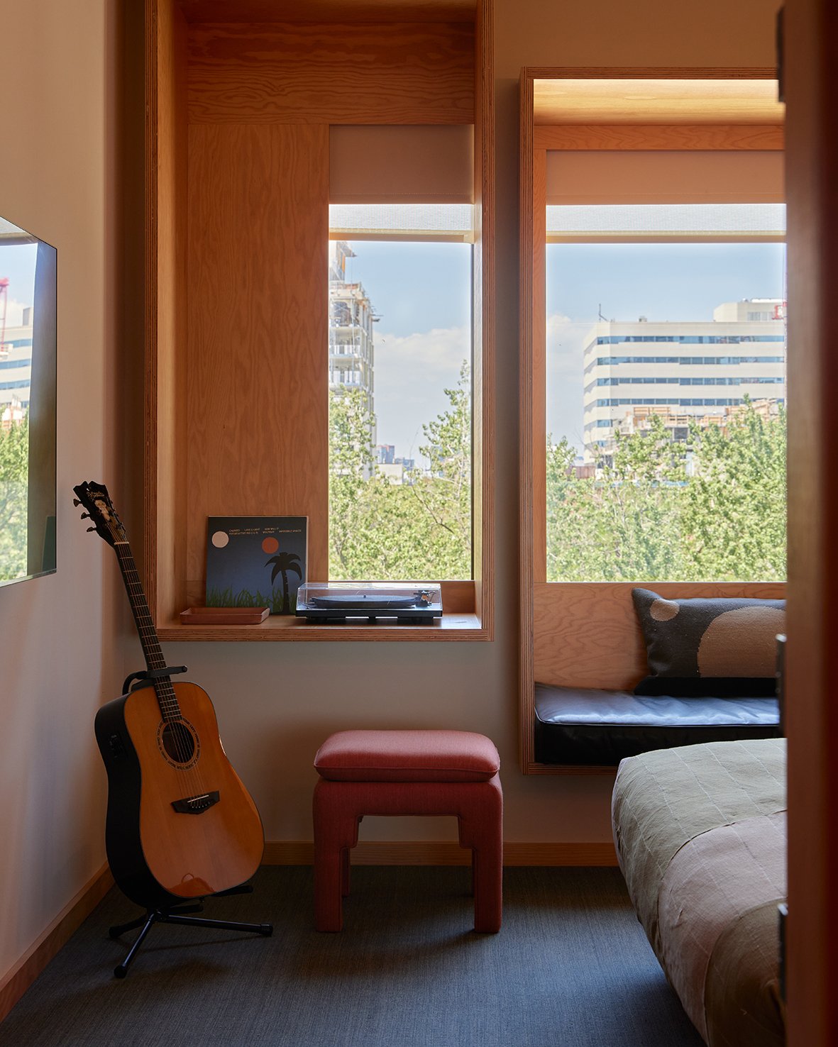
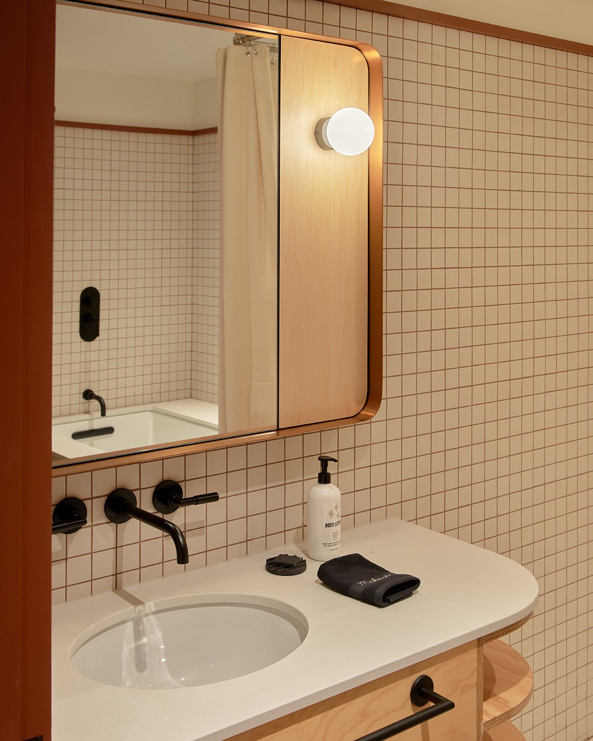
Guest suites are conceived as restful urban cabins, with Douglas fir panelling, copper accents, custom Shim- Sutcliffe lighting and side tables, and deep-set window benches built into the structure offering connection to the city’s shifting seasons and light. Considered material, constructed time, tremendous shifts of scale and sensitivity to place coalesce at Ace Hotel Toronto, bringing a future-facing structure and unprecedented creative centre to the city.
FOOD & BEVERAGE
Chef-Partner Patrick Kriss oversees all dining menus at Ace Hotel Toronto, working with Executive Chef Devin Murphy, who runs daily kitchen operations, and Pastry Chef Victoria Ammendolia. Widely regarded as one of the world’s top culinary talents, Chef Patrick holds the distinction of being awarded the title of “Outstanding Chef” by Canada’s 100 Best Restaurants consecutively from 2017-2020. His flagship Toronto restaurant, Alo, holds a rare four-star rating from The Globe & Mail, and in addition to Alo, Chef Patrick and his Alo Food Group own the popular and critically acclaimed local restaurants, Aloette, Salon and Alobar Yorkville.
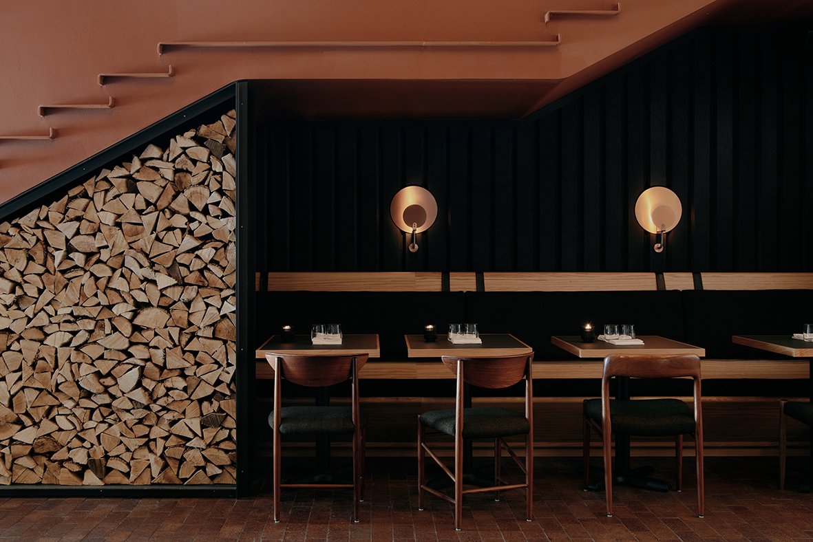
Alder aims to be an all-day hangout for Toronto, a welcoming, relaxed respite for both neighbours and farflung visitors. At the heart of the restaurant is its signature wood-fired hearth and grill, from which seasonal ingredients are gently transformed by open flame and smoke. For the menu, Chef Patrick draws inspiration from the gastronomic traditions and techniques long-practised in and around the Mediterranean. Highlights from the dinner menu include Half Grilled Chicken with harissa jus; Grilled Red Pepper Carpaccio with garlic, olive, anchovy and paprika; and for dessert, gluten-free Coconut Cream Pie and Dark Chocolate and Peanut Mille-Feuille. Alder also features a full bar program pouring classically inspired cocktails — such as the Tyrian with absinthe verte, browned yoghurt, pineapple and roasted coffee cream — local craft beers, and an eclectic selection of wines spanning a range of styles, varietals and both established and up-and-coming vintners.
Alder’s house red and white wines are specially blended and bottled for the restaurant by famed Canadian winery Pearl Morissette. Beverage Manager James Park oversees the bar program, and Sommelier Arashasp Shroff curates the wines. Alder opens for dinner August 9 with breakfast, lunch and brunch to come. Dinner reservations are now open, and can be booked via Alder’s Tock page.
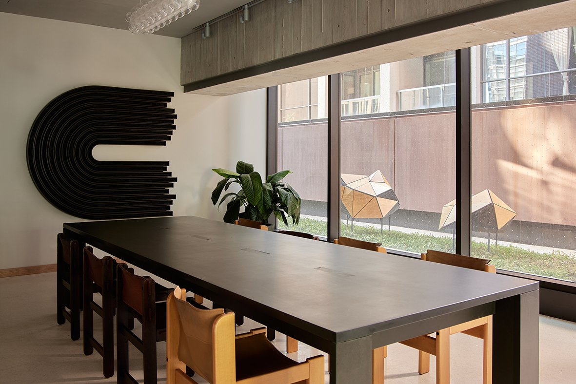
Continuing a long-standing Ace tradition of open community spaces, The Lobby is a stunning meeting spot offering a menu of pastries and locally roasted Sam James Coffee in the morning, followed by craft cocktails, wines by the glass, beers, snacks and shareable small plates later on. Menu highlights include Tuna Tartare with caper, parsley and crispy shallot; Alder Burger with griddled smoked havarti, bomba mayo and pickles; Potato Flatbread with lardo, rosemary and chili; an Everything Bagel Croissant; a Miso, Sesame and Ginger Cookie; and for drinks, the Ace Martini with local gin or vodka, vermouth blend, mastica and tarragon brine; and the nonalcoholic Good Vibes Only with spirit-free tequila, fermented pineapple, citrus and chili. The Lobby also features a robust calendar of music, arts and cultural programming. It’s open daily from 7AM–11PM, walk-in service only, with private space rental available. Located 14 stories high, rooftop bar and lounge Evangeline offers sweeping views of the surrounding cityscape.
The 80-seat lounge is spread across a cosy indoor area and an open-air patio, with DJs taking to Evangeline’s decks every weekend. A site of light-hearted fun and eats, Evangeline will serve snackable finger foods and small plates, along with beer, cocktails and wines by the glass. Evangeline will officially open later this year and will be open late night year-round.
Located 14 stories high, rooftop bar and lounge Evangeline offers sweeping views of the surrounding cityscape. The 80-seat lounge is spread across a cosy indoor area and an open-air patio, with DJs taking to Evangeline’s decks every weekend. A site of light-hearted fun and eats, Evangeline will serve snackable finger foods and small plates, along with beer, cocktails and wines by the glass. Evangeline will officially open later this year and will be open late night year-round.
Reservations are available for booking at acehotel.com/toronto, with rates starting at $399 CAD / $305 USD.
Ace Hotel Toronto is developed in partnership with Zinc Developments and Alterra Group.
Address: 51 Camden Street, Toronto, ON, M5V 1V2
Website: www.acehotel.com/toronto
For more details, please stay tuned for our online magazine.
ABOUT ACE HOTEL
Ace Hotel reimagines urban spaces for people who make cities interesting. Our approach to all our projects is simple — we seek to genuinely embrace local culture in the areas we inhabit. We bring together narratives, artists and materials that speak to the building, to the site and to the city. From there, we welcome in the alchemy that’s created. Our worlds are vast and dynamic. We build relationships with a wide range of people — makers, thinkers, creative do-it-yourselfers in the fields of art, technology, music, fashion, media and gastronomy. We are curious about the history and geography of the buildings and neighbourhoods we inhabit, and let these guide us to someplace new. By honouring the architectural, social history of a site, with an eye for the future that envisions respectful and nuanced dedication to a community, we create inspired spaces full of local art, intentional design and curious possibilities.
Ace was founded in Belltown, Seattle in 1999, with current locations in Seattle, Portland, New York, Palm Springs, Los Angeles, New Orleans, Kyoto, Brooklyn, Sydney and Toronto.
Design Pier capture the preciousness of time and the fragility of a moment
Design Pier returns for Designart Tokyo 2020, compiling a selection of high-end design objects that capture the preciousness of time and the fragility of a moment and compels them to experience life to its fullest. The selection includes unique and precious pieces that challenge commercially made objects' homogeneity and brings a refreshing perspective, creating an emotional attachment between products and users.
Design Pier returns for Designart Tokyo 2020, compiling a selection of high-end design objects that capture the preciousness of time and the fragility of a moment and compels them to experience life to its fullest. The selection includes unique and precious pieces that challenge commercially made objects' homogeneity and brings a refreshing perspective, creating an emotional attachment between products and users.


DAZINGFEELSGOOD (DFG) is a Singapore based design practice founded by Kiat Ng and Karen Chiam in 2015. Guided by design fundamentals, the practice reflects on rational and reduction approaches to explore, design, collaborate and create works that span across furniture, graphic and spatial design disciplines.
The practice has led DFG to produce works that are represented at international art and design platforms including Art Stage (Singapore), Maison&Objet (Paris), SaloneSatellite (Milan), and received recognition from A’ Design Award (Italy), Asia Design Prize (Korea) and Bolia Design Award (Denmark).
Objet is a series of modular planes in the expressions of geometric shapes connected in a methodical arrangement to create assemblages that function as lighting.
Title: Objet
Year: 2020
Dimensions: 500 x 500 x 500mm each (A series of 3 artworks)
Material: Acrylic with dichroic film
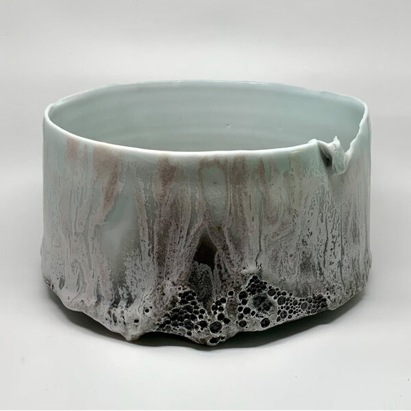
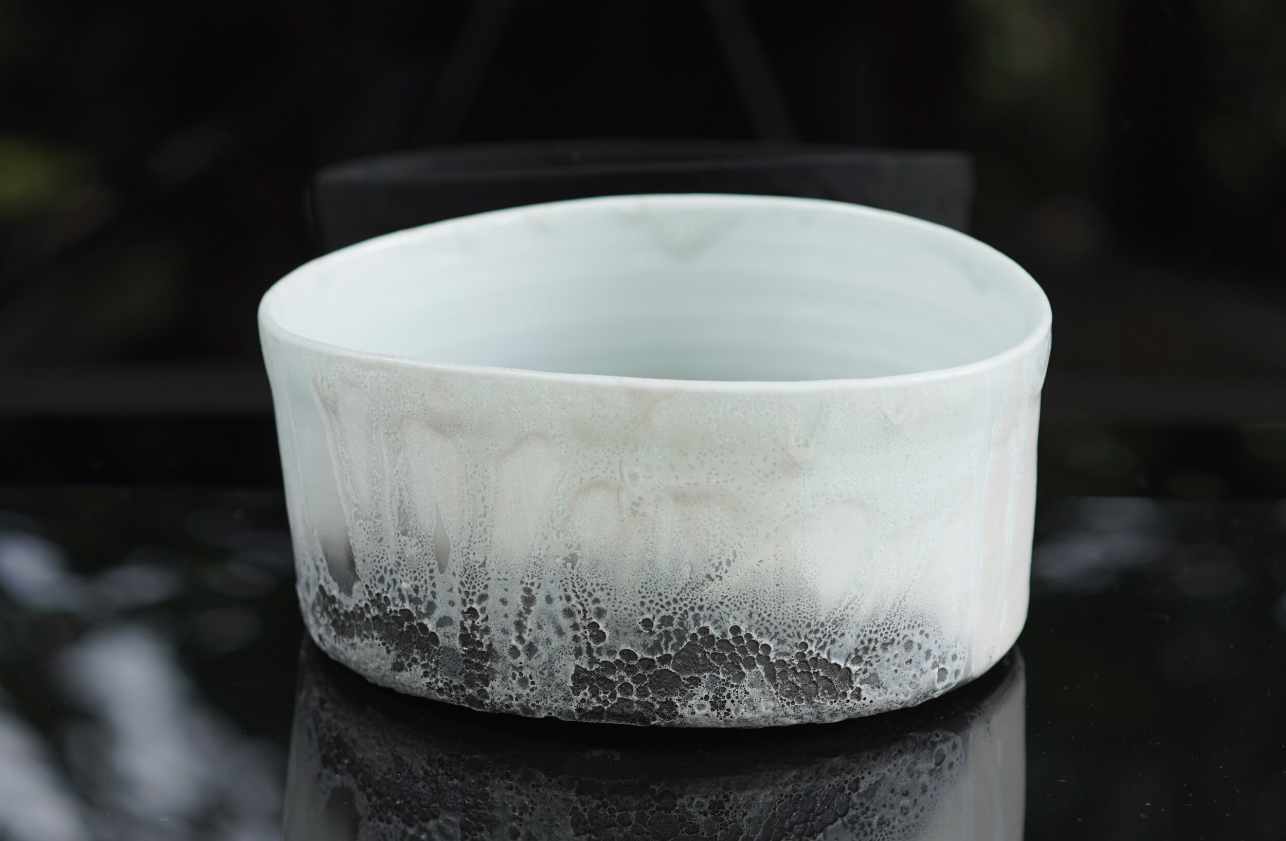
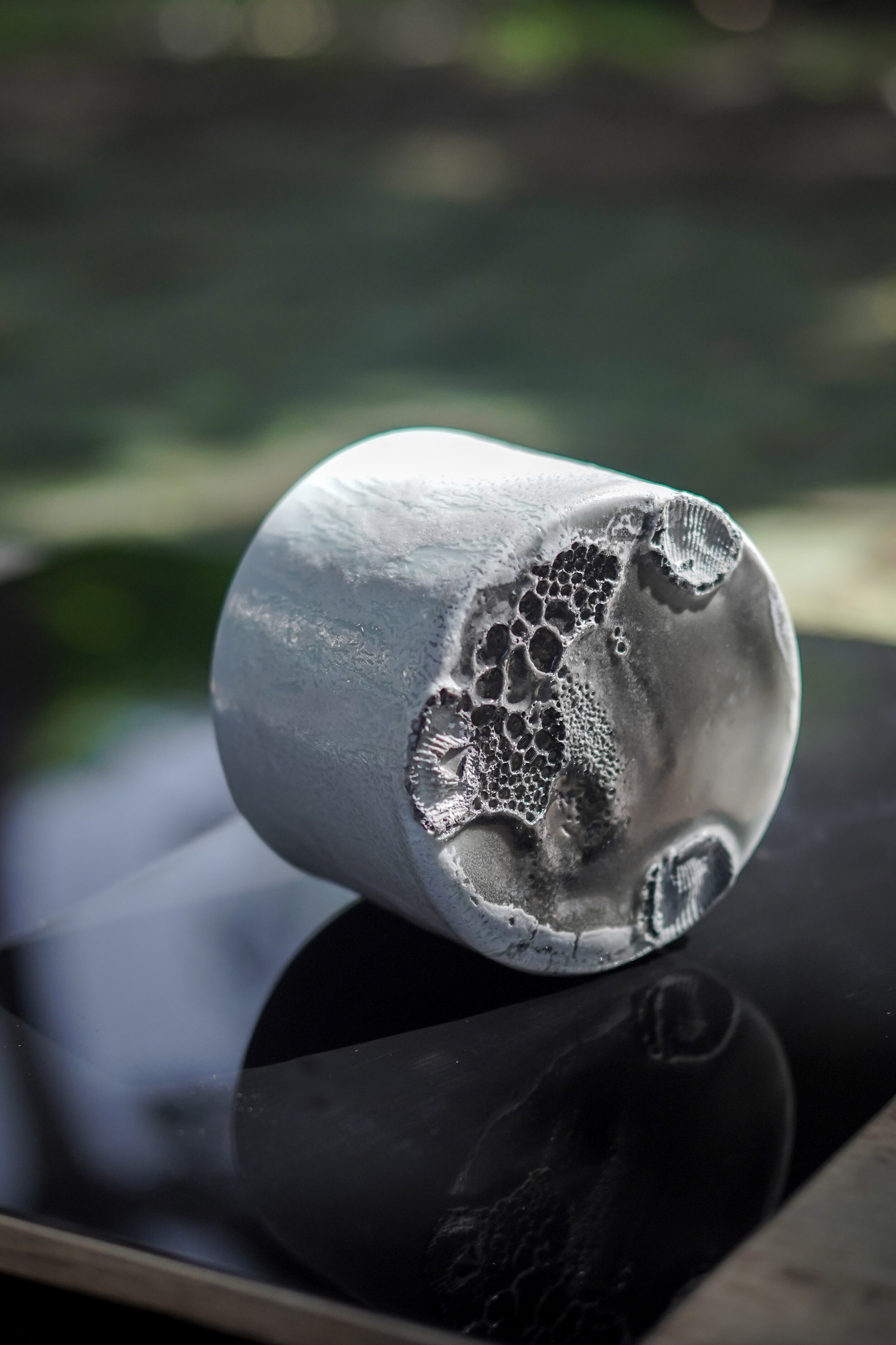
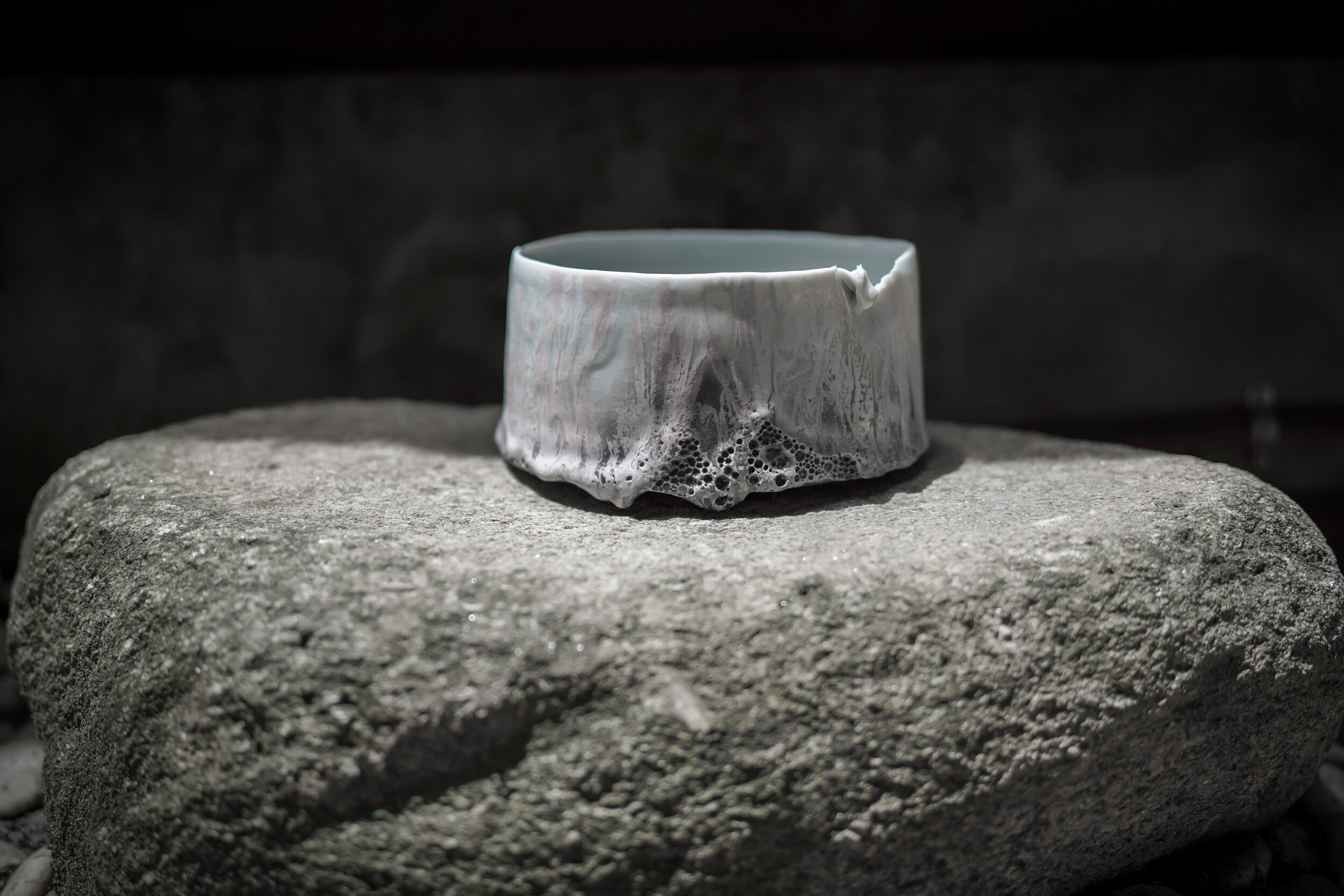


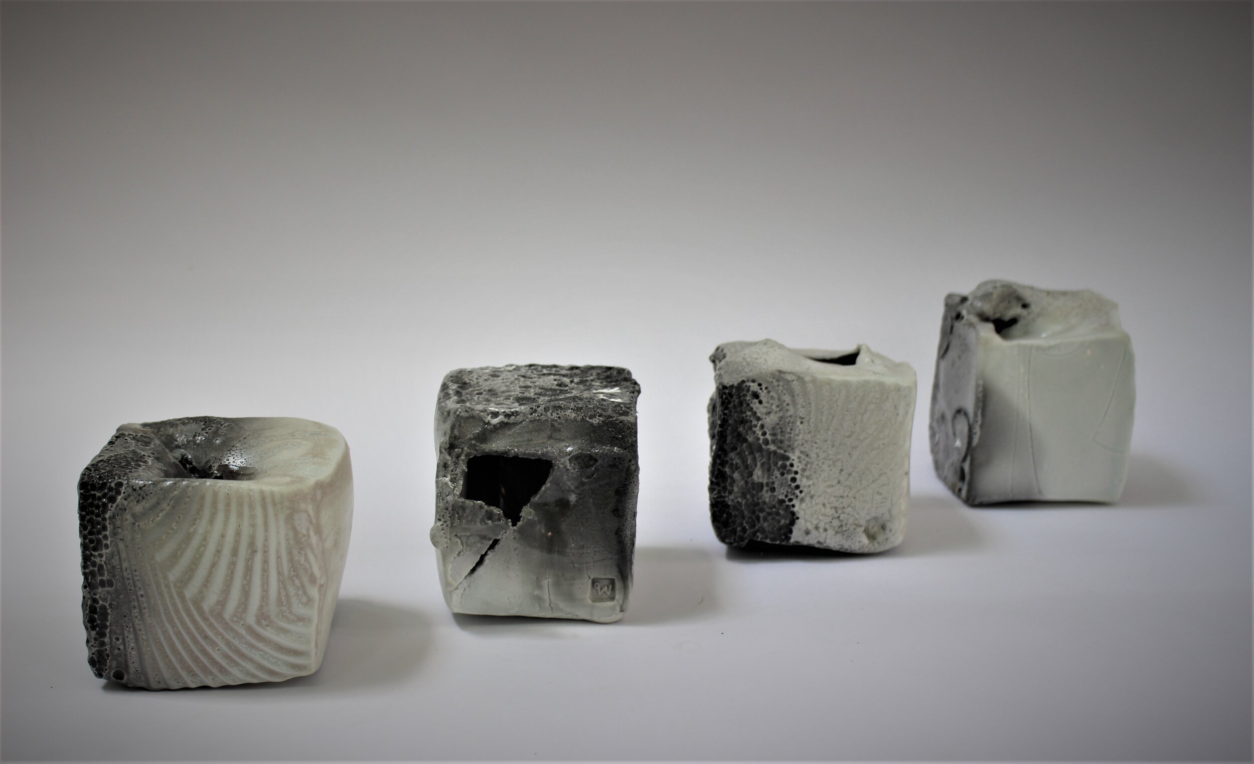
In my work I try to find a good balance between what is made and what is found. I want to submit to the nature of fired-clay, and keep certain evidence of my existence. That is my pride as a maker. I like boundaries and rules. Craftsmanship is very important to me.
I make vessels sometimes. Sometimes, I create an object with the intention of creating a vessel. When I take various kinds of minerals, clay, and different parts of Earth, arrange them in a specific way then heat them in my kiln and I feel like I am making a new type of rock in a very short time. The actual rock cycle in nature goes on for millions of years. In my lifetime I hope I can illustrate the process through my practice and bring it into the domestic settings and environments for people to experience.
Pim Sudhikam (1973/ Thailand): Pim holds a Bachelor of Industrial Design from Chulalongkorn University, Bangkok, and a Master of Fine Arts from HDK Gothenburg University, Sweden. Since 1998 Pim has been working with clay as her primary medium, investigating pottery as material, process and content. Her works include collections of objects, sculptures, and large-scale, site-specific installations. The works explore a balance between what happened and what being made while she tries to bring natural phenomena into the domestic context in the form of vessels. Pim has taken part in exhibitions, symposia, and residencies in Thailand and abroad. She has received “Awards of Excellence in Arts and Crafts” from the Ministry of Culture, “National Invention Award” from the National Research Council of Thailand, and an Honourable Mention from the 39th Ceramic Competition Gualdo Tadino, Italy. Pim is a board member of the Thai Ceramic Society and elected Council Member of The International Academy of Ceramics (IAC). Her studio is built among trees and gardens in the middle of Bangkok.
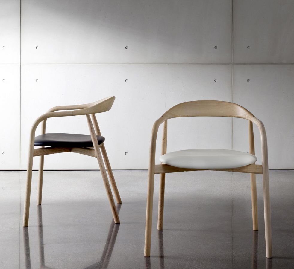

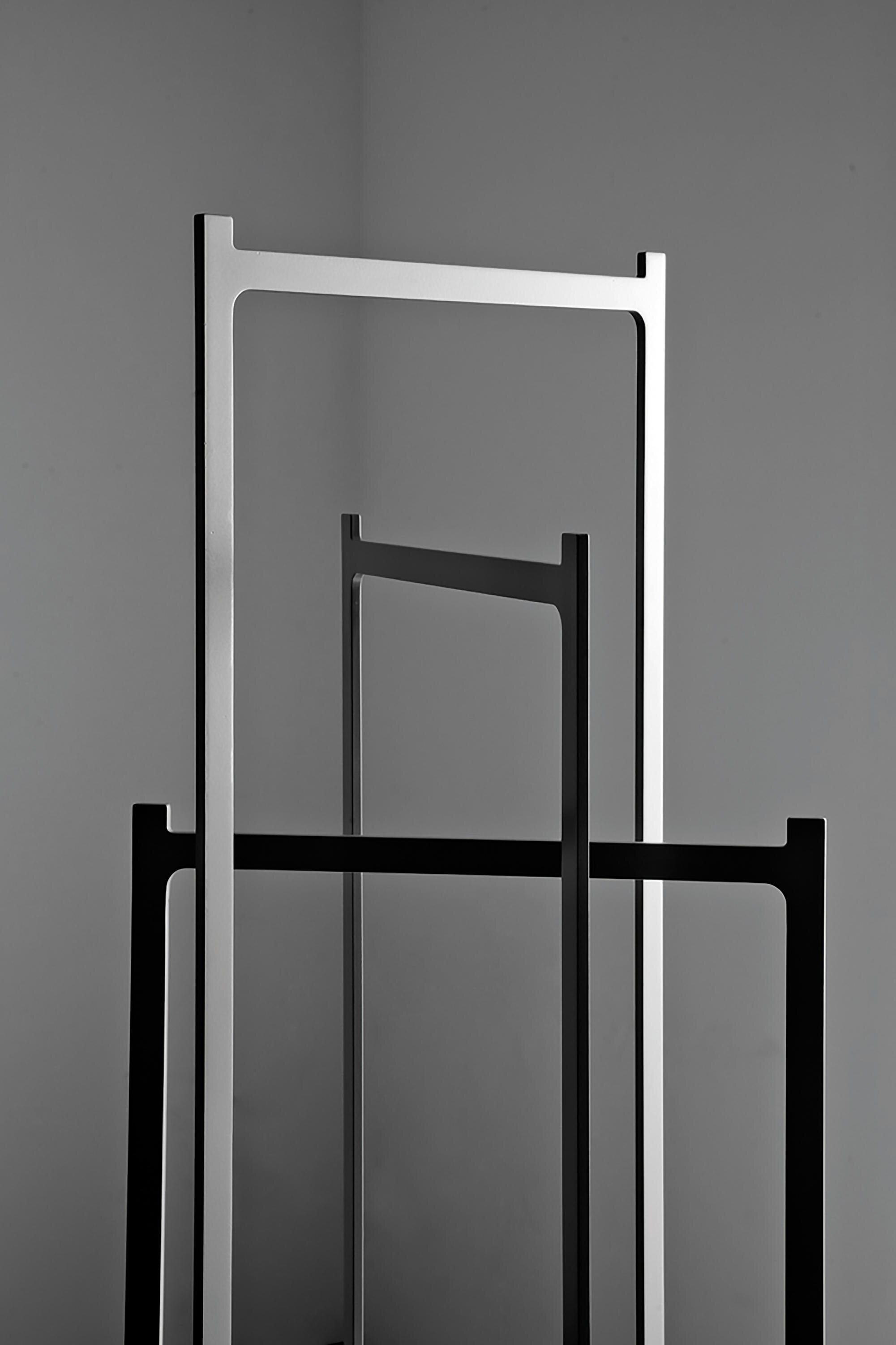
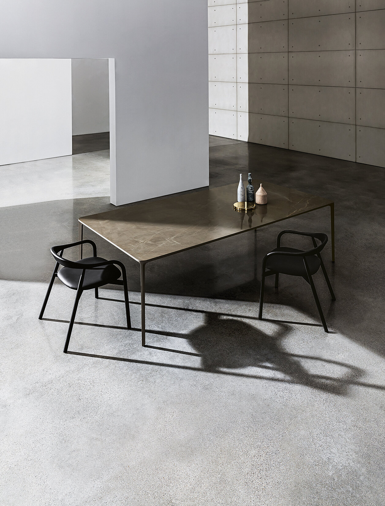
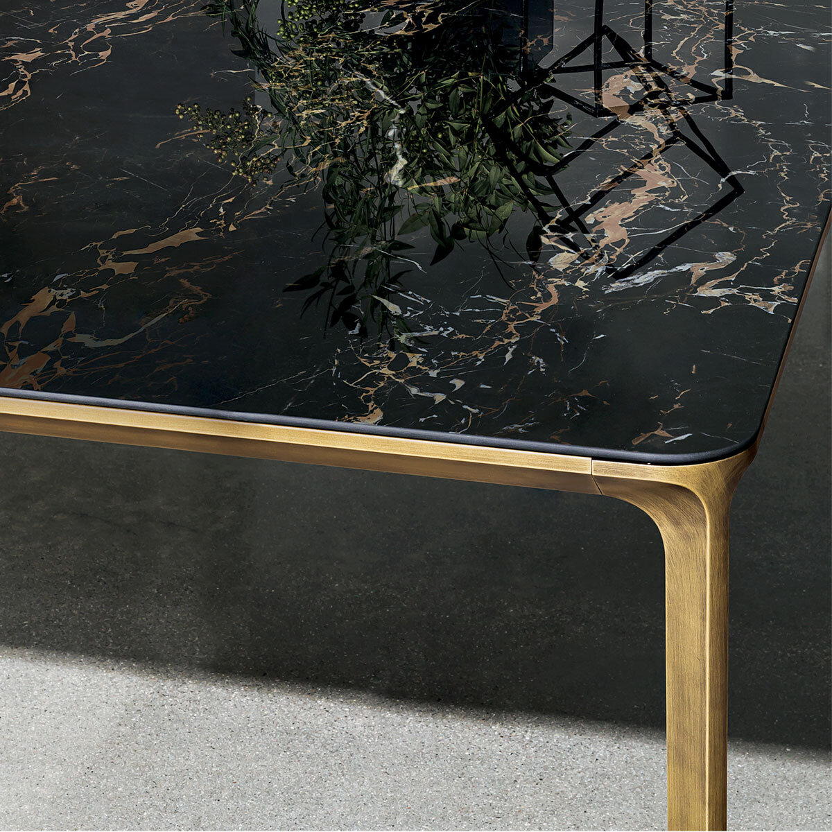
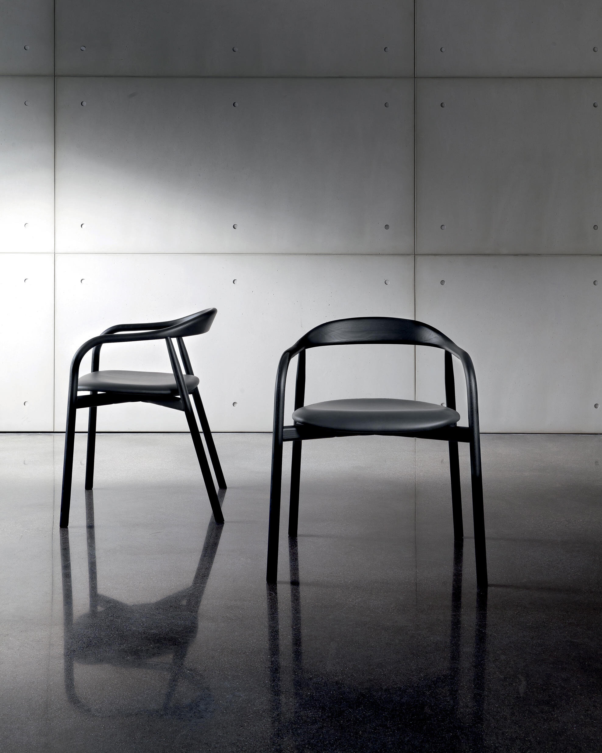
The Slim table, available in different sizes and heights, was designed by Matthias Demacker for Sovet. The designer sought the perfect balance between elegance and minimalism to create a model that can surprise the lines' lightness. Offering a selection of finishes that can fit any environment, Sovet's expertise in using materials added value to the model.
About Sovet: Sovet blends the Italian glass art tradition and the contemporary design inspiration to create furniture that speaks an original, elegant and versatile language. The company provides innovative material inspirations, combining elegance, sustainability and minimal design, focusing on the quality of the materials and the craftsmanship, the versatility of the project and the sustainability of the production process. Sovet is a new culture of living for home & contract spaces.
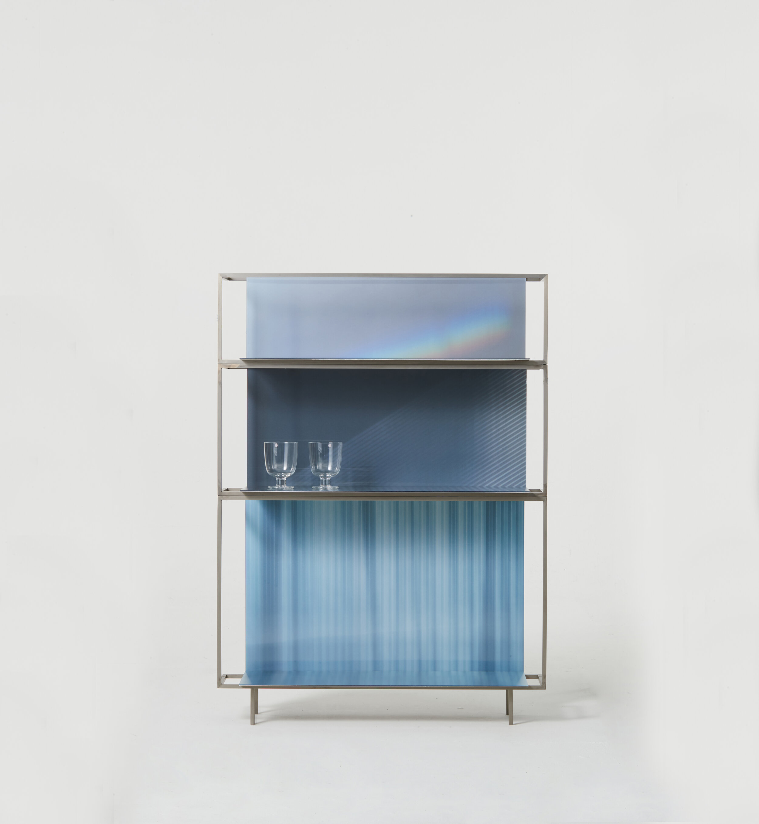
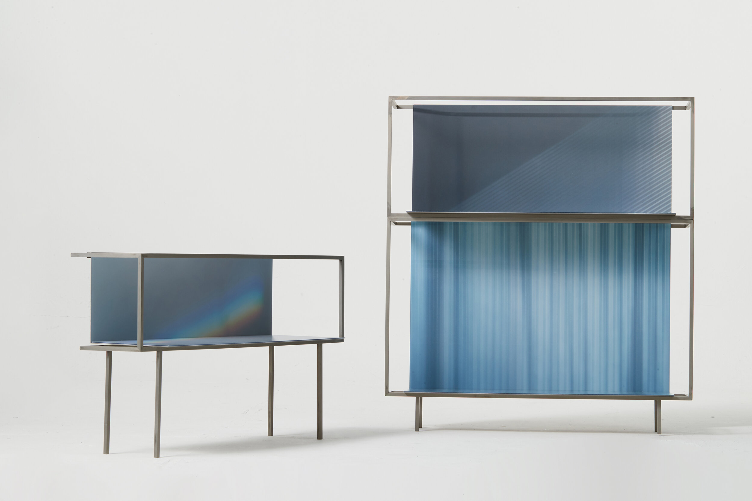
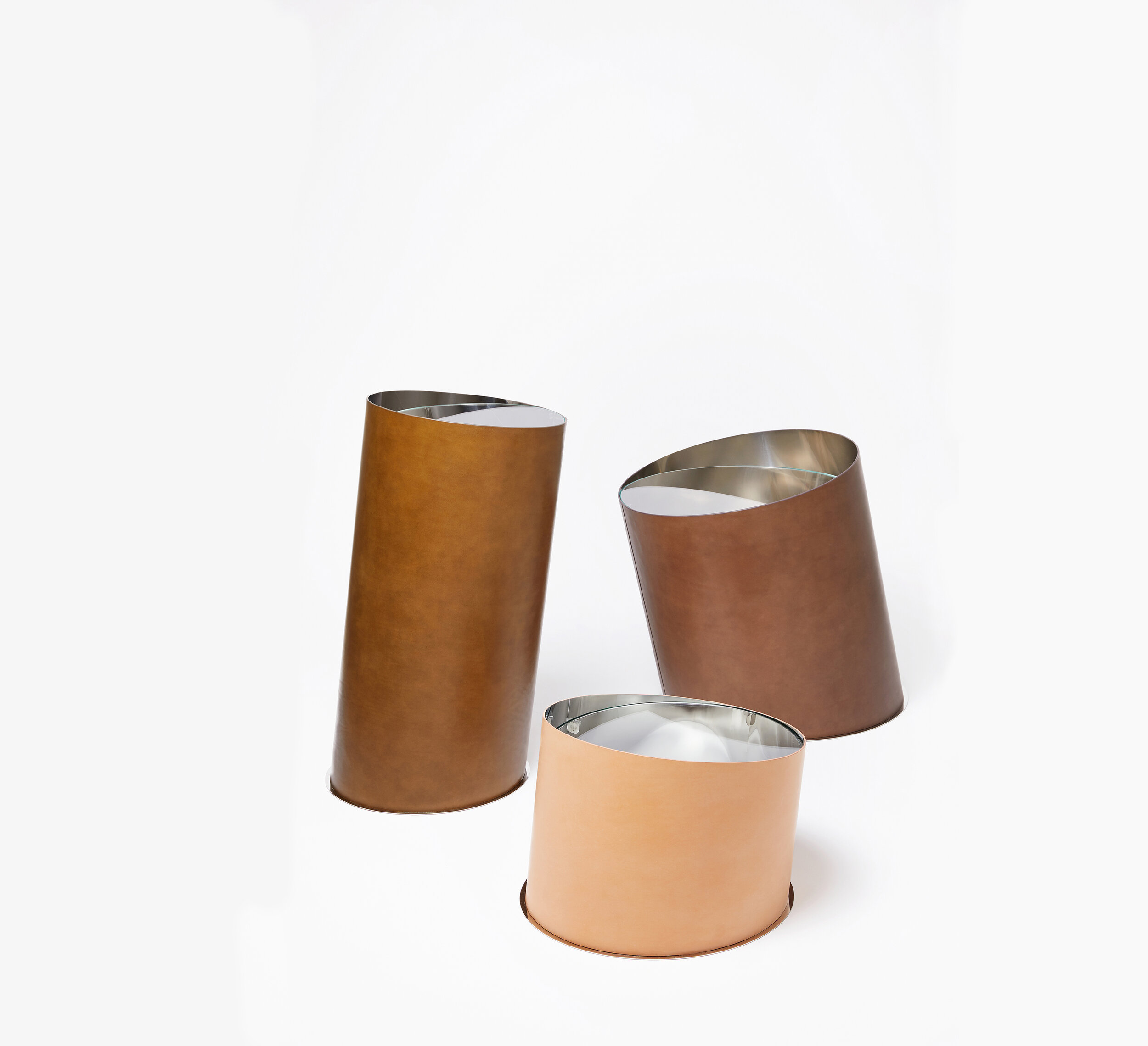
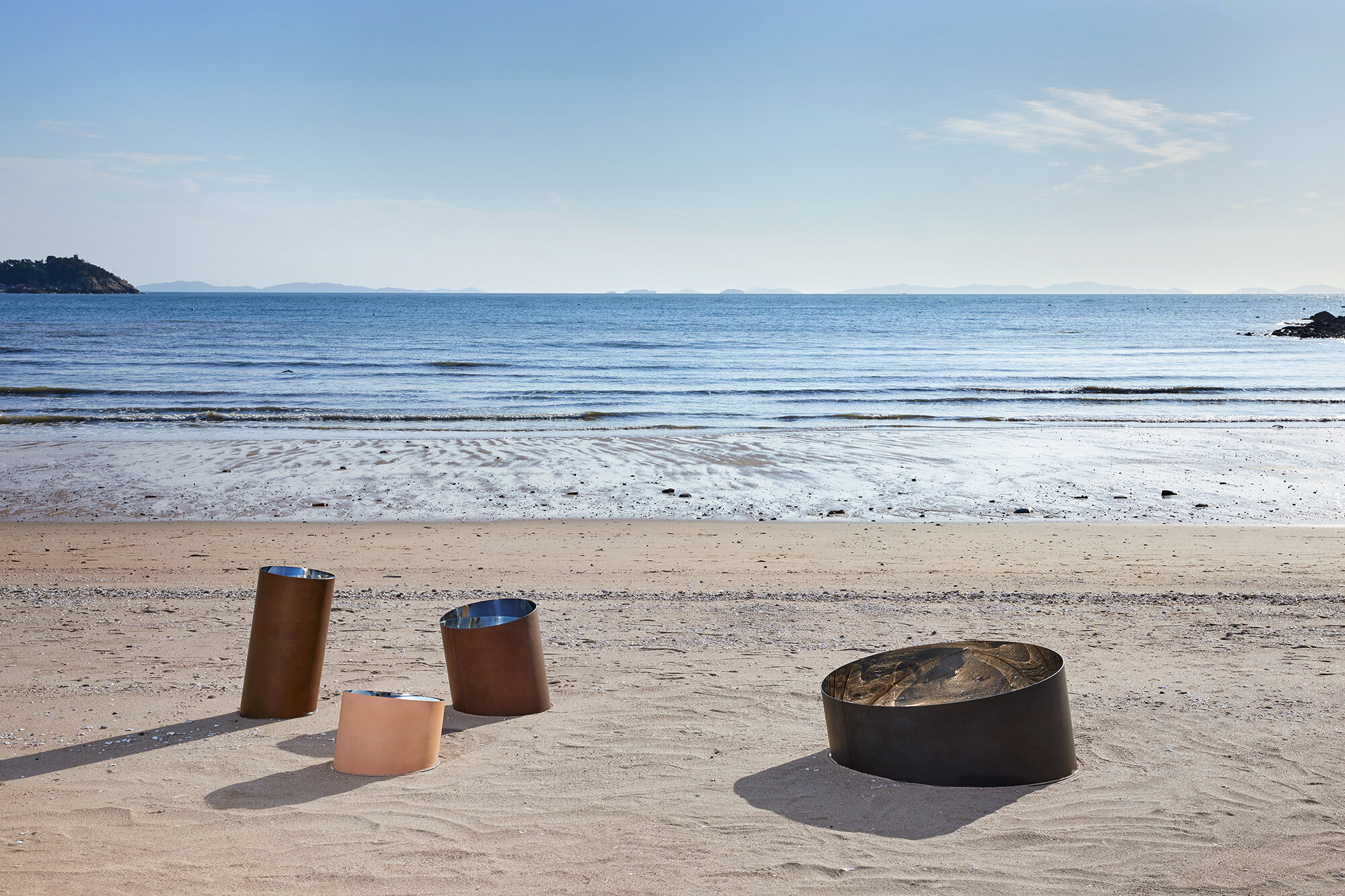
StudioEJ is a Seoul based design studio focusing on furniture and interior design.
“We try to make scenes of space that are created through unique relationships among objects and space.”
Printed Light 2020 is a shelf containing poetic moments drawn with natural light found in interior spaces. The light which is common in everyday life-light coming through the curtains in the morning, red light coming through the blind in the late afternoon and always nice rainbow (prism effect) on the wall-are applied to the spaces of different sizes to induce a warm light experience.
Happy Pixel intends more active and dramatic conversations with objects, which is interaction by applying a mirror to the lenticular as a pixel. If you apply a mirror to the naturalized pixelated image and reflect it on the mirror which is a part of the pixel, you will find a moment assimilated with the natural image.
With several years of working experience for architectural firms, she started her practice focusing on experimental and conceptual projects in a wide range of fields from small objects to space design. Her approach to design is to create a special and unique experience taking a fresh perspective on the mundane.
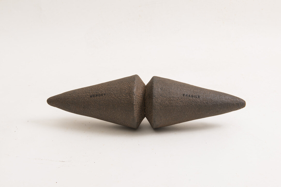
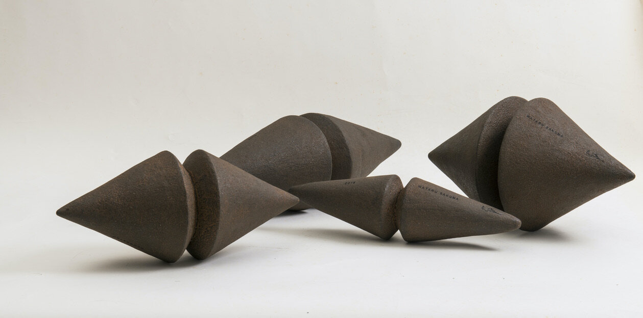
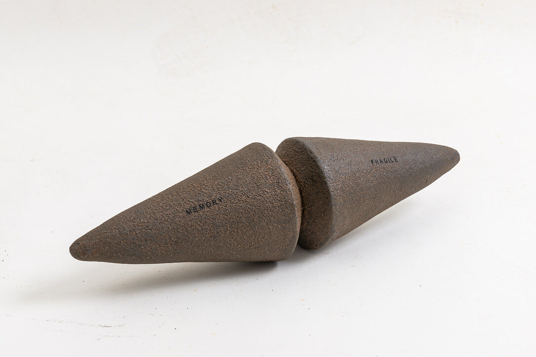
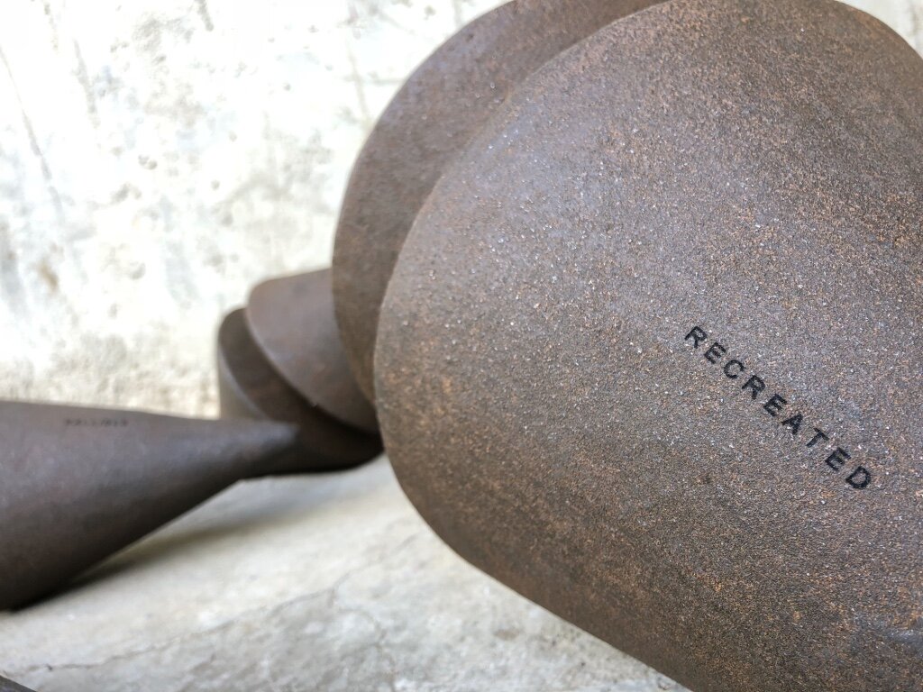
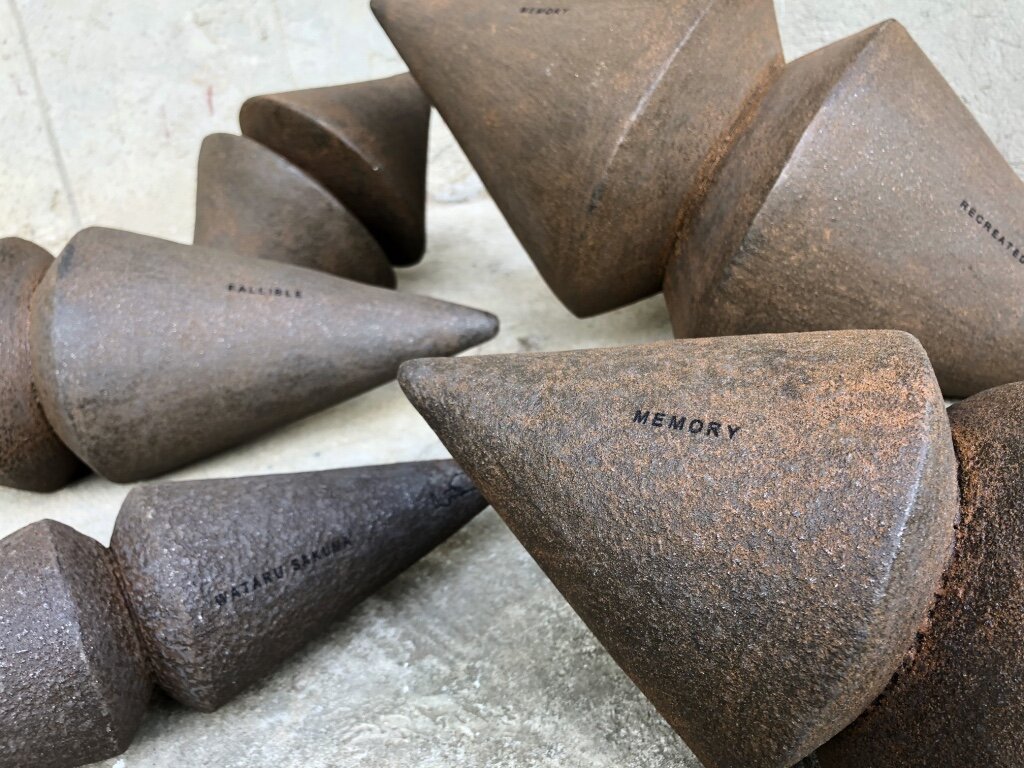

“Not what it seems to be”
Our memory is molded by daily social interaction with environment. We store the experience in our memory and we shape our own belief and faith.
We tend to judge and make decisions based on what we know. But more often things are “Not what it seems to be”.
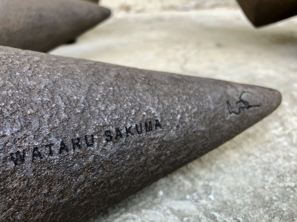
“Not what it seems to be”, the massive and masculine objects lead us to believe that they are made out of Heavy Black Iron, yet in contrary all the objects are made of light weight Recycled Carton. Once interacting with the objects, you would find out that they are not merely objects, but an instrumental pair of Maracas filled with natural seeds creating sound inside. Deceiving our expectations, they challenge our sense of perspective and question our own memory and faith while planting a New Memory through interacting with the pieces. Reminding us that Memory is Re-Created every day yet it is a Fragile, Mortal, and Fallible “Object” veiled by a thin layer of Rusting Faith.
THE DESIGNER
Wataru Sakuma is a Philippine-based Japanese designer with a strong background in fine arts. Famous for his creativity and ingenuity, Wataru uses even the most basic of materials, like paper, to create functional yet artistic pieces for urban living. His respect for nature and his ability to see something beautiful in discarded or overlooked materials gives his work conscience.
For more information, please visit: www.designpier.co or http://designart.jp/designarttokyo2020/en/exhibitor/design-pier/
Exhibition dates:Oct 27th – Nov 3rd, 2020
Hours:11:00 AM – 8:00 PM
Omotesando Hills Main Building B3F, Space O
Address:4-12-10 Jingumae, Shibuya-ku, Tokyo
About Omotesando Hills
Omotesando Hills is a unique cultural/commercial complex, emerging as the new face of Omotesando, which has transmitted various trends as the hub of Japanese fashion and culture.
The six-level atrium (three stories above ground and three underground stories) at the heart of the main building is complemented by the 700m “Spiral Slope” ramp (“the second Omotesando”) spiraling around the atrium space in an incline roughly equal to that of Omotesando. At the center of the atrium space is a grand stairway (from the first basement to the third basement), leading to a 548㎡ multi-purpose space, called “Space O”, in the third basement which serves as a base for imparting information.
The exterior wall holds a 250m long LED display called “Bright-Up Wall”, illuminating the nightscape of Omotesando.
These creative spaces are combined with “selective” stores mainly positioned along the Spiral Slope, “MEDIA SHIP.”, involved corporations, participating artists, and trend-conscious people who gather at Omotesando Hills combine together in order to evolve the complex into a new facility with unparalleled expressive ability. It is the venue for various events related to fashion and art and continues to generate the latest news.

