

Higeta Building, designed by MR STUDIO Co., Ltd. (Japan)
A company with a rich history spanning more than four centuries faces a distinct design challenge: how to showcase its heritage while creating a modern workplace for employees and visitors alike. At Higeta Shoyu’s new headquarters in Nihonbashi, MR STUDIO masterfully strikes this balance with an environmental graphics system that utilizes hues, light, and the traditions of soy sauce production.
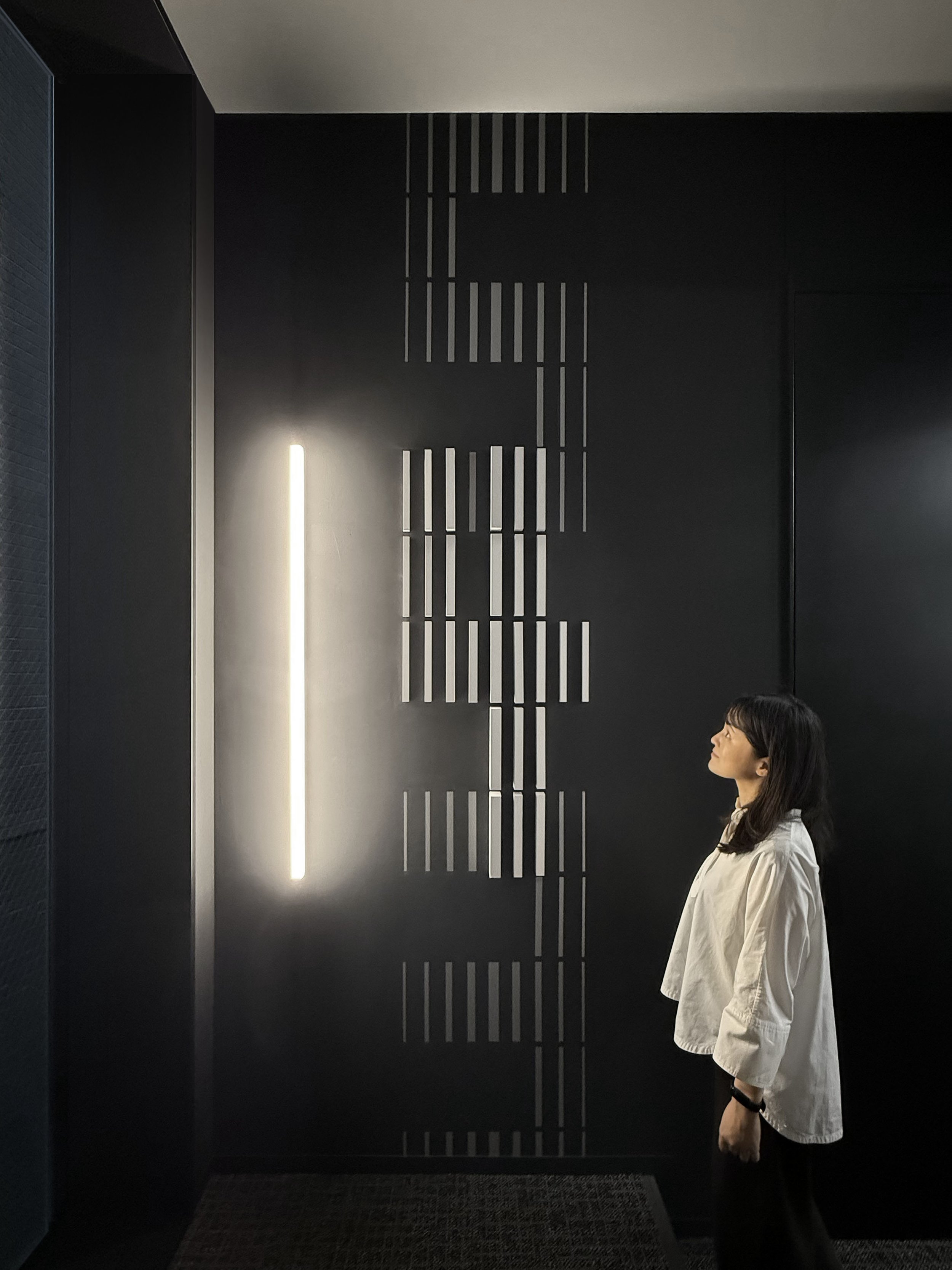
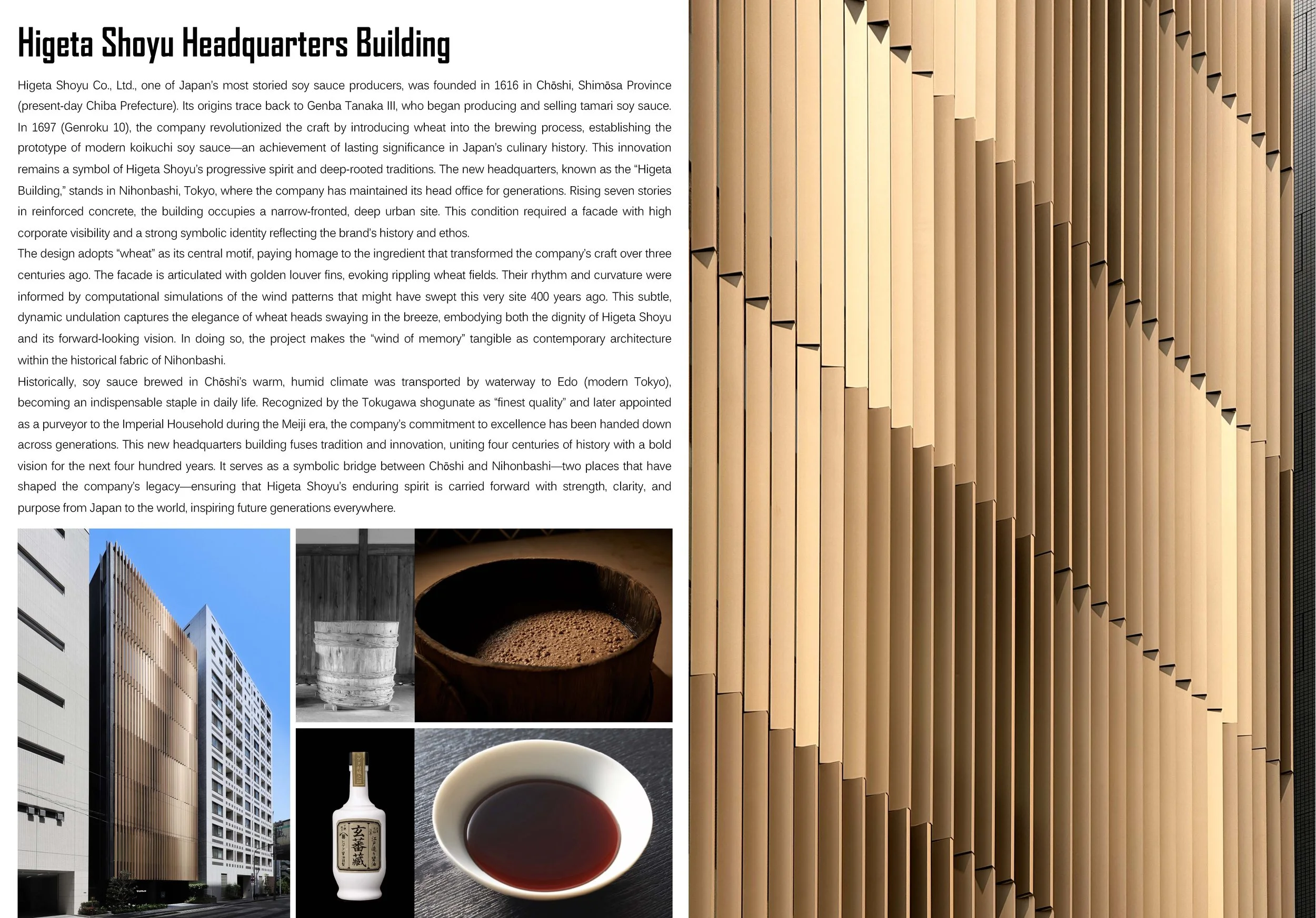
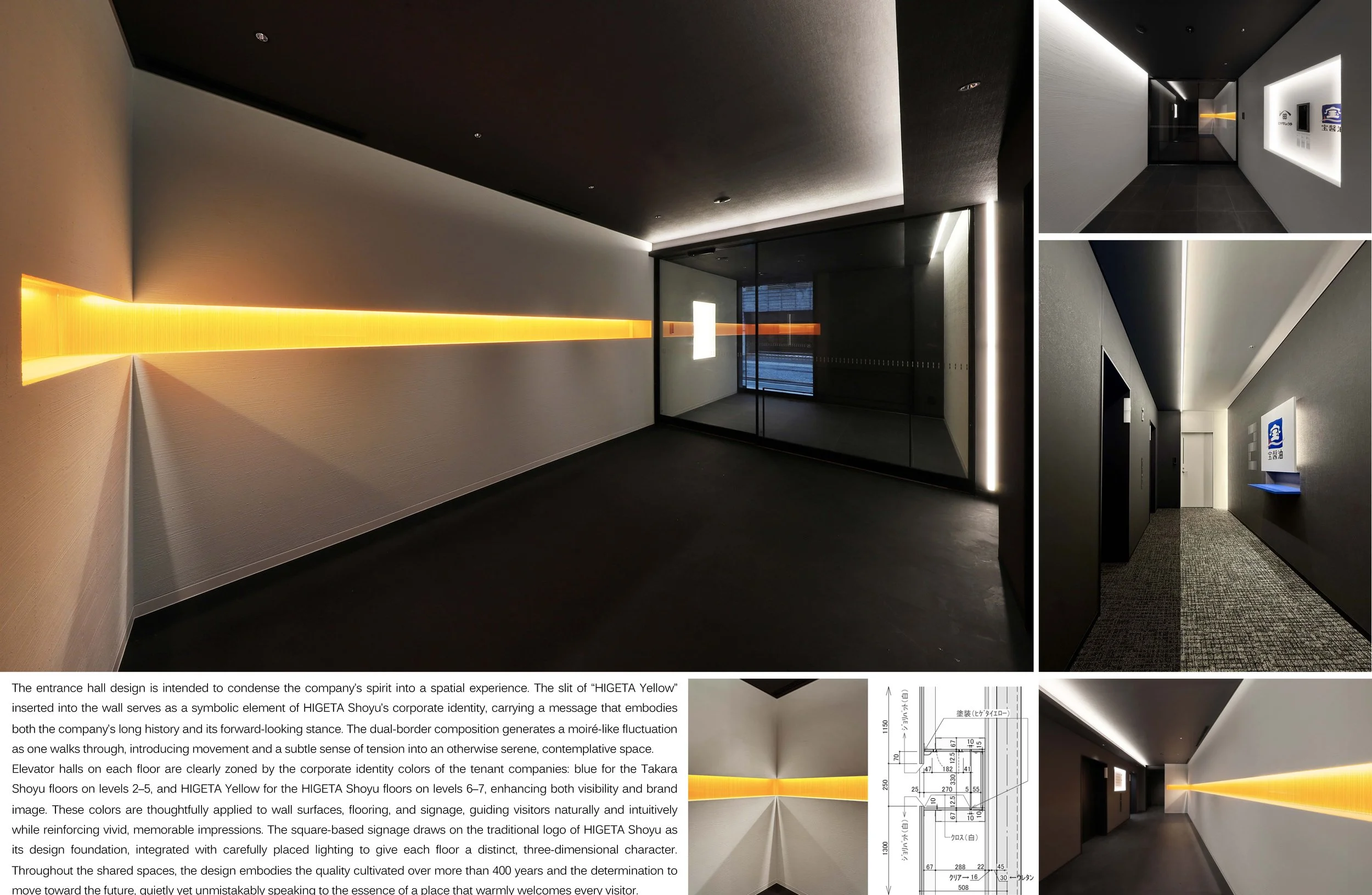
Founded in Chōshi in 1616, Higeta Shoyu revolutionized its brewing process by introducing wheat in 1697, paving the way for the development of modern koikuchi soy sauce and establishing a legacy of innovation. Drawing on this rich heritage, MR STUDIO enhances everyday experiences within the building, allowing tradition to shape arrival, orientation, and movement. Visitors are first greeted at the entrance, where a narrow band of HIGETA Yellow is embedded in the wall. This luminous element serves as a striking point of recognition while upholding the professionalism expected in a corporate setting. As visitors proceed, a double border creates a subtle moiré effect, giving the edges a shimmering appearance.
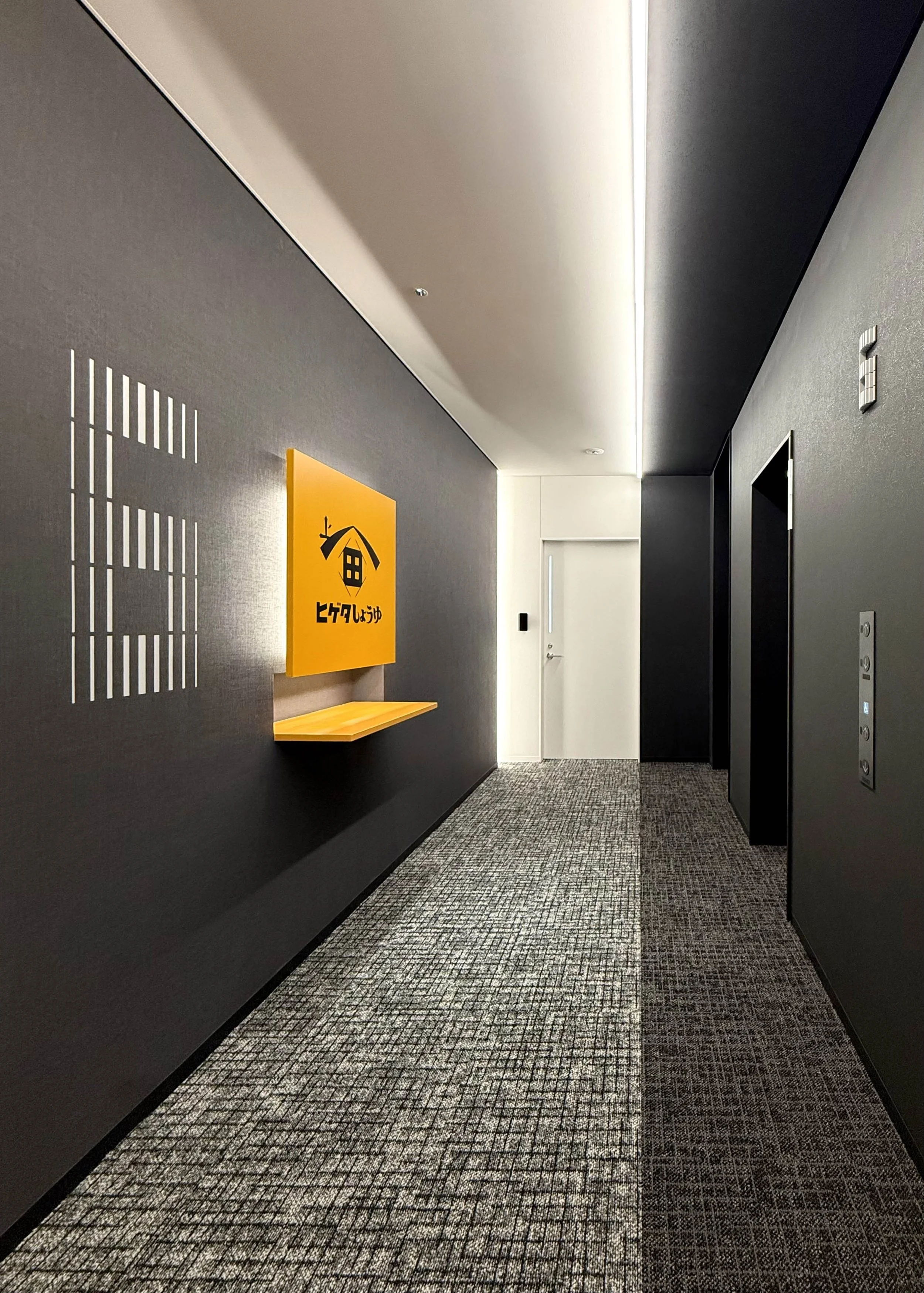
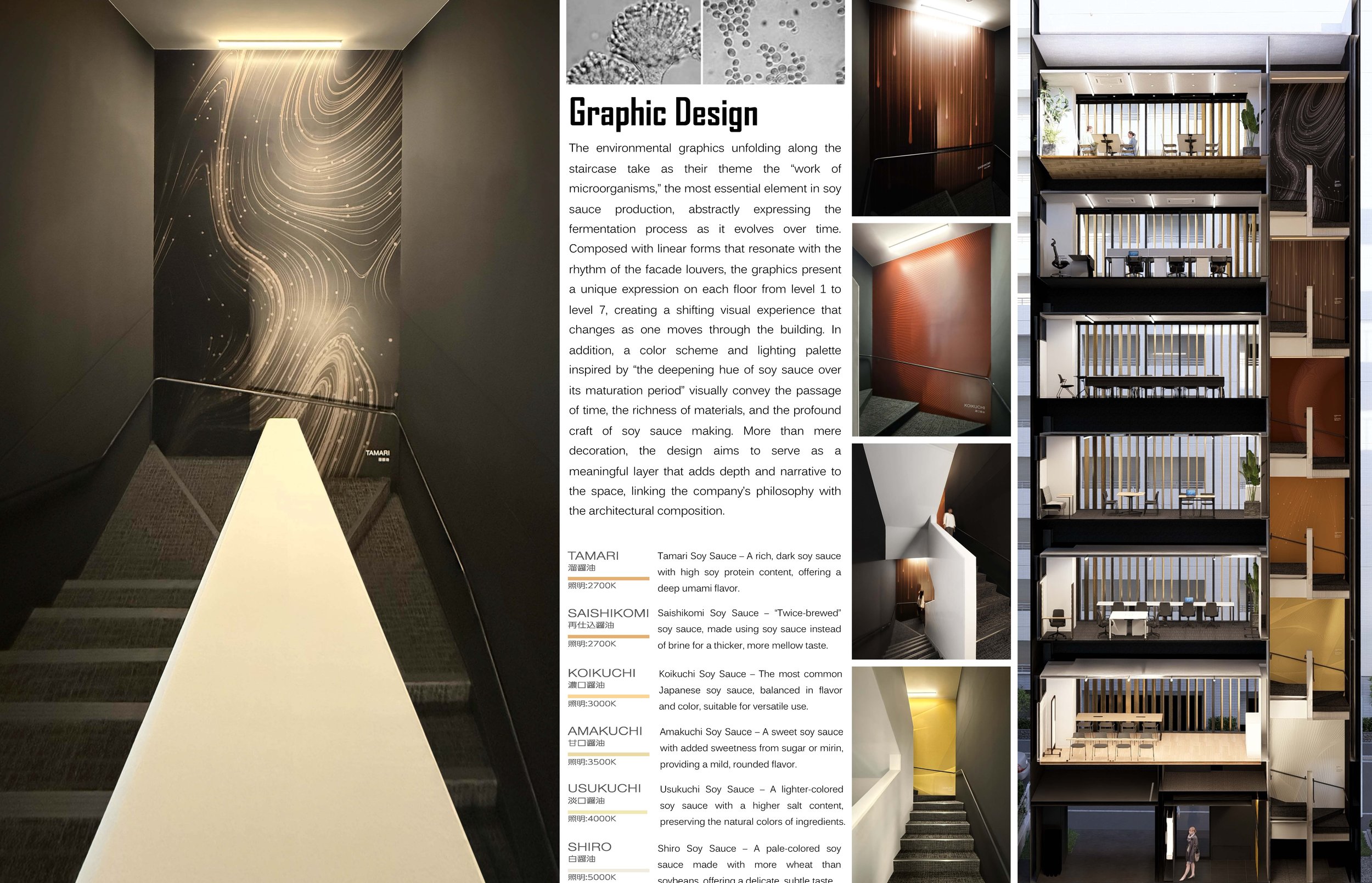
This design encapsulates the essence of Higeta’s story: a company steeped in centuries of craftsmanship that continues to evolve. The entrance symbolizes the delicate interplay between continuity and progress, allowing history to be experienced through movement before being articulated in words. Different shades play a pivotal role in guiding individuals throughout the headquarters. Blue signifies Takara Shoyu on floors two to five, while HIGETA Yellow marks Higeta Shoyu on floors six and seven. These tones, applied to walls, floors, and signage, enable intuitive navigation and foster a sense of place within the shared environment.
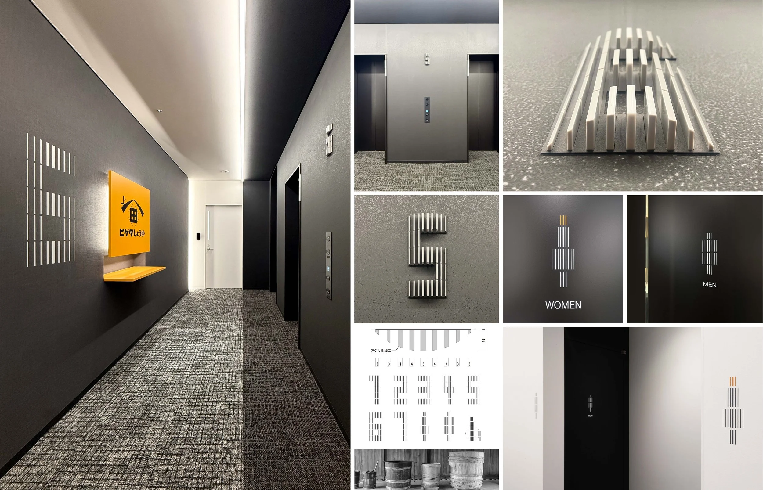
For employees, this creates a cohesive workplace identity encountered repeatedly throughout the day. For visitors, it offers immediate orientation within the building. This unified visual language transforms navigation and corporate identity into memorable experiences. The square geometry of the historic Higeta logo serves as the foundation for signage, floor indicators, and directional elements. MR STUDIO adapts this familiar shape, incorporating integrated illumination and controlled depth to provide a contemporary architectural presence while preserving a connection to the company’s established identity.
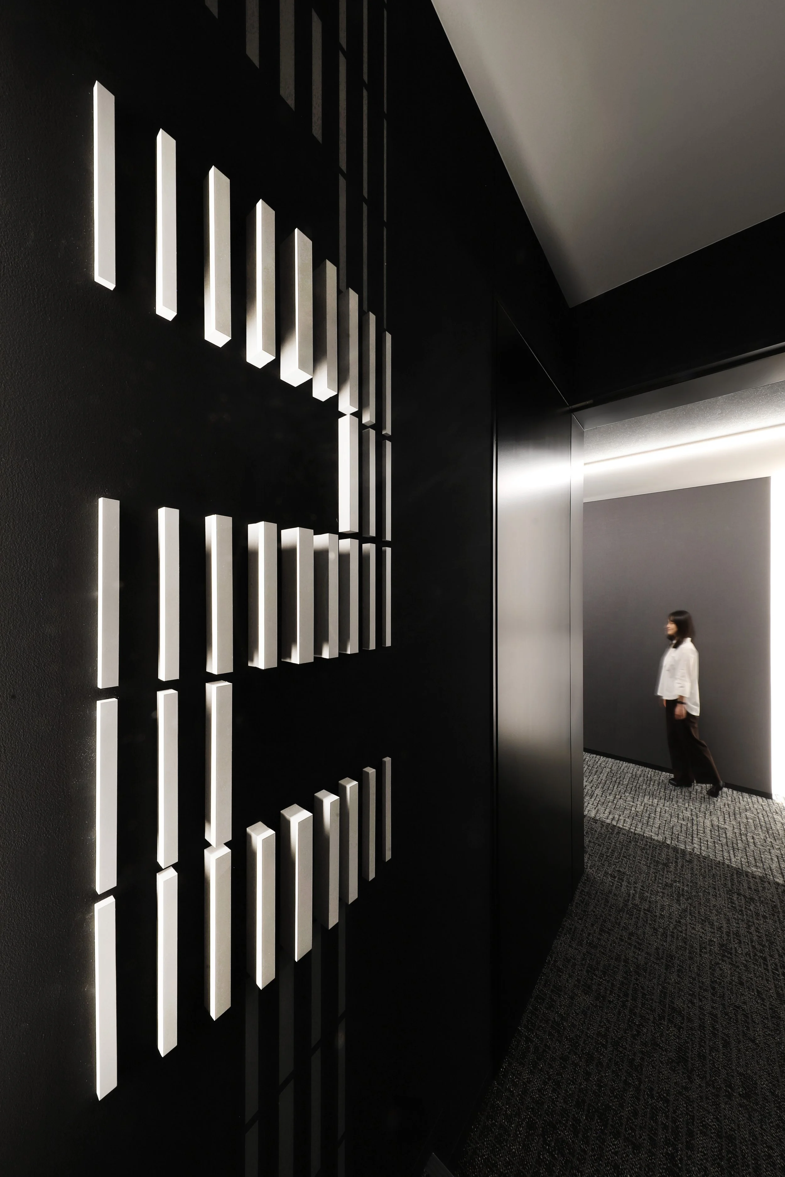
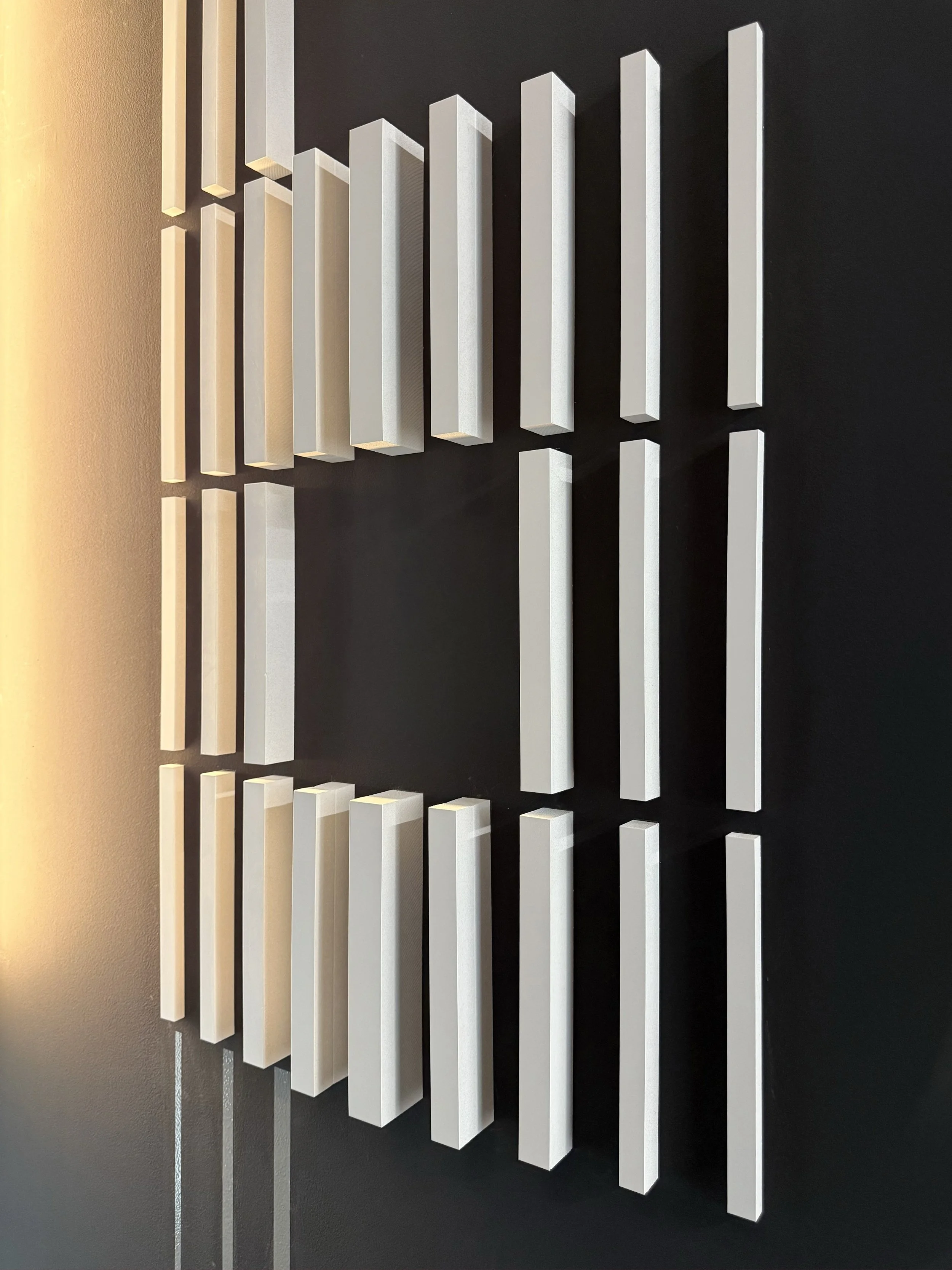
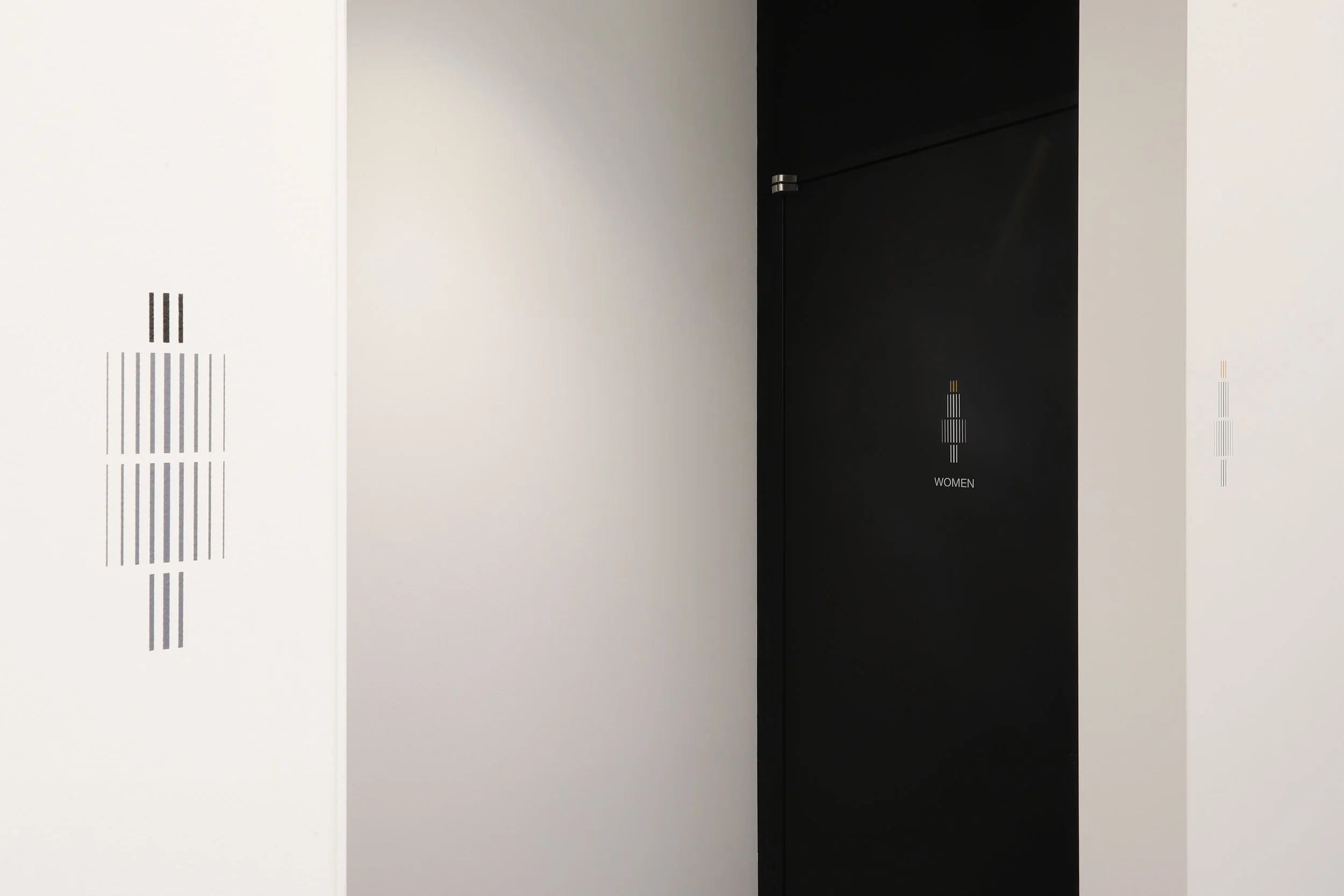
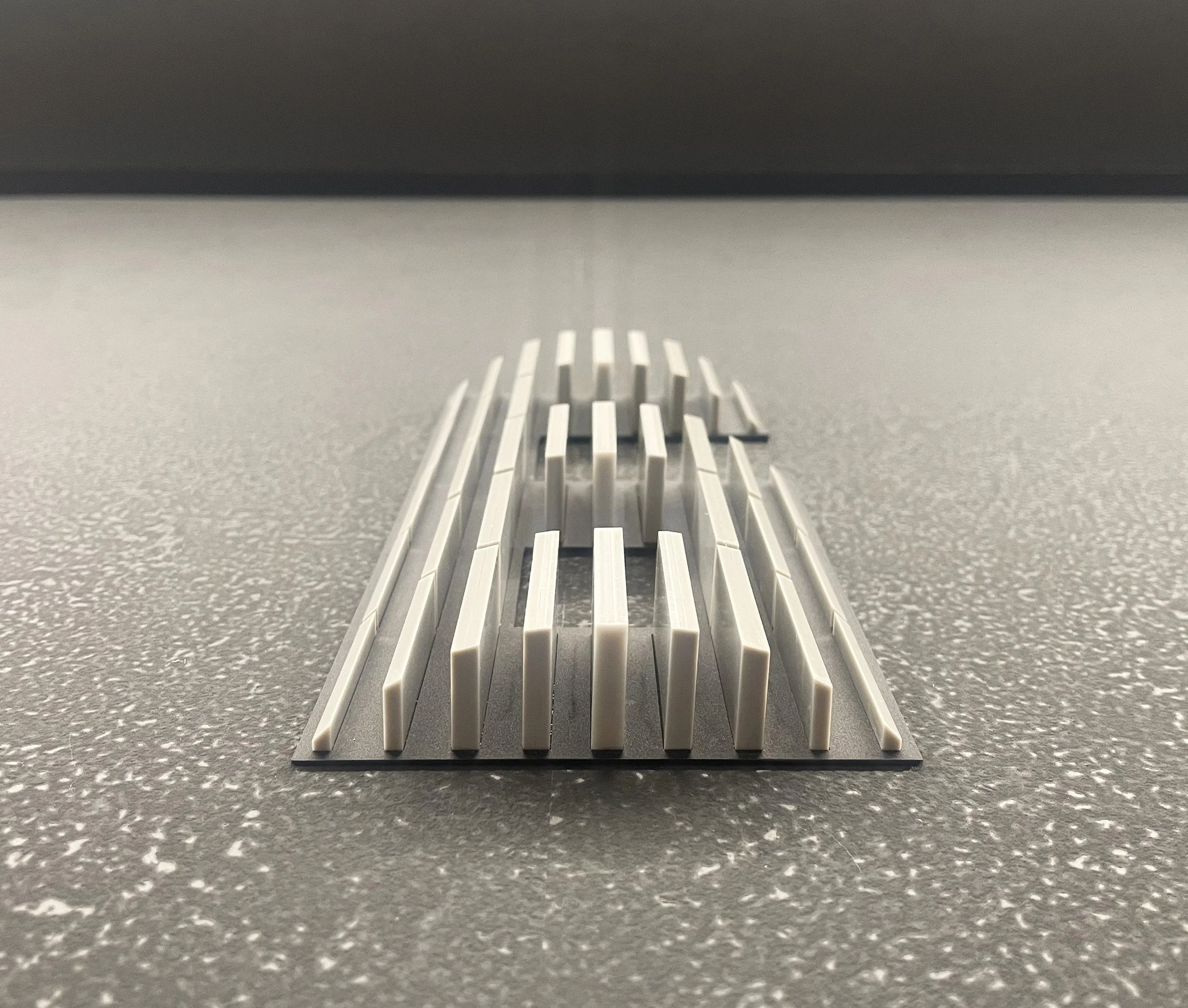
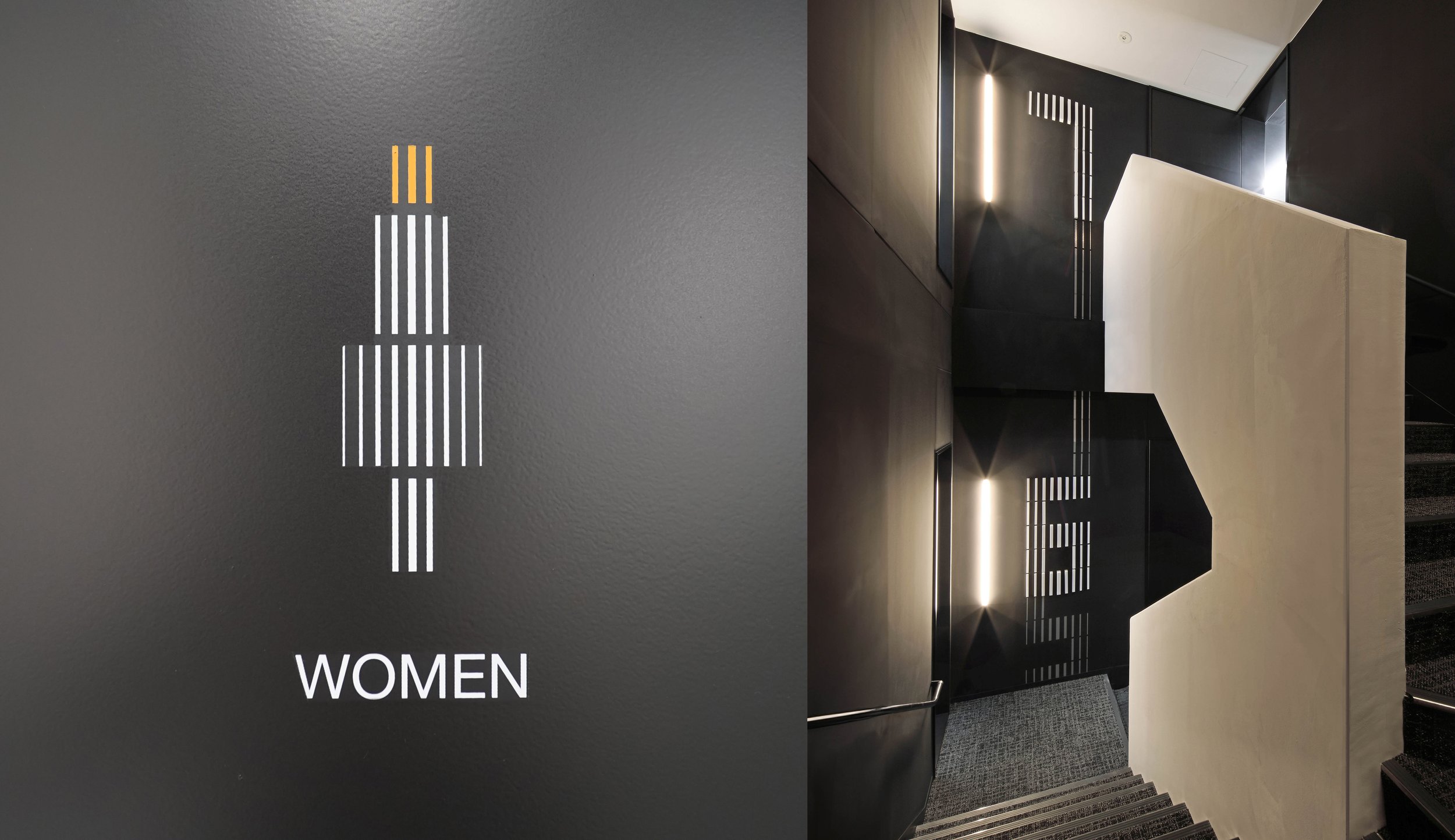
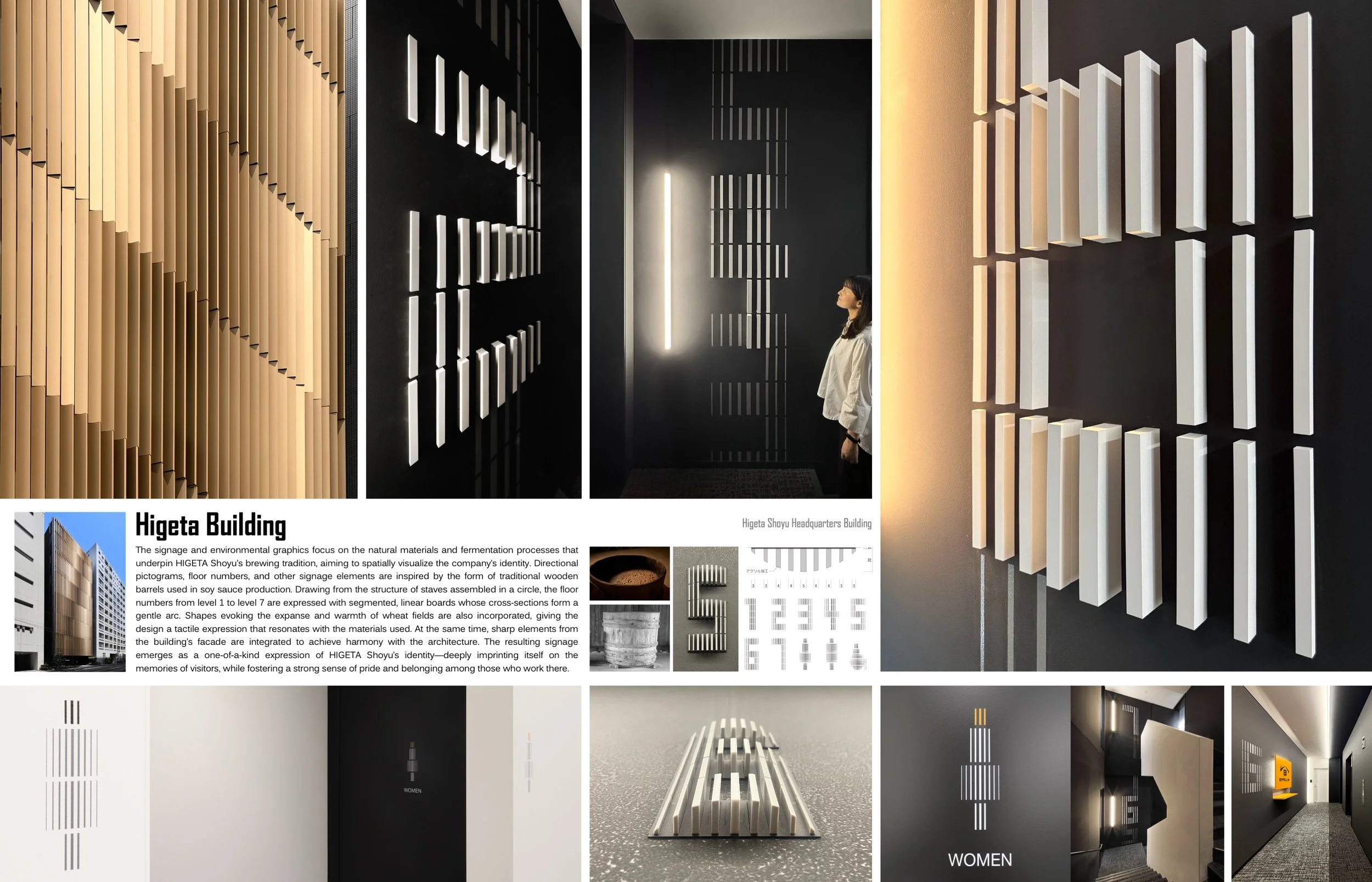
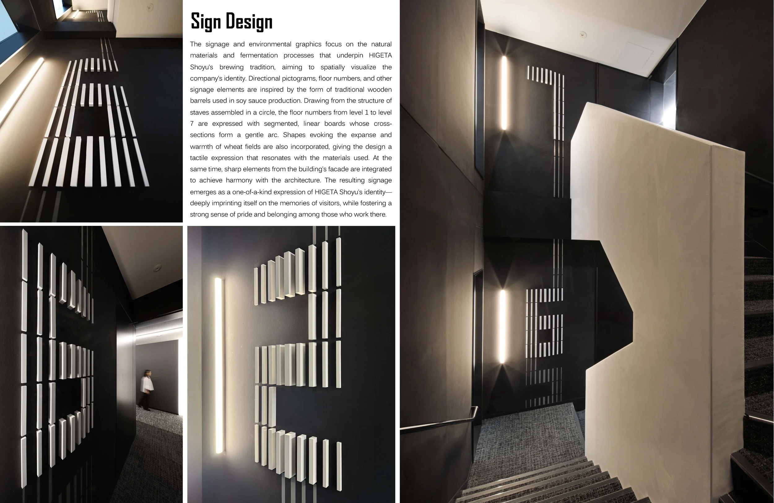
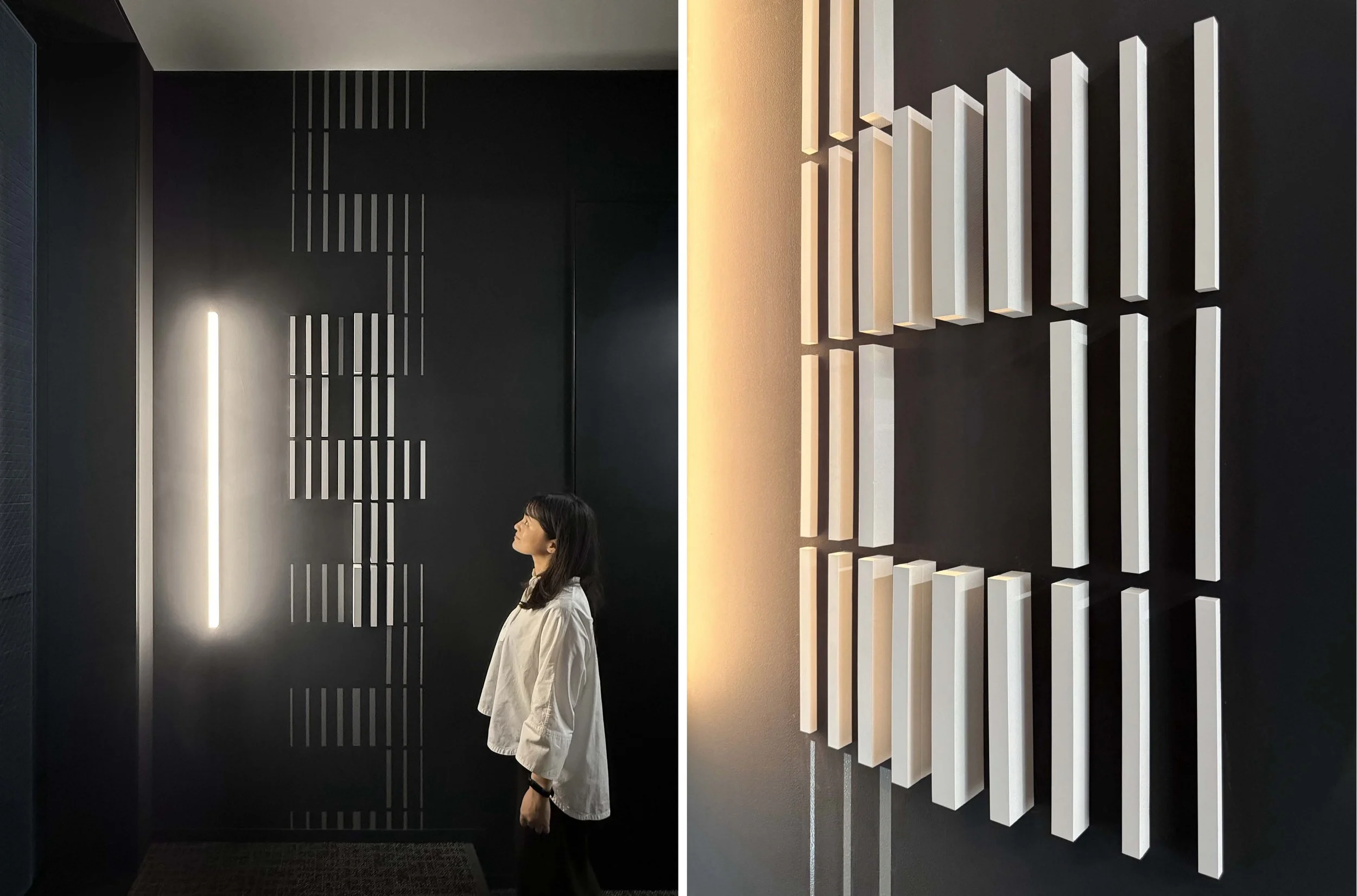
The art of brewing adds another layer to the design narrative. Traditional wooden soy sauce barrels, constructed with curved staves, inspire the building’s pictograms, directional signs, and floor numbers. Each numeral from one to seven is designed with segmented linear elements boasting gentle curves. These details forge a tactile connection to the production process, with the references to barrels evident in their shape and construction. This brings the knowledge and craftsmanship of brewing into the everyday workplace orientation spaces, where functional graphics quietly remind occupants of the expertise accumulated over generations.
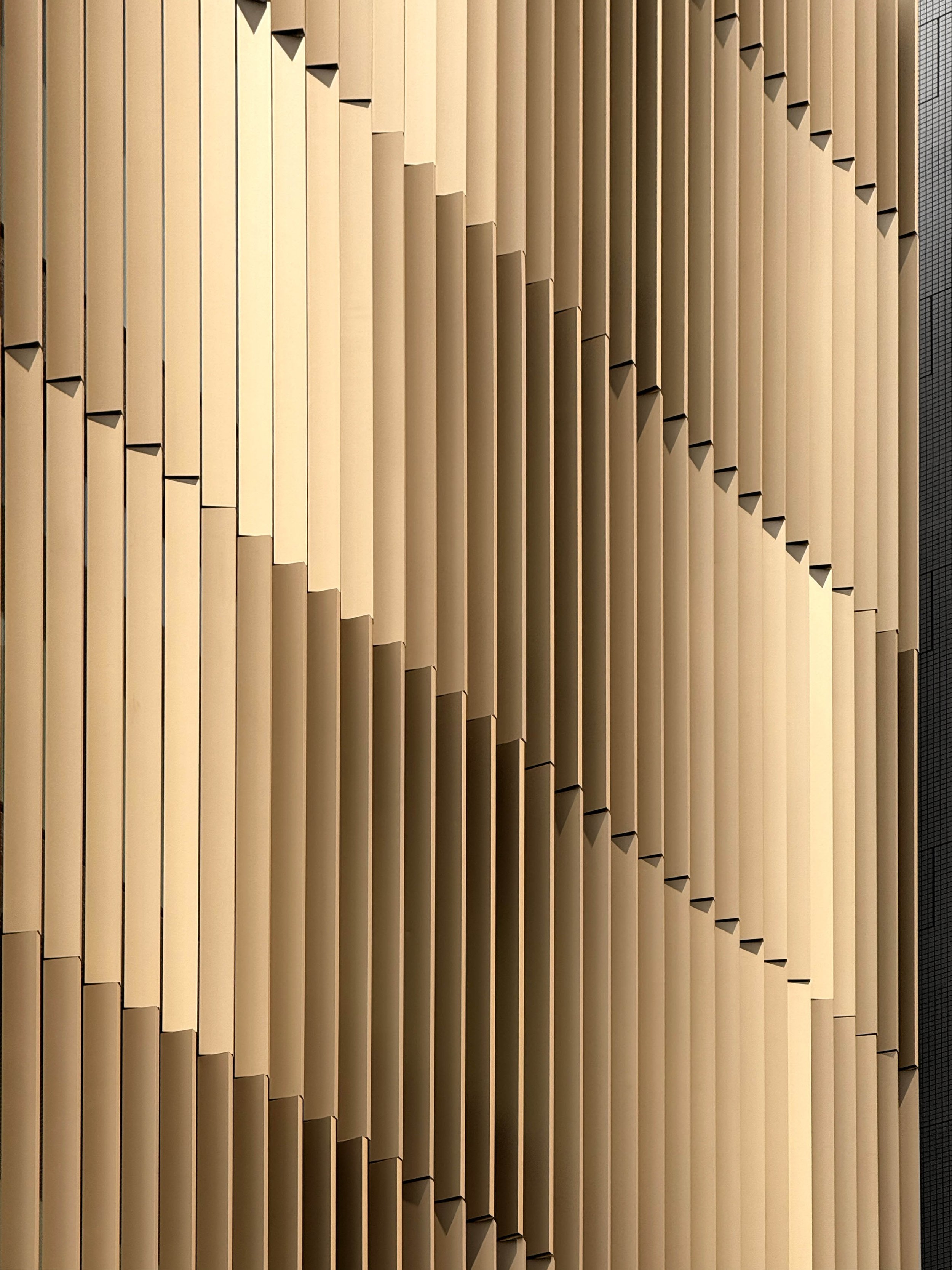
The connection to wheat extends from the interior to the building’s façade. Golden louvres evoke fields swaying in the wind, subtly alluding to the key ingredient that laid the foundation for Higeta’s koikuchi soy sauce. Inside, complementary patterns and linear forms further this narrative on a more intimate scale. This project exemplifies how corporate heritage can thrive in daily working life. Higeta’s history is reflected in the entrance each visitor experiences, the guiding tones that lead them to their respective floors, and the signage throughout the building. Every element serves a practical purpose, clarifying this narrative through repeated engagement.
MR STUDIO has crafted an identity system that connects Higeta Shoyu’s storied origins with its contemporary presence in Nihonbashi. References to wheat, wooden barrels, the historic logo, and HIGETA Yellow contribute to an understanding and remembrance of the headquarters. Four centuries of history are seamlessly woven into the simple acts of arriving, finding one’s way, and navigating the workday.
PEGGY'S EDITOR'S NOTE (2026 Sky Design Awards Editorial Jury)
Integrating a deep-rooted history into a contemporary corporate environment presents a delicate challenge, and this project achieves a harmonious balance. The design's strength comes from its understated utility. Historical references like the wheat motifs and the barrel-inspired sign construction fit naturally into the building’s architecture. This approach fosters an atmosphere where the heritage is felt intuitively and is not just decorative. The moiré detailing at the entrance and the vibrant floor zoning strategy guide occupants clearly and warmly. This project stands as a great example of how a brand’s origin story can be transformed into a shared, functional space that encourages exploration at every turn.
EDITOR'S REVIEW
MR STUDIO showcases an impressive understanding of narrative design, successfully blending a four-century legacy into the dynamics of a modern workspace. The design effectively integrates heritage into functional wayfinding and environmental graphics, ensuring that every wheat-inspired motif and barrel-derived shape serves a distinct practical purpose.
The entrance hall sets a captivating tone with its "HIGETA Yellow" luminous feature; the interplay of light and geometry creates subtle visual engagement that warmly welcomes visitors with a quiet, confident presence. Throughout the building, a zoning system that assigns specific hues to different tenant floors provides an intuitive and cohesive navigational experience. By harmonizing historical symbolism with contemporary spatial design, the project elevates corporate identity while honouring its heritage.
ORIGINAL DESIGNER SUBMISSION — VERBATIM
Higeta Building
Description
Higeta Shoyu Co., Ltd., founded in 1616 in Chōshi, Chiba Prefecture, is one of Japan’s most historic soy sauce producers. The company has long stood at the forefront of innovation, most notably in 1697, when it introduced wheat into the brewing process, establishing the prototype of modern koikuchi soy sauce. This transformative act has defined Japan’s culinary heritage and remains a symbol of Higeta Shoyu’s progressive spirit.
The new headquarters in Nihonbashi, Tokyo, embodies this four-hundred-year legacy, merging tradition with a bold vision for the future. Within this architectural framework, the signage and environmental graphics have been conceived as a profound spatial articulation of corporate identity.
The entrance hall condenses the essence of the company into a singular experience. A luminous slit of “HIGETA Yellow,” inserted into the wall, functions as a symbolic incision, capturing both historical depth and forward-looking dynamism. The dual-border composition creates a moiré-like fluctuation as visitors move through the space, introducing a subtle sense of motion and tension into an atmosphere of serenity and contemplation.
Elevator halls reinforce brand presence with clarity and elegance. Corporate identity colors distinguish the tenant zones—blue for Takara Shoyu on floors two through five, and HIGETA Yellow for Higeta Shoyu on floors six and seven. These colors extend across wall planes, flooring, and signage, ensuring intuitive navigation while leaving vivid, memorable impressions.
Square-based signage derives from the traditional Higeta logo, integrated with carefully orchestrated lighting to impart dimensional depth and a contemporary expression of heritage.
The environmental graphics draw inspiration from the natural materials and fermentation processes that anchor the brand’s craft. Pictograms, directional signs, and floor numbers reinterpret the circular structure of traditional wooden barrels used in soy sauce brewing. Each floor number, from one through seven, is composed of segmented, linear boards whose cross-sections arc gently, echoing the curvature of barrel staves.
At the same time, the signage incorporates motifs from the building’s facade, where golden louver fins evoke rippling wheat fields shaped by wind simulations. By uniting interior and exterior, the signage achieves harmony with the architecture while carrying forward the symbolic resonance of wheat—the ingredient that once revolutionized soy sauce brewing.
Additional gestures reference the expanse of wheat fields, conveying warmth and openness while balancing sharp geometries that reflect modernity. The result is a one-of-a-kind expression of corporate identity that integrates history, materiality, and spatial experience.
The signage system does more than guide movement; it narrates a story spanning centuries while instilling pride in those who work within. Visitors encounter a design that is at once welcoming and iconic, deeply imprinted in memory. By fusing symbolic heritage with contemporary sensibility, the project sets a new benchmark for how environmental graphics can embody cultural identity with dignity, precision, and lasting impact.
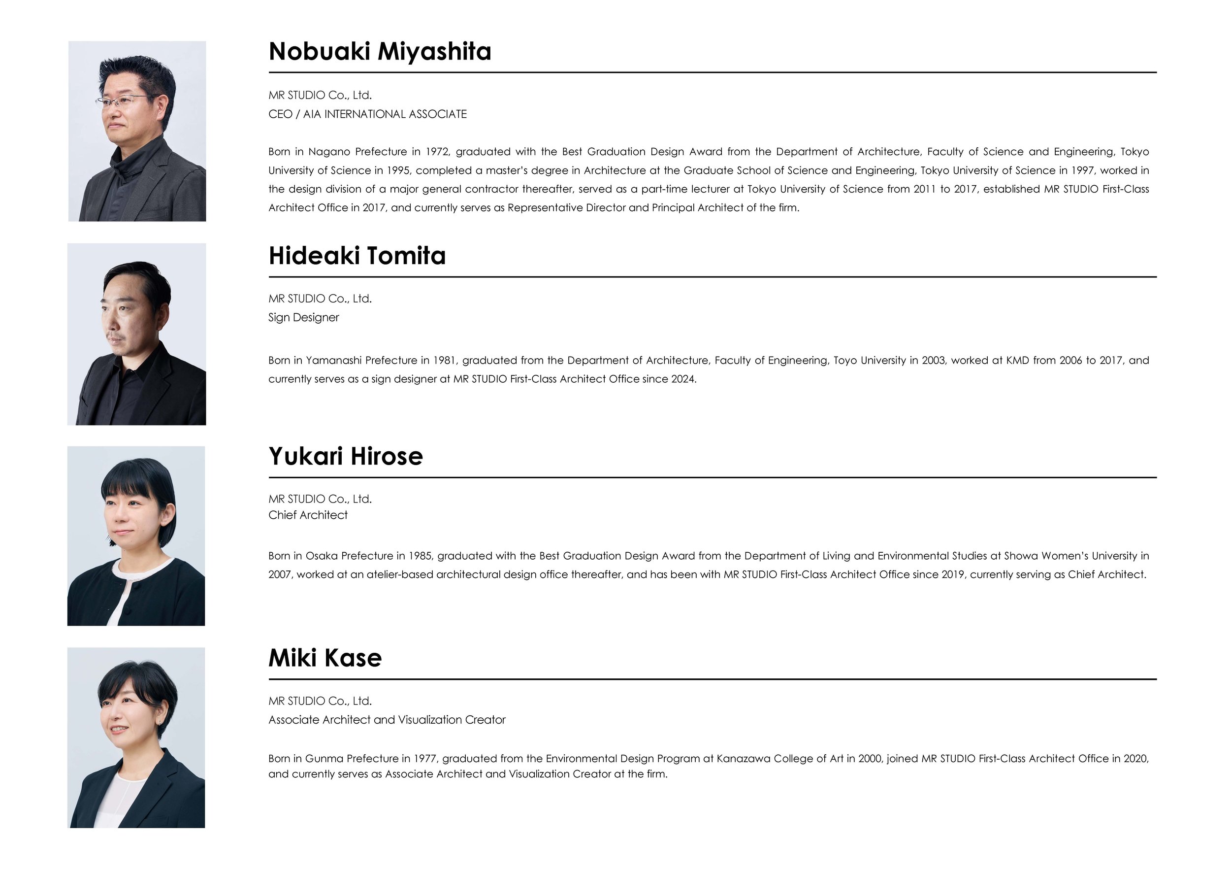
About the design team:
Project: Higeta Building
Location: Nihonbashi, Tokyo, Japan
Project type: Visual Communication Design — Signage and Environmental Graphics
Designer/company: MR STUDIO Co., Ltd.
Additional credits: Environmental graphics, signage and lighting integration
Client/collaborators: Higeta Shoyu Co., Ltd.
Completion: May 2025
Area: Headquarters entrance and floors 1–7